HDR tends to have a bad name in the world of photography. Type the words ‘HDR photography' into google images and you'll get an idea why. Florescent colours, softened pixels, noise and blinding halos jump out at you as you scroll down the search results. Yet, HDR techniques, if used correctly, be they tone mapping or digital blending, can help to create stunning images.
")
I don't like to consider myself a snob. When it comes to HDR, I love surreal and realistic images and remain as open minded as possible in terms of workflows and processing methods. As artists, there is no such thing as a useless tool – we just haven't discovered a use for it yet.
With that in mind I hope not to frame this article in a way that limits your creative juices by saying ‘don't do this'. Instead, I'm going to leave you with a number of suggestions that have been vital in the development of my workflow and imagery which you can, if you choose, adapt into your own style.
Colour Control in HDR
One of the biggest complaints from non-HDR fans is the often over-the-top cartoony colouring that seems to come with tone mapped images. There's nothing wrong with strongly coloured images. The shot I used at the top of this article shows how fond I am of powerful colours. However, knowing how to control the colours in our image to increase their impact is at the heart of all colour photography.
Often, the culprit is the Saturation slider in HDRsoft's Photomatix. When you choose the Default preset, the saturation slider sits on 45. Despite this being its default setting, for me it is far too strong. I never move the saturation slider beyond 35.
After this (or before, depending on your workflow), we HDRists then have to colour correct in the same way that other photographers do. This could require a workflow unto itself depending on the scene and how it was shot. But for those of you who have NIK's Color Efex, there's a nifty slider hidden under the Pro Contrast filter called ‘Correct Color Cast' that often does an incredible job of removing colour bleeding and restoring natural colouring.
Another important colour correction method for those of you without Color Efex is to establish white points in Photoshop. This video tutorial can show you how.
Keeping Shadows and Highlights to Increase Mood and Energy
HDR, by its very definition, serves to rescue highlights and darkened parts of a scene. Our goal is to create a range of light much closer to that in the real scene than our camera is capable of catching in a single frame. The trend, therefore, is for HDR photographers to avoiding clipping at all costs. Ultimately, shadows within our images begin to dwindle and our shots sometimes lack highlights. Here's the thing, shadows are absolutely paramount in creating mood, and strong bursts of light allow our images to explode with energy. In the end, without these, we can be left with flat images that simply don't move people. Below are two images where I've liberally clipped areas in order to affect mood.
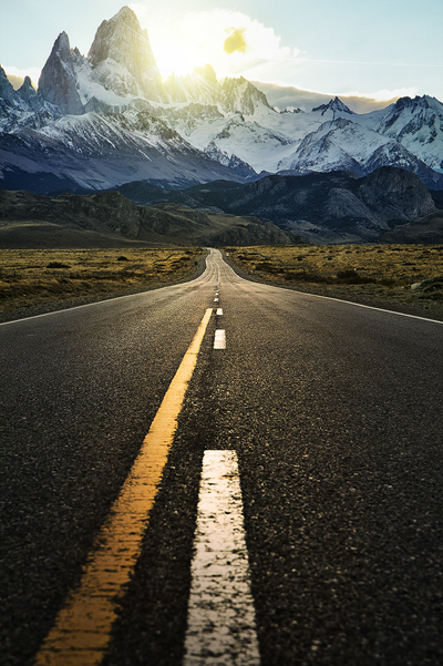
As you can see, I've purposefully blown out the sky where the sun was in order to increase the dynamic feel of the image.
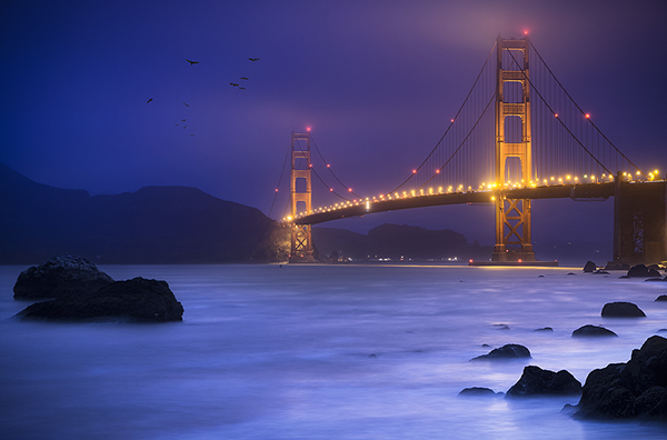
For this image, I used three separate exposures to recover the highlights in the bridge and bring detail into the rocks. But I then darkened the rocks further, losing detail in the process, in order to not distract the viewer's eye from the main points of interest and to increase the overall mood of the image.
Maintaining Proportional Luminosity Values
There are some incredible HDR programs available today. With a simple click of a button you can blend multiple exposures to leave you with an image that far surpasses a single exposure in terms of range of light. But, this software isn't perfect. It doesn't know the difference between the sky and a car, for example, so it can't process images in terms of specific objects or areas. It is your job, as the master of the sliders, to control how that image is rendered. A very common ‘mistake' in HDR images is to have the sky darker than the foreground, or shadows the same brightness as the midtones, or midtones brighter than the highlights. This fits in with our last point but it is relevant in every aspect of the image.
In HDR programs, there is usually a slider that changes the emphasis of light. In Photomatix it's called Lighting Adjustments. Slide it to the far right and it will create a natural distribution of light, where the highlights, midtones and shadows are correctly placed. Slide it to the left and the highlights darken, while the shadows brighten.
A rule I follow is this: if the sky is brighter in the original images, then it should also be brighter in HDR image. The same holds for midtones and shadows. I never create an image where the luminosity values are almost reversed because when people see the image, it simply doesn't fit correctly in their minds. If it's a beautiful sunny day but the sky is a dark grey and the shadows are glowing, our minds usually won't feel good about looking at that scene. It doesn't fit our logic. Now, there may be counter-examples of this, although I've yet to find one. But it is one of the very few ‘Rules' that I follow.
Knowing the benefits and uses of different methods and software
Not all HDR processes are equal. I regularly employ two different measures to blend exposures. Which method I use depends solely on that image. On some occasions, I combine multiple blending processes to achieve the maximum affect, as I see it.
Photomatix
Comfortably the most popular and easy-to-use software, Photomatix renders images in an absolutely unique way to any other software. Its tone mapping develops textures beautifully, leaving us with a slightly surreal, floaty feel. On the other hand, it can absolutely destroy images by introducing multitudes of noise, halos and completely softening sharp pixels.
Here is an example of the interesting, surreal feeling we can attain from Photomatix:
Digital Blending Using Luminance Masks
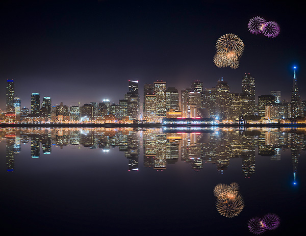
Luminance Masks, otherwise known as Luminosity Masks, are an advanced selection process in Photoshop where we can isolate specific areas based on luminosity and replace them with areas of more preferred luminosity from a different exposure. This is the most advanced exposure blending method around which does not alter the colour, sharpness or noise of your image in anyway. If you want to create natural HDRs, this is the way to do it. This process can be more time consuming than anything else, but it is also worth the effort. On the other hand, it also may be a quick process depending on the scene. For the image below I used a normally exposed shot for the base image, and then rescued the blown-out highlights in the building with an exposure 2 stops lower. The blending process took about 5 minutes.
For more on luminance masks, there is an beginner's tutorial here.
A tutorial on how to create a cityscape reflection can be found here on my site.
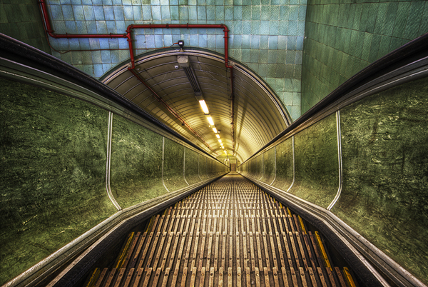
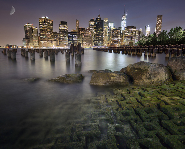
Ultimately, the process you choose can greatly determine the style and mood of your image. However, on many occasions I have combined outputs from both processes in order to get the best out of best of both worlds. In the example image below, the skyline (buildings and sky) is the result of 100% luminance masking, to maintain the sharp edges of the buildings and minimise noise. However, the bottom 3rd of the image is from the Photomatix output since I loved the foreground textures of the rocks and green flooring that Photomatix gave me. The sticks and water are 50% luminance masks and 50% Photomatix, which kept the shaprness of the sticks from the Luminance masks but also softened the water a touch.
Summary
I hope this article has helped you in some way, large or small. In truth, the four suggestions I've made here barely scratch the surface of compelling HDR imagery, but every one of them should be given their due concern when it comes to processing. While none of these points went into great detail, I hope you feel curious enough to conduct your own research on them and consider the way in which the quality of your images can improve with these suggestions.


6 Comments
The are gorgeous images :).
You’ve perked my interest in HDR again.
Thank you very much Rachael!
The photos you posted in the article are exquisite. The HDR enhances images that are already beautiful and stand on their own merits. One complaint about HDR is that it’s sometimes used as an “effect” to rescue a snapshot — like looking at your big toe through the lens of a lava lamp.
I don’t have Photomatix Pro, but just learned of another method for achieving realistic HDR using Photoshop alone. Select your photos of different exposures and merge to HDR Pro. Select the 32-bit option and remove ghosts. Save the image as a TIFF and pull it into Adobe Camera Raw (or Lightroom, if you have it). Then you can play with the basic sliders as you normally would, but with a much greater degree of latitude in recovering highlights and shadows.
Will try that too, thanx!
You guys are greate!
I was afraid to take it on because of the abowe mentioned Photomatix issues. There are other, simple ways and I see that when I read your article. And if none works for itself combine them… Brilliant. Inspired and will be putting it in practice right away 🙂
Thanx!
Great Work !
I love the colors. Looking forward to seeing more.