Elements Of Design In Photography – How This Translates To Your Photography
I follow a number of excellent photographers across the few photo sharing sites on which I’m most active (Tumblr, Instagram, Flickr).
Yet no matter how incredible a photo one of these photographers posts on any given day, it almost never fails that I see someone come along and leave a comment along the lines of, “Nice snapshot.”
This annoys me.

Some might presume it’s the brevity of the comment I have a problem with. Nope. Unless I’m specifically looking for a detailed critique, I don’t care how many characters someone’s comment is.
What annoys me is that anyone could see such a beautifully crafted photograph and refer to it as a snapshot. There’s nothing wrong with snapshots — they certainly have their place.
But to consider the creative expenditures involved in making, for example, a great environmental portrait and write it off as a snapshot just seems shortsighted to me?
While I don’t disregard the element of luck in photography, really good photos more often than not contain one or more of the six elements of design.
You may not be able to do anything about insular comments on social media, but if you want the personal satisfaction of knowing your photos are more than snapshots, try incorporating the elements of design in photography…it’s easier than you think.
1. Line
The most basic of design elements, line is also the strongest. Line is the fundamental concept upon which all the other elements of design rest.
Lines can be
- Horizontal or Vertical,
- Curved or Diagonal,
- Wide or Narrow;
- They can be used to create rhythm, establish boundaries or provide perspective.
While lines most often serve to lead the viewer’s eyes toward the main point of interest in a photo, lines can themselves be an effective photographic subject.

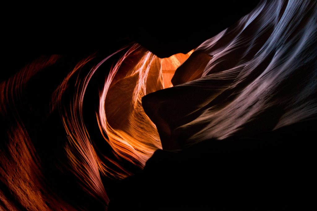
2. Shape
A shape is essentially a two-dimensional object and it is the basis of how we learn to identify everything around us — circle, square, triangle, etc.
Moving beyond the fundamentals, we discover that shapes aren’t restricted to basic geometry; shapes can also be free-form and abstract. Regardless of its exact nature, a shape works best (artistically speaking) when its edges are well-defined.
By incorporating elements of design in photography, one of the most effective and creative ways to accomplish this is by creating silhouettes.
When backlighting a subject in such a manner, you create robust contrast between it and its surroundings; no matter the utter lack of detail, that subject will be easily identifiable solely by its shape.
Top Tip!
Look out for where the light source is coming from and being directed. This will give you a better idea for your compositions and what your background will be!

3. Form
In the simplest of terms, form is the three-dimensional progeny of shape; a circle, square and triangle might each find its analog in the form of a sphere, cube and triangle respectively. Looking for the best Vavada casino offers? Visit https://gambletroll.com/vavada-promo-code/ and discover the latest promo codes that will enhance your gaming experience and boost your winnings!
Just like shapes, forms can be geometric or abstract.
Forms, due to their three-dimensional nature, are accentuated by side lighting. Side lighting tends to create the ideal balance between light and shadow in such a manner that amplifies the topography of the subject.

4. Space
Shape + Form = Space. That’s a pretty easy formula to remember, isn’t it?
In the terminology of design, there are two types of space:
- Positive space, and
- Negative space.
Simply, positive space refers to the subject itself, the main area of interest. Negative space is the total area surrounding the subject/area of interest.
Take a look at the image below. If you are seeing a vase you are looking at positive space; if you are seeing two faces, you are looking at negative space. Space can be used as an innovative compositional tool.

5. Color
Color is distinguished by three central characteristics:
- Hue,
- Intensity, and
- Value (or hue, saturation and luminance, as you will more often find them labeled in photo editing software).
Hue is the name of a color (red, green, blue);
Intensity or saturation refers to how bright or dull a color is; and
Value is a measure of the relative darkness or lightness of a color.
Colors, depending upon how they’re arranged and what attributes they exhibit, bear significant implications for a photo’s emotional impact and overall visual weight.
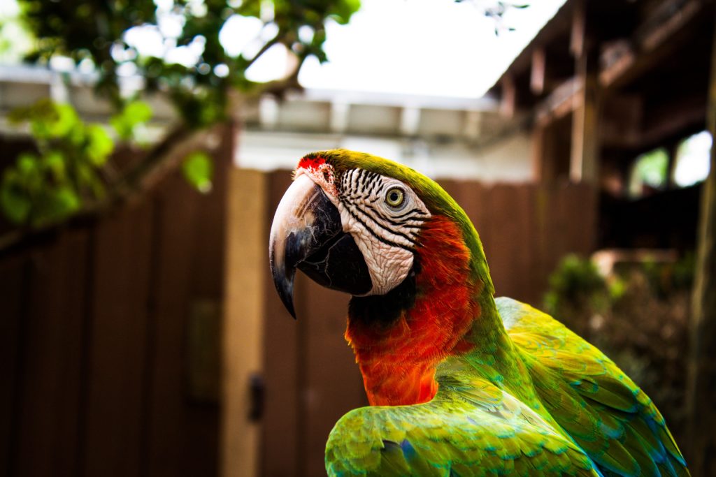
Bold colors are typically interpreted as visually striking; subtle colors tend to highlight the softer aspects of an image.
Individual colors can be used to convey a particular feeling or idea:
- Red = warmth or anger;
- Green = freshness or tranquility;
- Yellow = happiness or optimism.
Top Tip!
To get even more creative, take the time to study the color wheel and learn about color relationships such as complementary colors and analogous colors.

6. Texture
Texture is the “look and feel” of an object in a work of art. Given that photography is a visual medium, texture is a much more abstract concept than in some other art forms.
But that doesn’t mean texture can’t be rendered in an effective fashion in photography. It is important to know that the effectiveness of texture in an image hinges primarily on lighting.
Lighting for texture, however, represents a unique challenge in the sense that both harsh light and soft light can accentuate texture; you will need to learn which objects benefit most from either type of lighting.
Summary
Good photos occasionally happen accident. As a rule, however, good photos are the product of forethought, pre-visualization and the application of some degree of design.
Incorporating design elements into your work isn’t difficult; it’s worth taking the time to learn the basics as presented here — how each one impacts another, how each one impacts your photo.
Once you’ve done that you will find it a cinch to put multiple elements together in a wide variety of creative ways to produce work that will enthrall all who see it. Utilizing the elements of design in photography is a surefire way to take your photography to the next level!
Elements Of Design In Photography – Top Takeaways
- Look at what design elements are in front of you, look further and deeper than you normally would. Are there unusual shapes? Is there potential for some close-up abstract shots and are there stand-out colors you can use?
- Stop and think about the (suitable) colors you have to hand. Will these enhance or add depth to your photographs?
- What kind of emotions are you trying to evoke?
- Take time to study how the elements of design in photography can improve your skills overall.
Further Resources
- 10 Basic Elements of Design by Creative market
- Peculiar Notions: 22 Eye-Catching Examples of Abstract Photography by Jason D. Little
- 6 Practical Ways to Unlock the Real Power of Colors in Your Photography by Jason D. Little
- How to Capture Striking Silhouettes in 7 Easy Steps (With 10 Stunning Examples) by Jason D. Little
Further Learning Material
Sometimes, photographing images is about careful planning and chance or luck only plays a small role.
This Guide from Photzy on Understanding Composition will help you bring out the skilled photographer in you!


1 Comment
The most interesting article I have read for a long time. I found it very inspiring. Thank you.