Creating dramatic skies in Lightroom is a bit different than Photoshop, but you can easily achieve similar results. The goal is to bring out the true drama of a sky that the camera can often leave out – but without over-processing your image to the point where your sky looks fake, or showing noticeable signs of deterioration (halos, blown highlights, and so on).
Note: Click on all images to see them in full resolution.
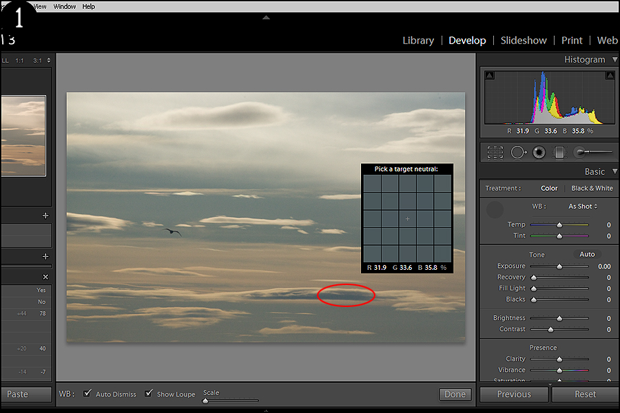
1. Once your image is open in Lightroom, adjust your white balance so that you have the tone you want to work with. For my image, I wanted to add a bit more warmth so I set my white balance neutral to one of the dark blues (Figure 1).
2. Next, let’s move onto our Tone menu. Here we can adjust our exposure if needed (much better done with RAW than a JPG if possible) – just make sure not to blow out your highlights. Photographing skies can often be difficult, especially when you have darkened foreground images as that can throw off your metering substantially and give you an overexposed sky. If you're working with a RAW file, you can actually save blown highlights to a certain point. For this image, I didn’t need to adjust the exposure.
Recovery can help a bit with the blown highlights as well, but adjusting it too much can give you an unnatural-looking image. Again, my image was pretty evenly exposed so no need to adjust this here.
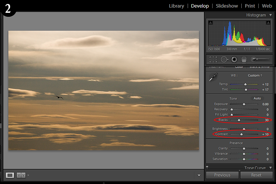
I did, however, make a few other adjustments. I wanted to make this image more contrasty in the bottom portion, so I upped the Blacks to 30 and the Contrast only 10 as I liked the way the top sky looked and didn't want to overexpose it (Figure 2).
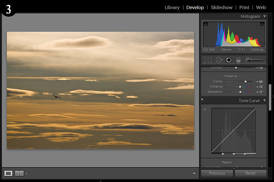
3. Moving on to the Presence tab, we can see three options here: Clarity, Vibrance, and Saturation. Clarity has its place when adjusting your image and can improve it greatly depending on what kind of photo you have. It’s almost like a blur/sharpen tool in one, where dropping it will create a very soft, dreamlike effect while increasing it will sharpen your image without deteriorating it (noticeably anyways). I want my clouds to pop a bit so I increased Clarity to 60.
Vibrance and Saturation work hand-in-hand to make your colors stand out, or alternatively decrease them if you find your image to be too colorful. I want my colors to stand out a bit, but not too much so I only increased the Vibrance to 15 and Saturation to 17 (Figure 3).
4. Next up we have our Tonal Curve menu, which is essentially the amount of lights and darks present in your image. This is where you can really improve your image or turn it into a disaster, so it’s much better to adjust too little than too much – actually, that rule can be applied to any post process editing.
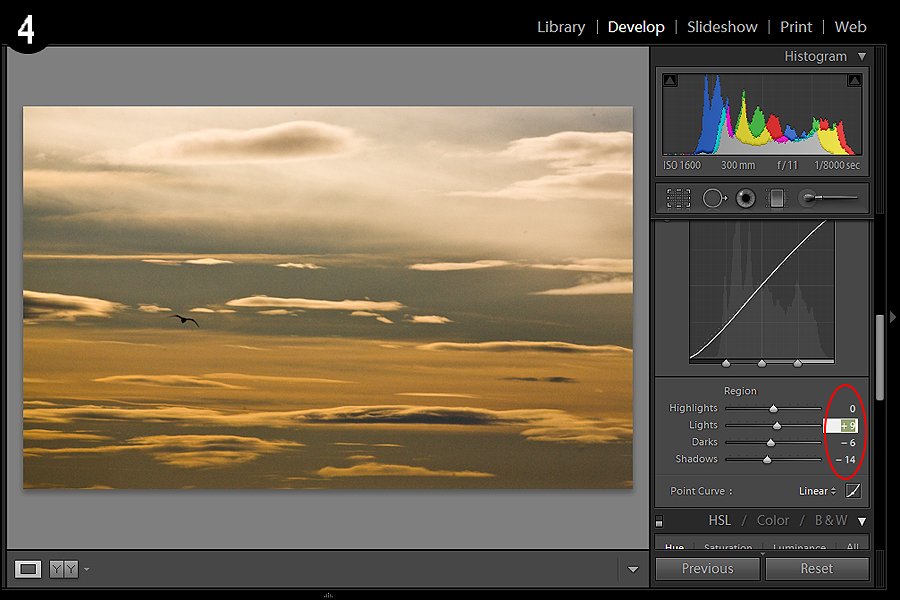
In Lightroom, you can either drag the curve around with your mouse or input exact numbers into the specific adjustments below. Highlights and Shadows are the extreme ends of the spectrum and should be adjusted lightly depending on your image as you can easily over or underexpose those parts of your photo. With Lights and Darks you have a bit more leeway, but again these should be eased into. For this photo, since I didn’t want to blow out the highlights of the top portion of the sky, I left the Highlights alone. However, I really wanted to bring out the shadows of the clouds so I decreased Darks by -6 and Shadows by -12, and also upped the Lights to 9 just to add a bit more contrast (Figure 4).
5. Finally, let’s get to the fun part – adjusting your colors. Scroll down to the next window and click on HSL (Hue, Saturation, and Luminance).
Each sub-menu is separated into the colors present in your image. For my image, the tonal range is rather limited to red, oranges, and yellows so we’re going to stick to adjusting those sliders.
Hues will change the colors in your image as indicated on the slider – for example, adjusting the Red to the left will add magenta, while adjusting it to the right will add some orange. Explore all these sliders but refer back to the original from time to time to see if you’ve gone too far – you can shut off the HSL change by ticking the on/off switch (Figure 5).
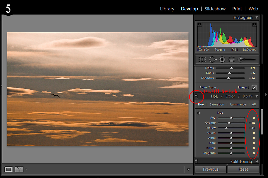
In the Hue sub-menu, I wanted to get rid of some of the yellow tinge to my photo and add a bit of red, so I decreased the Orange to -18 (which added red) and the Yellow to -41 (which added orange). I also adjusted my Saturation to make the Orange pop more (+30) and removed the yellow by decreasing it to -34.
You can always remove any adjustments you made to these sliders by double-clicking on the name (Orange, Yellow, etc.) – much easier than inputting 0.
6. Here’s the final image side-by-side so you can see the sky improvement (Figure 6):
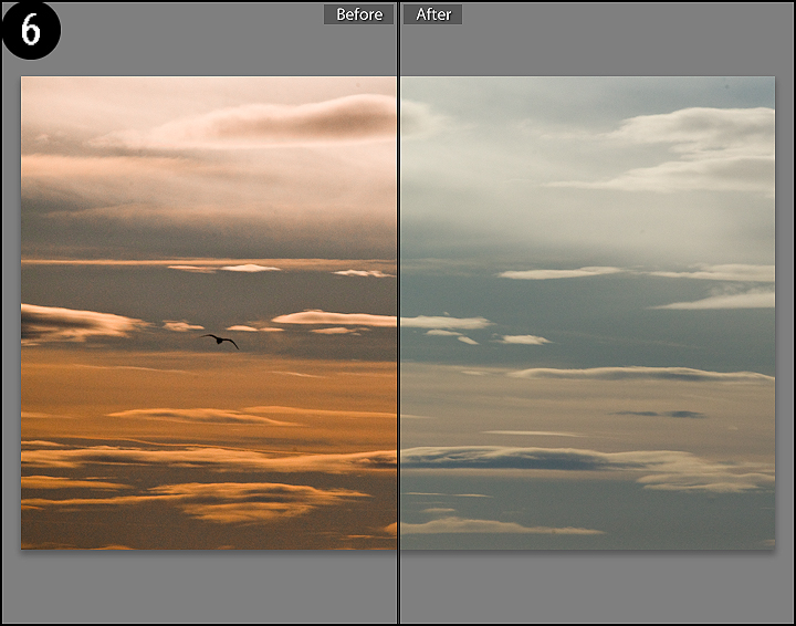
The goal of my image was to create a warmer tone and feeling to it while also removing some of the haze/cloudiness to the colors – more representative of a sunset. Depending on your own tastes, you can create something completely different with the same photo.
I uploaded a full-res version of this file here so you can adjust the image along with this tutorial, or create your own. Feel free to upload your creations to the Light Stalking Facebook fan page photo album if you want to show off your editing skills.
Read more great articles by Christopher O’Donnell at his blog or follow him on Facebook.


4 Comments
Thanks for your tutorial. I believe the last image, #6 is incorrect. It seems that the processed image is the left portion while the original, non processed is the right, however the tags at top are not inverse.
George
Good catch George, thank you!
Good article, I am constantly trying to improve my Lightroom skills and skies are tough. The tone curve is still somewhat difficult to work with though, guess I just need more practice
Nice tutorial. If I have a foreground in the shot I like to go heavy on the clarity slider with either the paintbrush tool, or gradient tool. Sometimes I’ll layer a few gradients over one another for some really detailed clouds. They do look over processed, but sometimes the effect really works