window._wpemojiSettings = {"baseUrl":"https:\/\/s.w.org\/images\/core\/emoji\/14.0.0\/72x72\/","ext":".png","svgUrl":"https:\/\/s.w.org\/images\/core\/emoji\/14.0.0\/svg\/","svgExt":".svg","source":{"concatemoji":"\/\/www.lightstalking.com\/wp-includes\/js\/wp-emoji-release.min.js?ver=00ee2dc9c4a47c0421c3a1063c12ecee"}};
/*! This file is auto-generated */
!function(i,n){var o,s,e;function c(e){try{var t={supportTests:e,timestamp:(new Date).valueOf()};sessionStorage.setItem(o,JSON.stringify(t))}catch(e){}}function p(e,t,n){e.clearRect(0,0,e.canvas.width,e.canvas.height),e.fillText(t,0,0);var t=new Uint32Array(e.getImageData(0,0,e.canvas.width,e.canvas.height).data),r=(e.clearRect(0,0,e.canvas.width,e.canvas.height),e.fillText(n,0,0),new Uint32Array(e.getImageData(0,0,e.canvas.width,e.canvas.height).data));return t.every(function(e,t){return e===r[t]})}function u(e,t,n){switch(t){case"flag":return n(e,"\ud83c\udff3\ufe0f\u200d\u26a7\ufe0f","\ud83c\udff3\ufe0f\u200b\u26a7\ufe0f")?!1:!n(e,"\ud83c\uddfa\ud83c\uddf3","\ud83c\uddfa\u200b\ud83c\uddf3")&&!n(e,"\ud83c\udff4\udb40\udc67\udb40\udc62\udb40\udc65\udb40\udc6e\udb40\udc67\udb40\udc7f","\ud83c\udff4\u200b\udb40\udc67\u200b\udb40\udc62\u200b\udb40\udc65\u200b\udb40\udc6e\u200b\udb40\udc67\u200b\udb40\udc7f");case"emoji":return!n(e,"\ud83e\udef1\ud83c\udffb\u200d\ud83e\udef2\ud83c\udfff","\ud83e\udef1\ud83c\udffb\u200b\ud83e\udef2\ud83c\udfff")}return!1}function f(e,t,n){var r="undefined"!=typeof WorkerGlobalScope&&self instanceof WorkerGlobalScope?new OffscreenCanvas(300,150):i.createElement("canvas"),a=r.getContext("2d",{willReadFrequently:!0}),o=(a.textBaseline="top",a.font="600 32px Arial",{});return e.forEach(function(e){o[e]=t(a,e,n)}),o}function t(e){var t=i.createElement("script");t.src=e,t.defer=!0,i.head.appendChild(t)}"undefined"!=typeof Promise&&(o="wpEmojiSettingsSupports",s=["flag","emoji"],n.supports={everything:!0,everythingExceptFlag:!0},e=new Promise(function(e){i.addEventListener("DOMContentLoaded",e,{once:!0})}),new Promise(function(t){var n=function(){try{var e=JSON.parse(sessionStorage.getItem(o));if("object"==typeof e&&"number"==typeof e.timestamp&&(new Date).valueOf()<e.timestamp+604800&&"object"==typeof e.supportTests)return e.supportTests}catch(e){}return null}();if(!n){if("undefined"!=typeof Worker&&"undefined"!=typeof OffscreenCanvas&&"undefined"!=typeof URL&&URL.createObjectURL&&"undefined"!=typeof Blob)try{var e="postMessage("+f.toString()+"("+[JSON.stringify(s),u.toString(),p.toString()].join(",")+"));",r=new Blob([e],{type:"text/javascript"}),a=new Worker(URL.createObjectURL(r),{name:"wpTestEmojiSupports"});return void(a.onmessage=function(e){c(n=e.data),a.terminate(),t(n)})}catch(e){}c(n=f(s,u,p))}t(n)}).then(function(e){for(var t in e)n.supports[t]=e[t],n.supports.everything=n.supports.everything&&n.supports[t],"flag"!==t&&(n.supports.everythingExceptFlag=n.supports.everythingExceptFlag&&n.supports[t]);n.supports.everythingExceptFlag=n.supports.everythingExceptFlag&&!n.supports.flag,n.DOMReady=!1,n.readyCallback=function(){n.DOMReady=!0}}).then(function(){return e}).then(function(){var e;n.supports.everything||(n.readyCallback(),(e=n.source||{}).concatemoji?t(e.concatemoji):e.wpemoji&&e.twemoji&&(t(e.twemoji),t(e.wpemoji)))}))}((window,document),window._wpemojiSettings);
window.advanced_ads_ready=function(e,a){a=a||"complete";var d=function(e){return"interactive"===a?"loading"!==e:"complete"===e};d(document.readyState)?e():document.addEventListener("readystatechange",(function(a){d(a.target.readyState)&&e()}),{once:"interactive"===a})},window.advanced_ads_ready_queue=window.advanced_ads_ready_queue||[];
//www.lightstalking.com/wp-includes/js/jquery/jquery.min.js
//www.lightstalking.com/wp-includes/js/jquery/jquery-migrate.min.js
var breeze_prefetch = {"local_url":"https:\/\/www.lightstalking.com","ignore_remote_prefetch":"1","ignore_list":["\/wp-admin\/"]};
//www.lightstalking.com/wp-content/plugins/breeze/assets/js/js-front-end/breeze-prefetch-links.min.js
//www.lightstalking.com/wp-content/plugins/intelly-countdown-pro/assets/deps/moment/moment.js
//www.lightstalking.com/wp-content/plugins/intelly-countdown-pro/assets/js/icp.library.js
//www.lightstalking.com/wp-content/plugins/wp-user-avatar/assets/flatpickr/flatpickr.min.js
//www.lightstalking.com/wp-content/plugins/wp-user-avatar/assets/select2/select2.min.js
//www.lightstalking.com/wp-content/plugins/tag-groups/assets/js/frontend.min.js
var advads_options = {"blog_id":"1","privacy":{"enabled":false,"state":"not_needed"}};
//www.lightstalking.com/wp-content/plugins/advanced-ads/public/assets/js/advanced.min.js
var advanced_ads_pro_visitor_conditions = {"referrer_cookie_name":"advanced_ads_pro_visitor_referrer","referrer_exdays":"365","page_impr_cookie_name":"advanced_ads_page_impressions","page_impr_exdays":"3650"};
//www.lightstalking.com/wp-content/plugins/advanced-ads-pro/modules/advanced-visitor-conditions/inc/conditions.min.js
//www.lightstalking.com/wp-content/themes/lightstalking/assets/js/index.js
document.createElement( "picture" );if(!window.HTMLPictureElement && document.addEventListener) {window.addEventListener("DOMContentLoaded", function() {var s = document.createElement("script");s.src = "https://www.lightstalking.com/wp-content/plugins/webp-express/js/picturefill.min.js";document.body.appendChild(s);});}
var essb_settings = {"ajax_url":"https:\/\/www.lightstalking.com\/wp-admin\/admin-ajax.php","essb3_nonce":"97530ac94c","essb3_plugin_url":"https:\/\/www.lightstalking.com\/wp-content\/plugins\/easy-social-share-buttons3","essb3_stats":true,"essb3_ga":false,"essb3_ga_ntg":false,"blog_url":"https:\/\/www.lightstalking.com\/","post_id":"15117","internal_stats":true};
https://www.lightstalking.com/wp-content/uploads/breeze/google/gtag.js
!function(f,b,e,v,n,t,s)
{if(f.fbq)return;n=f.fbq=function(){n.callMethod?
n.callMethod.apply(n,arguments):n.queue.push(arguments)};
if(!f._fbq)f._fbq=n;n.push=n;n.loaded=!0;n.version='2.0';
n.queue=[];t=b.createElement(e);t.async=!0;
t.src=v;s=b.getElementsByTagName(e)[0];
s.parentNode.insertBefore(t,s)}(window, document,'script',
'https://connect.facebook.net/en_US/fbevents.js');
fbq('init', '1079708588874183');
fbq('track', 'PageView');
var head = document.head;var script = document.createElement('script');script.type = 'text/javascript';script.src = "https://178444.tracking.hyros.com/v1/lst/universal-script?ph=6df64206c166a45894d8b8d2beeed3f98ece187ef7e83c10a2acca9a68e688a5&tag=!tracking";head.appendChild(script);
(function(c,l,a,r,i,t,y){
c[a]=c[a]||function(){(c[a].q=c[a].q||[]).push(arguments)};
t=l.createElement(r);t.async=1;t.src="https://www.clarity.ms/tag/"+i;
y=l.getElementsByTagName(r)[0];y.parentNode.insertBefore(t,y);
})(window, document, "clarity", "script", "jzjsbgih7m");
var advadsCfpQueue = [];
var advadsCfpAd = function( adID ){
if ( 'undefined' == typeof advadsProCfp ) { advadsCfpQueue.push( adID ) } else { advadsProCfp.addElement( adID ) }
};
document.documentElement.className = document.documentElement.className.replace( 'no-js', 'js' );
Skip to the contentThere are many rules to photographic composition, the rule of thirds, balancing elements, symmetry and balance etc. None of these rules are defined in stone, all can be broken or modified. Perhaps one of the most overlooked aids to composition is that of using color. By using color creatively, we can lead the viewer's eye to the subject, create a response in the viewer or even frame an image. As with most tutorials on composition, perhaps the best way to understand what we are talking about is through the use of images.
This first example demonstrates using a bold color to draw your eye to the subject. Here, your eye is immediately drawn to the red barn despite all the beautiful shades of green going on behind.
In this shot, the bright red of the Antarctic base contrasts against the almost monochromatic mountains and sea, and despite being small in the image, the eye is immediately drawn to the base because of its color, helping to highlight its remoteness.
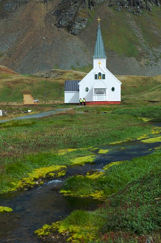
This image uses color in a similar way to above, with a white church against a predominately green background but because the white is not strong enough to hold the eye, I have used a leading line to aid the composition.
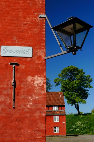
This image highlights the use of color with the rule of thirds with the red brick taking both the lower and left third, the blue sky taking the upper and upper right thirds and the green taking the lower right.
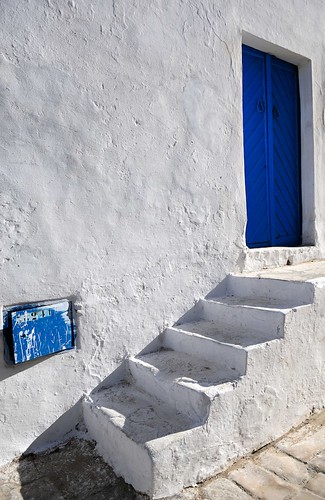
Similar to the above this image again uses the rule of thirds and combines it with just two colors, white and blue. The blue box in the bottom left is nicely placed at the bottom of the steps, which in turn lead your eye to the blue door.
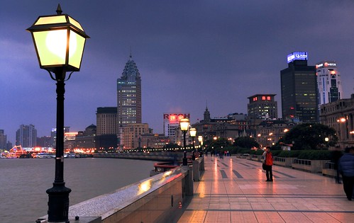
This photograph uses the orange glow of the street lamp to frame the left side of the image, making sure our eye looks to the skyline and figures to the center and right.
Similar to above, this image taken in the Commonwealth cemetery in El Alamein uses the tree on the right to keep our eyes focused on the endless graves.
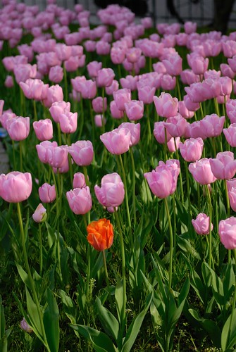
Here the eye is caught immediately by the single red flower surrounded by the sea of purple ones. By placing the solitary red flower on a third we strengthen the composition, enhancing its uniqueness.
This last image demonstrates the use of multiple bright colors to get a striking composition. Aa with many of the other examples, the image works better because it follows other compositional rules, in this case thirds and leading lines. Because there are so many colors, the use of the lamp post both takes your eye to the sign and balances the image.
Color is an often under utilized aid to composition, yet when used in combination with other rules, it has the potential to allow you to create very striking images.
Jason Row is a British born travel photographer now living in Ukraine. You can follow him on Facebook or visit his site, The Odessa Files. He also maintains a blog chronicling his exploits as an Expat in the former Soviet Union
(function(d, s, id) {
var js, fjs = d.getElementsByTagName(s)[0];
if (d.getElementById(id)) return;
js = d.createElement(s); js.id = id;
js.src = "//forms.aweber.com/form/96/435600896.js";
fjs.parentNode.insertBefore(js, fjs);
}(document, "script", "aweber-wjs-8cq4o7hvd"));
document.getElementById( "ak_js_1" ).setAttribute( "value", ( new Date() ).getTime() );
if (typeof jQuery !== 'undefined' && typeof jQuery.ui !== 'undefined' && typeof jQuery.ui.tabs !== 'undefined' && typeof jQuery.widget !== 'undefined' && typeof TagGroupsBase !== 'undefined') {
TagGroupsBase.tabs('tag-groups-cloud-tabs-661f60cb150d7', {"active":false}, true);
} else {
jQuery(document).ready(function(){
setTimeout(function(){
if (typeof jQuery !== 'undefined' && typeof jQuery.ui !== 'undefined' && typeof jQuery.ui.tabs !== 'undefined' && typeof jQuery.widget !== 'undefined') {
TagGroupsBase.tabs('tag-groups-cloud-tabs-661f60cb150d7', {"active":false}, true);
} else {
console.log('[Tag Groups] Error: jQuery UI Tabs is missing!');
}
}, 500);
});
}
( $ => {
/**
* Displays toast message from storage, it is used when the user is redirected after login
*/
if ( window.sessionStorage ) {
$( window ).on( 'tcb_after_dom_ready', () => {
const message = sessionStorage.getItem( 'tcb_toast_message' );if ( message ) {
tcbToast( sessionStorage.getItem( 'tcb_toast_message' ), false );
sessionStorage.removeItem( 'tcb_toast_message' );
}
} );
}/**
* Displays toast message
*
* @param {string} message - message to display
* @param {Boolean} error - whether the message is an error or not
* @param {Function} callback - callback function to be called after the message is closed
*/
function tcbToast( message, error, callback ) {
/* Also allow "message" objects */
if ( typeof message !== 'string' ) {
message = message.message || message.error || message.success;
}
if ( ! error ) {
error = false;
}
TCB_Front.notificationElement.toggle( message, error ? 'error' : 'success', callback );
}
} )( typeof ThriveGlobal === 'undefined' ? jQuery : ThriveGlobal.$j );
(function($) {
$('.home #custom-home-more-categories').on("click", function() {
$(this).parent('.custom-home-categories').find('.custom-home-categories-list').toggleClass('show');
});
})(jQuery);
//www.lightstalking.com/wp-content/plugins/metronet-profile-picture/js/mpp-frontend.js
var pp_ajax_form = {"ajaxurl":"https:\/\/www.lightstalking.com\/wp-admin\/admin-ajax.php","confirm_delete":"Are you sure?","deleting_text":"Deleting...","deleting_error":"An error occurred. Please try again.","nonce":"af261cd31f","disable_ajax_form":"false","is_checkout":"0","is_checkout_tax_enabled":"0"};
//www.lightstalking.com/wp-content/plugins/wp-user-avatar/assets/js/frontend.min.js
//www.lightstalking.com/wp-includes/js/jquery/ui/core.min.js
//www.lightstalking.com/wp-includes/js/jquery/ui/tabs.min.js
//www.lightstalking.com/wp-includes/js/jquery/ui/accordion.min.js
var advanced_ads_cookies = {"cookie_path":"\/","cookie_domain":""};
var advadsCfpInfo = {"cfpExpHours":"3","cfpClickLimit":"3","cfpBan":"7","cfpPath":"","cfpDomain":"www.lightstalking.com"};
//www.lightstalking.com/wp-content/plugins/advanced-ads-pro/assets/js/advanced-ads-pro.min.js
//www.lightstalking.com/wp-includes/js/comment-reply.min.js
var beloadmore = {"url":"https:\/\/www.lightstalking.com\/wp-admin\/admin-ajax.php","query":{"post__not_in":[15117],"category_name":"photographic-composition","posts_per_page":3}};
//www.lightstalking.com/wp-content/themes/lightstalking/assets/js/load-more.js
var tve_dash_front = {"ajaxurl":"https:\/\/www.lightstalking.com\/wp-admin\/admin-ajax.php","force_ajax_send":"1","is_crawler":"","recaptcha":[],"post_id":"15117"};
//www.lightstalking.com/wp-content/plugins/thrive-visual-editor/thrive-dashboard/js/dist/frontend.min.js
_stq = window._stq || [];
_stq.push([ "view", JSON.parse("{\"v\":\"ext\",\"blog\":\"12538233\",\"post\":\"15117\",\"tz\":\"-4\",\"srv\":\"www.lightstalking.com\",\"j\":\"1:13.3.1\"}") ]);
_stq.push([ "clickTrackerInit", "12538233", "15117" ]);
//www.lightstalking.com/wp-content/plugins/akismet/_inc/akismet-frontend.js
var eztoc_smooth_local = {"scroll_offset":"30","add_request_uri":""};
//www.lightstalking.com/wp-content/plugins/easy-table-of-contents/assets/js/smooth_scroll.min.js
//www.lightstalking.com/wp-content/plugins/easy-table-of-contents/vendor/js-cookie/js.cookie.min.js
//www.lightstalking.com/wp-content/plugins/easy-table-of-contents/vendor/sticky-kit/jquery.sticky-kit.min.js
var ezTOC = {"smooth_scroll":"1","scroll_offset":"30","fallbackIcon":"<span class=\"\"><span class=\"eztoc-hide\" style=\"display:none;\">Toggle<\/span><span class=\"ez-toc-icon-toggle-span\"><svg style=\"fill: #666666;color:#666666\" xmlns=\"http:\/\/www.w3.org\/2000\/svg\" class=\"list-377408\" width=\"20px\" height=\"20px\" viewBox=\"0 0 24 24\" fill=\"none\"><path d=\"M6 6H4v2h2V6zm14 0H8v2h12V6zM4 11h2v2H4v-2zm16 0H8v2h12v-2zM4 16h2v2H4v-2zm16 0H8v2h12v-2z\" fill=\"currentColor\"><\/path><\/svg><svg style=\"fill: #666666;color:#666666\" class=\"arrow-unsorted-368013\" xmlns=\"http:\/\/www.w3.org\/2000\/svg\" width=\"10px\" height=\"10px\" viewBox=\"0 0 24 24\" version=\"1.2\" baseProfile=\"tiny\"><path d=\"M18.2 9.3l-6.2-6.3-6.2 6.3c-.2.2-.3.4-.3.7s.1.5.3.7c.2.2.4.3.7.3h11c.3 0 .5-.1.7-.3.2-.2.3-.5.3-.7s-.1-.5-.3-.7zM5.8 14.7l6.2 6.3 6.2-6.3c.2-.2.3-.5.3-.7s-.1-.5-.3-.7c-.2-.2-.4-.3-.7-.3h-11c-.3 0-.5.1-.7.3-.2.2-.3.5-.3.7s.1.5.3.7z\"\/><\/svg><\/span><\/span>"};
//www.lightstalking.com/wp-content/plugins/easy-table-of-contents/assets/js/front.min.js
var tcb_current_post_lists=JSON.parse('[]'); var tcb_post_lists=tcb_post_lists?[...tcb_post_lists,...tcb_current_post_lists]:tcb_current_post_lists;
/(trident|msie)/i.test(navigator.userAgent)&&document.getElementById&&window.addEventListener&&window.addEventListener("hashchange",function(){var t,e=location.hash.substring(1);/^[A-z0-9_-]+$/.test(e)&&(t=document.getElementById(e))&&(/^(?:a|select|input|button|textarea)$/i.test(t.tagName)||(t.tabIndex=-1),t.focus())},!1);
if ( !window.TL_Const ) {var TL_Const={"security":"692d5ae9f9","ajax_url":"https:\/\/www.lightstalking.com\/wp-admin\/admin-ajax.php","action_conversion":"tve_leads_ajax_conversion","action_impression":"tve_leads_ajax_impression","custom_post_data":{"http_referrer":"https:\/\/www.lightstalking.com\/how-to-use-color-in-photographic-composition-with-9-gorgeous-examples"},"current_screen":{"screen_type":4,"screen_id":15117},"ignored_fields":["email","_captcha_size","_captcha_theme","_captcha_type","_submit_option","_use_captcha","g-recaptcha-response","__tcb_lg_fc","__tcb_lg_msg","_state","_form_type","_error_message_option","_back_url","_submit_option","url","_asset_group","_asset_option","mailchimp_optin","tcb_token","tve_labels","tve_mapping","_api_custom_fields","_sendParams","_autofill"],"ajax_load":1};} else { window.TL_Front && TL_Front.extendConst && TL_Front.extendConst({"security":"692d5ae9f9","ajax_url":"https:\/\/www.lightstalking.com\/wp-admin\/admin-ajax.php","action_conversion":"tve_leads_ajax_conversion","action_impression":"tve_leads_ajax_impression","custom_post_data":{"http_referrer":"https:\/\/www.lightstalking.com\/how-to-use-color-in-photographic-composition-with-9-gorgeous-examples"},"current_screen":{"screen_type":4,"screen_id":15117},"ignored_fields":["email","_captcha_size","_captcha_theme","_captcha_type","_submit_option","_use_captcha","g-recaptcha-response","__tcb_lg_fc","__tcb_lg_msg","_state","_form_type","_error_message_option","_back_url","_submit_option","url","_asset_group","_asset_option","mailchimp_optin","tcb_token","tve_labels","tve_mapping","_api_custom_fields","_sendParams","_autofill"],"ajax_load":1})}
window.advads_admin_bar_items = [];
var TVE_Ult_Data = {"ajaxurl":"https:\/\/www.lightstalking.com\/wp-admin\/admin-ajax.php","ajax_load_action":"tve_ult_ajax_load","conversion_events_action":"tve_ult_conversion_event","shortcode_campaign_ids":[],"matched_display_settings":[],"campaign_ids":[],"post_id":15117,"is_singular":true,"tu_em":"","evergreen_redirects":[]};
https://www.lightstalking.com/wp-content/plugins/thrive-ultimatum/js/dist/no-campaign.min.js
!function(){window.advanced_ads_ready_queue=window.advanced_ads_ready_queue||[],advanced_ads_ready_queue.push=window.advanced_ads_ready;for(var d=0,a=advanced_ads_ready_queue.length;d<a;d++)advanced_ads_ready(advanced_ads_ready_queue[d])}();
(function() { var po = document.createElement('script'); po.type = 'text/javascript'; po.async=true;; po.src = 'https://www.lightstalking.com/wp-content/plugins/easy-social-share-buttons3/lib/modules/conversions-pro/assets/share-conversions-tracker.js'; var s = document.getElementsByTagName('script')[0]; s.parentNode.insertBefore(po, s); })();(function() { var po = document.createElement('script'); po.type = 'text/javascript'; po.async=true;; po.src = 'https://www.lightstalking.com/wp-content/plugins/easy-social-share-buttons3/assets/modules/pinterest-pro.min.js'; var s = document.getElementsByTagName('script')[0]; s.parentNode.insertBefore(po, s); })();(function() { var po = document.createElement('script'); po.type = 'text/javascript'; po.async=true;; po.src = 'https://www.lightstalking.com/wp-content/plugins/easy-social-share-buttons3/assets/modules/subscribe-forms.min.js'; var s = document.getElementsByTagName('script')[0]; s.parentNode.insertBefore(po, s); })();(function() { var po = document.createElement('script'); po.type = 'text/javascript'; po.async=true;; po.src = 'https://www.lightstalking.com/wp-content/plugins/easy-social-share-buttons3/assets/js/essb-core.min.js'; var s = document.getElementsByTagName('script')[0]; s.parentNode.insertBefore(po, s); })();
let ccwpDOMLoaded=!1;
let ccwp_loaded = false;
let resources_length=0;
let resources =undefined;
let is_last_resource = 0;
ccwpUserInteractions=["keydown","mousemove","wheel","touchmove","touchstart","touchend","touchcancel","touchforcechange"];
ccwpUserInteractions.forEach(function(e){
window.addEventListener(e,calculate_load_times);
});
function calculate_load_times() {
// Check performance support
if (performance === undefined) {
console.log("Performance NOT supported");
return;
}
// Get a list of "resource" performance entries
resources = performance.getEntriesByType("resource");
if (resources === undefined || resources.length <= 0) {
console.log("NO Resource performance records");
}
if(resources.length){
resources_length=resources.length;
}
for(let i=0; i < resources.length; i++) {
if(resources[i].responseEnd>0){
is_last_resource = is_last_resource + 1;
}
}
let uag = navigator.userAgent;
let gpat = /Google Page Speed Insights/gm;
let gres = uag.match(gpat);
let cpat = /Chrome-Lighthouse/gm;
let cres = uag.match(cpat);
let wait_till=300;
let new_ua = "Mozilla/5.0 (Linux; Android 11; moto g power (2022)) AppleWebKit/537.36 (KHTML, like Gecko) Chrome/109.0.0.0 Mobile Safari/537.36";
let new_ua2 = "Mozilla/5.0 (Macintosh; Intel Mac OS X 10_15_7) AppleWebKit/537.36 (KHTML, like Gecko) Chrome/109.0.0.0 Safari/537.36";
if(gres || cres || uag==new_ua || uag==new_ua2){
wait_till = 3000;
}
if(is_last_resource==resources.length){
setTimeout(function(){
console.log("ccwpTriggerDelayedScripts timeout : "+wait_till);
ccwpTriggerDelayedScripts();
},wait_till);
}
}
window.addEventListener("load", function(e) {
console.log("load complete");
setTimeout(function(){
calculate_load_times();
},100);
});async function ccwpTriggerDelayedScripts() {
if(ccwp_loaded){ return ;}
ccwpPreloadStyles();
ccwpPreloadDelayedScripts();
ccwpLoadCss();
ccwpScriptLoading();
ccwp_loaded=true;
}
function ccwpPreloadStyles() {
let e = document.createDocumentFragment();
var cssEle = document.querySelectorAll("link[rel=ccwpdelayedstyle]");
for(let i=0; i <= cssEle.length;i++){
if(cssEle[i]){
cssEle[i].href = removeVersionFromLink(cssEle[i].href);
let r = document.createElement("link");
r.href = cssEle[i].href;
r.rel = "preload";
r.as = "style";
e.appendChild(r);
}
}
document.head.appendChild(e);
}
function ccwpPreloadDelayedScripts() {
var e = document.createDocumentFragment();
document.querySelectorAll("script[type=ccwpdelayedscript]").forEach(function(t) {
var n = removeVersionFromLink(t.getAttribute("src"));
if (n) {
t.setAttribute("src", n);
var r = document.createElement("link");
r.href = n, r.rel = "preload", r.as = "script", e.appendChild(r)
}
}), document.head.appendChild(e)
}
function ccwpScriptLoading(){
var jsEle = document.querySelectorAll("script[type=ccwpdelayedscript]");
jsEle.forEach(function(t) {
t.type = "text/javascript";
if(t.src)
{
t.src = removeVersionFromLink(t.src);
}
});
}function ccwpLoadCss(){
var cssEle = document.querySelectorAll("link[rel=ccwpdelayedstyle]");
for(let i=0; i <= cssEle.length;i++){
if(cssEle[i]){
cssEle[i].href = removeVersionFromLink(cssEle[i].href);
cssEle[i].rel = "stylesheet";
cssEle[i].type = "text/css";
}
}var cssEle = document.querySelectorAll("style[type=ccwpdelayedstyle]");
for(let i=0; i <= cssEle.length;i++){
if(cssEle[i]){
cssEle[i].type = "text/css";
}
}
}
function removeVersionFromLink(link)
{
if(ccwpIsValidUrl(link))
{
const url = new URL(ccwpFormatLink(link));
url.searchParams.delete("ver");
url.searchParams.delete("time");
return url.href;
}
else{
return link;
}
}
function ccwpIsValidUrl(urlString)
{
if(urlString){
var expression =/[-a-zA-Z0-9@:%_\+.~#?&//=]{2,256}\.[a-z]{2,4}\b(\/[-a-zA-Z0-9@:%_\+.~#?&//=]*)?/gi;
var regex = new RegExp(expression);
return urlString.match(regex);
}
return false;
}
function ccwpFormatLink(link)
{
let http_check=link.match("http:");
let https_check=link.match("https:");
if(!http_check && !https_check)
{
return location.protocol+link;
}
return link;
}


4 Comments
Thank you! Very helpful!
Thanks for the great lesson. Very much appreciated.
excellent use of color…
light and color go together..C:\Documents and Settings\tanmoy\Desktop\edits nepalistas\New Folder
Awesome shots ,what do you use for a camera the colors are rich and the images are sharp.Thank you for shareing.