window._wpemojiSettings = {"baseUrl":"https:\/\/s.w.org\/images\/core\/emoji\/14.0.0\/72x72\/","ext":".png","svgUrl":"https:\/\/s.w.org\/images\/core\/emoji\/14.0.0\/svg\/","svgExt":".svg","source":{"concatemoji":"\/\/www.lightstalking.com\/wp-includes\/js\/wp-emoji-release.min.js?ver=00ee2dc9c4a47c0421c3a1063c12ecee"}};
/*! This file is auto-generated */
!function(i,n){var o,s,e;function c(e){try{var t={supportTests:e,timestamp:(new Date).valueOf()};sessionStorage.setItem(o,JSON.stringify(t))}catch(e){}}function p(e,t,n){e.clearRect(0,0,e.canvas.width,e.canvas.height),e.fillText(t,0,0);var t=new Uint32Array(e.getImageData(0,0,e.canvas.width,e.canvas.height).data),r=(e.clearRect(0,0,e.canvas.width,e.canvas.height),e.fillText(n,0,0),new Uint32Array(e.getImageData(0,0,e.canvas.width,e.canvas.height).data));return t.every(function(e,t){return e===r[t]})}function u(e,t,n){switch(t){case"flag":return n(e,"\ud83c\udff3\ufe0f\u200d\u26a7\ufe0f","\ud83c\udff3\ufe0f\u200b\u26a7\ufe0f")?!1:!n(e,"\ud83c\uddfa\ud83c\uddf3","\ud83c\uddfa\u200b\ud83c\uddf3")&&!n(e,"\ud83c\udff4\udb40\udc67\udb40\udc62\udb40\udc65\udb40\udc6e\udb40\udc67\udb40\udc7f","\ud83c\udff4\u200b\udb40\udc67\u200b\udb40\udc62\u200b\udb40\udc65\u200b\udb40\udc6e\u200b\udb40\udc67\u200b\udb40\udc7f");case"emoji":return!n(e,"\ud83e\udef1\ud83c\udffb\u200d\ud83e\udef2\ud83c\udfff","\ud83e\udef1\ud83c\udffb\u200b\ud83e\udef2\ud83c\udfff")}return!1}function f(e,t,n){var r="undefined"!=typeof WorkerGlobalScope&&self instanceof WorkerGlobalScope?new OffscreenCanvas(300,150):i.createElement("canvas"),a=r.getContext("2d",{willReadFrequently:!0}),o=(a.textBaseline="top",a.font="600 32px Arial",{});return e.forEach(function(e){o[e]=t(a,e,n)}),o}function t(e){var t=i.createElement("script");t.src=e,t.defer=!0,i.head.appendChild(t)}"undefined"!=typeof Promise&&(o="wpEmojiSettingsSupports",s=["flag","emoji"],n.supports={everything:!0,everythingExceptFlag:!0},e=new Promise(function(e){i.addEventListener("DOMContentLoaded",e,{once:!0})}),new Promise(function(t){var n=function(){try{var e=JSON.parse(sessionStorage.getItem(o));if("object"==typeof e&&"number"==typeof e.timestamp&&(new Date).valueOf()<e.timestamp+604800&&"object"==typeof e.supportTests)return e.supportTests}catch(e){}return null}();if(!n){if("undefined"!=typeof Worker&&"undefined"!=typeof OffscreenCanvas&&"undefined"!=typeof URL&&URL.createObjectURL&&"undefined"!=typeof Blob)try{var e="postMessage("+f.toString()+"("+[JSON.stringify(s),u.toString(),p.toString()].join(",")+"));",r=new Blob([e],{type:"text/javascript"}),a=new Worker(URL.createObjectURL(r),{name:"wpTestEmojiSupports"});return void(a.onmessage=function(e){c(n=e.data),a.terminate(),t(n)})}catch(e){}c(n=f(s,u,p))}t(n)}).then(function(e){for(var t in e)n.supports[t]=e[t],n.supports.everything=n.supports.everything&&n.supports[t],"flag"!==t&&(n.supports.everythingExceptFlag=n.supports.everythingExceptFlag&&n.supports[t]);n.supports.everythingExceptFlag=n.supports.everythingExceptFlag&&!n.supports.flag,n.DOMReady=!1,n.readyCallback=function(){n.DOMReady=!0}}).then(function(){return e}).then(function(){var e;n.supports.everything||(n.readyCallback(),(e=n.source||{}).concatemoji?t(e.concatemoji):e.wpemoji&&e.twemoji&&(t(e.twemoji),t(e.wpemoji)))}))}((window,document),window._wpemojiSettings);
window.advanced_ads_ready=function(e,a){a=a||"complete";var d=function(e){return"interactive"===a?"loading"!==e:"complete"===e};d(document.readyState)?e():document.addEventListener("readystatechange",(function(a){d(a.target.readyState)&&e()}),{once:"interactive"===a})},window.advanced_ads_ready_queue=window.advanced_ads_ready_queue||[];
//www.lightstalking.com/wp-includes/js/jquery/jquery.min.js
//www.lightstalking.com/wp-includes/js/jquery/jquery-migrate.min.js
var breeze_prefetch = {"local_url":"https:\/\/www.lightstalking.com","ignore_remote_prefetch":"1","ignore_list":["\/wp-admin\/"]};
//www.lightstalking.com/wp-content/plugins/breeze/assets/js/js-front-end/breeze-prefetch-links.min.js
//www.lightstalking.com/wp-content/plugins/intelly-countdown-pro/assets/deps/moment/moment.js
//www.lightstalking.com/wp-content/plugins/intelly-countdown-pro/assets/js/icp.library.js
//www.lightstalking.com/wp-content/plugins/wp-user-avatar/assets/flatpickr/flatpickr.min.js
//www.lightstalking.com/wp-content/plugins/wp-user-avatar/assets/select2/select2.min.js
//www.lightstalking.com/wp-content/plugins/tag-groups/assets/js/frontend.min.js
var advads_options = {"blog_id":"1","privacy":{"enabled":false,"state":"not_needed"}};
//www.lightstalking.com/wp-content/plugins/advanced-ads/public/assets/js/advanced.min.js
var advanced_ads_pro_visitor_conditions = {"referrer_cookie_name":"advanced_ads_pro_visitor_referrer","referrer_exdays":"365","page_impr_cookie_name":"advanced_ads_page_impressions","page_impr_exdays":"3650"};
//www.lightstalking.com/wp-content/plugins/advanced-ads-pro/modules/advanced-visitor-conditions/inc/conditions.min.js
//www.lightstalking.com/wp-content/themes/lightstalking/assets/js/index.js
document.createElement( "picture" );if(!window.HTMLPictureElement && document.addEventListener) {window.addEventListener("DOMContentLoaded", function() {var s = document.createElement("script");s.src = "https://www.lightstalking.com/wp-content/plugins/webp-express/js/picturefill.min.js";document.body.appendChild(s);});}
var essb_settings = {"ajax_url":"https:\/\/www.lightstalking.com\/wp-admin\/admin-ajax.php","essb3_nonce":"f6325c5592","essb3_plugin_url":"https:\/\/www.lightstalking.com\/wp-content\/plugins\/easy-social-share-buttons3","essb3_stats":true,"essb3_ga":false,"essb3_ga_ntg":false,"blog_url":"https:\/\/www.lightstalking.com\/","post_id":"10797","internal_stats":true};
https://www.lightstalking.com/wp-content/uploads/breeze/google/gtag.js
!function(f,b,e,v,n,t,s)
{if(f.fbq)return;n=f.fbq=function(){n.callMethod?
n.callMethod.apply(n,arguments):n.queue.push(arguments)};
if(!f._fbq)f._fbq=n;n.push=n;n.loaded=!0;n.version='2.0';
n.queue=[];t=b.createElement(e);t.async=!0;
t.src=v;s=b.getElementsByTagName(e)[0];
s.parentNode.insertBefore(t,s)}(window, document,'script',
'https://connect.facebook.net/en_US/fbevents.js');
fbq('init', '1079708588874183');
fbq('track', 'PageView');
var head = document.head;var script = document.createElement('script');script.type = 'text/javascript';script.src = "https://178444.tracking.hyros.com/v1/lst/universal-script?ph=6df64206c166a45894d8b8d2beeed3f98ece187ef7e83c10a2acca9a68e688a5&tag=!tracking";head.appendChild(script);
(function(c,l,a,r,i,t,y){
c[a]=c[a]||function(){(c[a].q=c[a].q||[]).push(arguments)};
t=l.createElement(r);t.async=1;t.src="https://www.clarity.ms/tag/"+i;
y=l.getElementsByTagName(r)[0];y.parentNode.insertBefore(t,y);
})(window, document, "clarity", "script", "jzjsbgih7m");
var advadsCfpQueue = [];
var advadsCfpAd = function( adID ){
if ( 'undefined' == typeof advadsProCfp ) { advadsCfpQueue.push( adID ) } else { advadsProCfp.addElement( adID ) }
};
document.documentElement.className = document.documentElement.className.replace( 'no-js', 'js' );
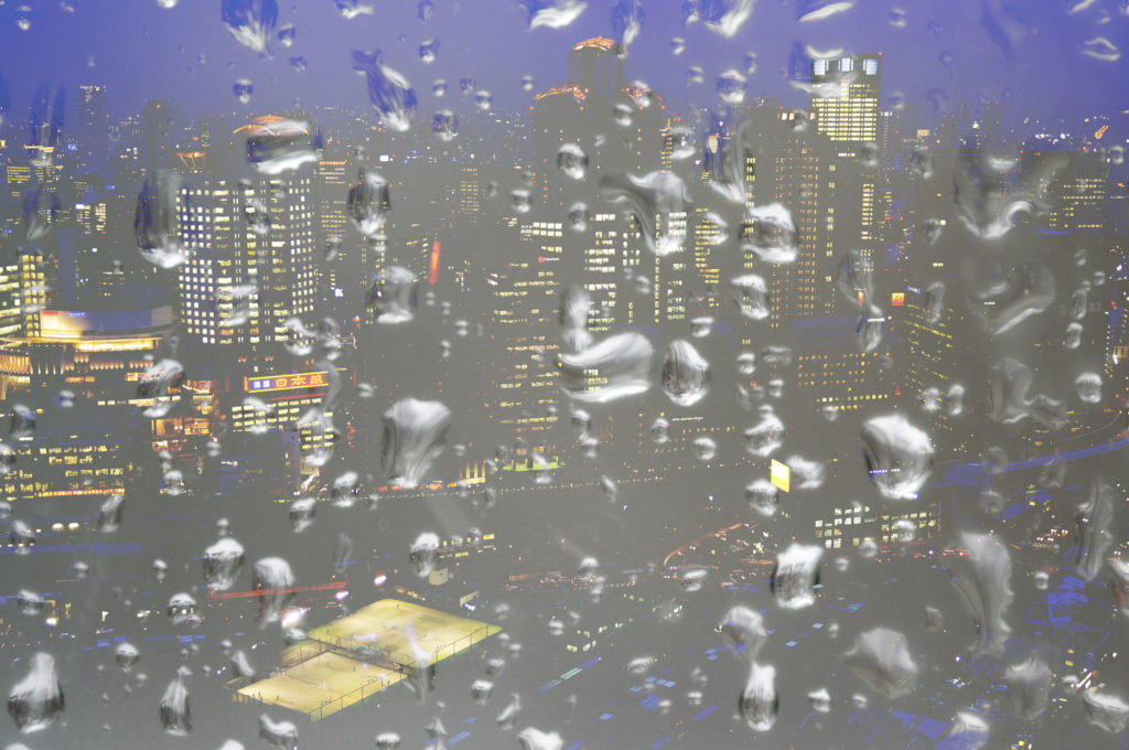
Skip to the contentIn this brief tutorial, we will demonstrate the power of the curves tool in Photoshop to adjust exposure and color. The shot I am using has the potential to be a good photo, but as it was very much a quick grab, there was no time to adjust exposure or white balance. There are may facets to the curves tool, far too many to detail in a brief tutorial such as this, so we will show you the basics of adjusting the curve itself, to get you started on this powerful Photoshop tool.
A Potentially Good Shot
With the image open in Photoshop we are going to open the curves palette from Image – Adjustments – Curves. The default histogram shows a combination of Red, Green and Blue exposure and as it is falling off to the left, we can instantly see the image is underexposed. Through the middle of the histogram is a straight line which is in fact our curve. Putting the mouse curser just in from the bottom left edge of the curve, we are going to drag upwards. You should see a curve start to appear and the shadow areas begin to lighten. Adjust you image until you are happy with the detail in the shadow areas.
Adjusting the Shadows
Now, going to the top right of the curve we can pull back the highlights. This time drag the curve on the top right slowly down until you are happy with the highlights. Your curve should now resemble an S shape. Don’t drag either end far too far, as you will flatten the contrast and introduce noise into the image. If required you can adjust the mid-tone of the image by dragging the curve up or down in the centre.
Adjusting the Highlights
Once we are happy with the exposure, it is time to adjust the color. Take a look at the image and try to determine what color the cast is. In our image we are getting a yellow cast from the street lighting, so we need to reduce yellow. The panel allows you to adjust curves in the Red, Green and Blue channels. These are known as the primary colours and each in turn has an opposite called secondary colours. These are, in the same order, Cyan, Magenta and Yellow. Because in our image the predominant cast is yellow, we need to select its opposite, the blue channel. We will start by dragging the middle of the curve, the mid-tones, up to neutralize the yellow. If required we can adjust shadow and highlight area until we are happy we have removed as much of the yellow cast as possible. You may often find that if you remove for instance, yellow from the highlights, that you will need to introduce yellow to the shadows.
Adding Blue to Remove Yellow
The image is better, but there is still some color cast in it. Next we will do the same with the red channel, again dragging the curve to adjust mid-tones, highlights and shadows. Lastly we will repeat the exercise with the green channel. In each channel the histogram can give you a good idea if there is too much or little of that particular color in the image. You will need to play around to get the effect you are looking for and you also need to be aware of the possibilities of introducing noise to the image. With night time color cast, it is very often not possible to remove a cast entirely but you can certainly improve an image.
Not Perfect but Significantly Better
So that’s a very brief run down of the curve tool. As I mentioned at the top, it is a very powerful tool and one worth understanding. Adobe’s own website has some good detailed information about all Photoshop’s tools and it’s well worth a visit to improve your knowledge.
Photoshop Resources
Jason Row is a British born travel photographer now living in Ukraine. You can follow him on Facebook or visit his site, The Odessa Files. He also maintains a blog chronicling his exploits as an Expat in the former Soviet Union
(function(d, s, id) {
var js, fjs = d.getElementsByTagName(s)[0];
if (d.getElementById(id)) return;
js = d.createElement(s); js.id = id;
js.src = "//forms.aweber.com/form/96/435600896.js";
fjs.parentNode.insertBefore(js, fjs);
}(document, "script", "aweber-wjs-8cq4o7hvd"));
document.getElementById( "ak_js_1" ).setAttribute( "value", ( new Date() ).getTime() );
if (typeof jQuery !== 'undefined' && typeof jQuery.ui !== 'undefined' && typeof jQuery.ui.tabs !== 'undefined' && typeof jQuery.widget !== 'undefined' && typeof TagGroupsBase !== 'undefined') {
TagGroupsBase.tabs('tag-groups-cloud-tabs-6612d7d0bb788', {"active":false}, true);
} else {
jQuery(document).ready(function(){
setTimeout(function(){
if (typeof jQuery !== 'undefined' && typeof jQuery.ui !== 'undefined' && typeof jQuery.ui.tabs !== 'undefined' && typeof jQuery.widget !== 'undefined') {
TagGroupsBase.tabs('tag-groups-cloud-tabs-6612d7d0bb788', {"active":false}, true);
} else {
console.log('[Tag Groups] Error: jQuery UI Tabs is missing!');
}
}, 500);
});
}
( $ => {
/**
* Displays toast message from storage, it is used when the user is redirected after login
*/
if ( window.sessionStorage ) {
$( window ).on( 'tcb_after_dom_ready', () => {
const message = sessionStorage.getItem( 'tcb_toast_message' );if ( message ) {
tcbToast( sessionStorage.getItem( 'tcb_toast_message' ), false );
sessionStorage.removeItem( 'tcb_toast_message' );
}
} );
}/**
* Displays toast message
*
* @param {string} message - message to display
* @param {Boolean} error - whether the message is an error or not
* @param {Function} callback - callback function to be called after the message is closed
*/
function tcbToast( message, error, callback ) {
/* Also allow "message" objects */
if ( typeof message !== 'string' ) {
message = message.message || message.error || message.success;
}
if ( ! error ) {
error = false;
}
TCB_Front.notificationElement.toggle( message, error ? 'error' : 'success', callback );
}
} )( typeof ThriveGlobal === 'undefined' ? jQuery : ThriveGlobal.$j );
(function($) {
$('.home #custom-home-more-categories').on("click", function() {
$(this).parent('.custom-home-categories').find('.custom-home-categories-list').toggleClass('show');
});
})(jQuery);
//www.lightstalking.com/wp-content/plugins/metronet-profile-picture/js/mpp-frontend.js
var pp_ajax_form = {"ajaxurl":"https:\/\/www.lightstalking.com\/wp-admin\/admin-ajax.php","confirm_delete":"Are you sure?","deleting_text":"Deleting...","deleting_error":"An error occurred. Please try again.","nonce":"6c2ac53fc7","disable_ajax_form":"false","is_checkout":"0","is_checkout_tax_enabled":"0"};
//www.lightstalking.com/wp-content/plugins/wp-user-avatar/assets/js/frontend.min.js
//www.lightstalking.com/wp-includes/js/jquery/ui/core.min.js
//www.lightstalking.com/wp-includes/js/jquery/ui/tabs.min.js
//www.lightstalking.com/wp-includes/js/jquery/ui/accordion.min.js
var advanced_ads_cookies = {"cookie_path":"\/","cookie_domain":""};
var advadsCfpInfo = {"cfpExpHours":"3","cfpClickLimit":"3","cfpBan":"7","cfpPath":"","cfpDomain":"www.lightstalking.com"};
//www.lightstalking.com/wp-content/plugins/advanced-ads-pro/assets/js/advanced-ads-pro.min.js
//www.lightstalking.com/wp-includes/js/comment-reply.min.js
var beloadmore = {"url":"https:\/\/www.lightstalking.com\/wp-admin\/admin-ajax.php","query":{"post__not_in":[10797],"category_name":"photoshop","posts_per_page":3}};
//www.lightstalking.com/wp-content/themes/lightstalking/assets/js/load-more.js
var tve_dash_front = {"ajaxurl":"https:\/\/www.lightstalking.com\/wp-admin\/admin-ajax.php","force_ajax_send":"1","is_crawler":"","recaptcha":[],"post_id":"10797"};
//www.lightstalking.com/wp-content/plugins/thrive-visual-editor/thrive-dashboard/js/dist/frontend.min.js
_stq = window._stq || [];
_stq.push([ "view", JSON.parse("{\"v\":\"ext\",\"blog\":\"12538233\",\"post\":\"10797\",\"tz\":\"-4\",\"srv\":\"www.lightstalking.com\",\"j\":\"1:13.3\"}") ]);
_stq.push([ "clickTrackerInit", "12538233", "10797" ]);
//www.lightstalking.com/wp-content/plugins/akismet/_inc/akismet-frontend.js
var eztoc_smooth_local = {"scroll_offset":"30","add_request_uri":""};
//www.lightstalking.com/wp-content/plugins/easy-table-of-contents/assets/js/smooth_scroll.min.js
//www.lightstalking.com/wp-content/plugins/easy-table-of-contents/vendor/js-cookie/js.cookie.min.js
//www.lightstalking.com/wp-content/plugins/easy-table-of-contents/vendor/sticky-kit/jquery.sticky-kit.min.js
var ezTOC = {"smooth_scroll":"1","scroll_offset":"30","fallbackIcon":"<span class=\"\"><span class=\"eztoc-hide\" style=\"display:none;\">Toggle<\/span><span class=\"ez-toc-icon-toggle-span\"><svg style=\"fill: #666666;color:#666666\" xmlns=\"http:\/\/www.w3.org\/2000\/svg\" class=\"list-377408\" width=\"20px\" height=\"20px\" viewBox=\"0 0 24 24\" fill=\"none\"><path d=\"M6 6H4v2h2V6zm14 0H8v2h12V6zM4 11h2v2H4v-2zm16 0H8v2h12v-2zM4 16h2v2H4v-2zm16 0H8v2h12v-2z\" fill=\"currentColor\"><\/path><\/svg><svg style=\"fill: #666666;color:#666666\" class=\"arrow-unsorted-368013\" xmlns=\"http:\/\/www.w3.org\/2000\/svg\" width=\"10px\" height=\"10px\" viewBox=\"0 0 24 24\" version=\"1.2\" baseProfile=\"tiny\"><path d=\"M18.2 9.3l-6.2-6.3-6.2 6.3c-.2.2-.3.4-.3.7s.1.5.3.7c.2.2.4.3.7.3h11c.3 0 .5-.1.7-.3.2-.2.3-.5.3-.7s-.1-.5-.3-.7zM5.8 14.7l6.2 6.3 6.2-6.3c.2-.2.3-.5.3-.7s-.1-.5-.3-.7c-.2-.2-.4-.3-.7-.3h-11c-.3 0-.5.1-.7.3-.2.2-.3.5-.3.7s.1.5.3.7z\"\/><\/svg><\/span><\/span>"};
//www.lightstalking.com/wp-content/plugins/easy-table-of-contents/assets/js/front.min.js
var tcb_current_post_lists=JSON.parse('[]'); var tcb_post_lists=tcb_post_lists?[...tcb_post_lists,...tcb_current_post_lists]:tcb_current_post_lists;
/(trident|msie)/i.test(navigator.userAgent)&&document.getElementById&&window.addEventListener&&window.addEventListener("hashchange",function(){var t,e=location.hash.substring(1);/^[A-z0-9_-]+$/.test(e)&&(t=document.getElementById(e))&&(/^(?:a|select|input|button|textarea)$/i.test(t.tagName)||(t.tabIndex=-1),t.focus())},!1);
if ( !window.TL_Const ) {var TL_Const={"security":"04a6d4aa2d","ajax_url":"https:\/\/www.lightstalking.com\/wp-admin\/admin-ajax.php","action_conversion":"tve_leads_ajax_conversion","action_impression":"tve_leads_ajax_impression","custom_post_data":[],"current_screen":{"screen_type":4,"screen_id":10797},"ignored_fields":["email","_captcha_size","_captcha_theme","_captcha_type","_submit_option","_use_captcha","g-recaptcha-response","__tcb_lg_fc","__tcb_lg_msg","_state","_form_type","_error_message_option","_back_url","_submit_option","url","_asset_group","_asset_option","mailchimp_optin","tcb_token","tve_labels","tve_mapping","_api_custom_fields","_sendParams","_autofill"],"ajax_load":1};} else { window.TL_Front && TL_Front.extendConst && TL_Front.extendConst({"security":"04a6d4aa2d","ajax_url":"https:\/\/www.lightstalking.com\/wp-admin\/admin-ajax.php","action_conversion":"tve_leads_ajax_conversion","action_impression":"tve_leads_ajax_impression","custom_post_data":[],"current_screen":{"screen_type":4,"screen_id":10797},"ignored_fields":["email","_captcha_size","_captcha_theme","_captcha_type","_submit_option","_use_captcha","g-recaptcha-response","__tcb_lg_fc","__tcb_lg_msg","_state","_form_type","_error_message_option","_back_url","_submit_option","url","_asset_group","_asset_option","mailchimp_optin","tcb_token","tve_labels","tve_mapping","_api_custom_fields","_sendParams","_autofill"],"ajax_load":1})}
window.advads_admin_bar_items = [];
var TVE_Ult_Data = {"ajaxurl":"https:\/\/www.lightstalking.com\/wp-admin\/admin-ajax.php","ajax_load_action":"tve_ult_ajax_load","conversion_events_action":"tve_ult_conversion_event","shortcode_campaign_ids":[],"matched_display_settings":[],"campaign_ids":[],"post_id":10797,"is_singular":true,"tu_em":"","evergreen_redirects":[]};
https://www.lightstalking.com/wp-content/plugins/thrive-ultimatum/js/dist/no-campaign.min.js
!function(){window.advanced_ads_ready_queue=window.advanced_ads_ready_queue||[],advanced_ads_ready_queue.push=window.advanced_ads_ready;for(var d=0,a=advanced_ads_ready_queue.length;d<a;d++)advanced_ads_ready(advanced_ads_ready_queue[d])}();
(function() { var po = document.createElement('script'); po.type = 'text/javascript'; po.async=true;; po.src = 'https://www.lightstalking.com/wp-content/plugins/easy-social-share-buttons3/lib/modules/conversions-pro/assets/share-conversions-tracker.js'; var s = document.getElementsByTagName('script')[0]; s.parentNode.insertBefore(po, s); })();(function() { var po = document.createElement('script'); po.type = 'text/javascript'; po.async=true;; po.src = 'https://www.lightstalking.com/wp-content/plugins/easy-social-share-buttons3/assets/modules/pinterest-pro.min.js'; var s = document.getElementsByTagName('script')[0]; s.parentNode.insertBefore(po, s); })();(function() { var po = document.createElement('script'); po.type = 'text/javascript'; po.async=true;; po.src = 'https://www.lightstalking.com/wp-content/plugins/easy-social-share-buttons3/assets/modules/subscribe-forms.min.js'; var s = document.getElementsByTagName('script')[0]; s.parentNode.insertBefore(po, s); })();(function() { var po = document.createElement('script'); po.type = 'text/javascript'; po.async=true;; po.src = 'https://www.lightstalking.com/wp-content/plugins/easy-social-share-buttons3/assets/js/essb-core.min.js'; var s = document.getElementsByTagName('script')[0]; s.parentNode.insertBefore(po, s); })();
let ccwpDOMLoaded=!1;
let ccwp_loaded = false;
let resources_length=0;
let resources =undefined;
let is_last_resource = 0;
ccwpUserInteractions=["keydown","mousemove","wheel","touchmove","touchstart","touchend","touchcancel","touchforcechange"];
ccwpUserInteractions.forEach(function(e){
window.addEventListener(e,calculate_load_times);
});
function calculate_load_times() {
// Check performance support
if (performance === undefined) {
console.log("Performance NOT supported");
return;
}
// Get a list of "resource" performance entries
resources = performance.getEntriesByType("resource");
if (resources === undefined || resources.length <= 0) {
console.log("NO Resource performance records");
}
if(resources.length){
resources_length=resources.length;
}
for(let i=0; i < resources.length; i++) {
if(resources[i].responseEnd>0){
is_last_resource = is_last_resource + 1;
}
}
let uag = navigator.userAgent;
let gpat = /Google Page Speed Insights/gm;
let gres = uag.match(gpat);
let cpat = /Chrome-Lighthouse/gm;
let cres = uag.match(cpat);
let wait_till=300;
let new_ua = "Mozilla/5.0 (Linux; Android 11; moto g power (2022)) AppleWebKit/537.36 (KHTML, like Gecko) Chrome/109.0.0.0 Mobile Safari/537.36";
let new_ua2 = "Mozilla/5.0 (Macintosh; Intel Mac OS X 10_15_7) AppleWebKit/537.36 (KHTML, like Gecko) Chrome/109.0.0.0 Safari/537.36";
if(gres || cres || uag==new_ua || uag==new_ua2){
wait_till = 3000;
}
if(is_last_resource==resources.length){
setTimeout(function(){
console.log("ccwpTriggerDelayedScripts timeout : "+wait_till);
ccwpTriggerDelayedScripts();
},wait_till);
}
}
window.addEventListener("load", function(e) {
console.log("load complete");
setTimeout(function(){
calculate_load_times();
},100);
});async function ccwpTriggerDelayedScripts() {
if(ccwp_loaded){ return ;}
ccwpPreloadStyles();
ccwpPreloadDelayedScripts();
ccwpLoadCss();
ccwpScriptLoading();
ccwp_loaded=true;
}
function ccwpPreloadStyles() {
let e = document.createDocumentFragment();
var cssEle = document.querySelectorAll("link[rel=ccwpdelayedstyle]");
for(let i=0; i <= cssEle.length;i++){
if(cssEle[i]){
cssEle[i].href = removeVersionFromLink(cssEle[i].href);
let r = document.createElement("link");
r.href = cssEle[i].href;
r.rel = "preload";
r.as = "style";
e.appendChild(r);
}
}
document.head.appendChild(e);
}
function ccwpPreloadDelayedScripts() {
var e = document.createDocumentFragment();
document.querySelectorAll("script[type=ccwpdelayedscript]").forEach(function(t) {
var n = removeVersionFromLink(t.getAttribute("src"));
if (n) {
t.setAttribute("src", n);
var r = document.createElement("link");
r.href = n, r.rel = "preload", r.as = "script", e.appendChild(r)
}
}), document.head.appendChild(e)
}
function ccwpScriptLoading(){
var jsEle = document.querySelectorAll("script[type=ccwpdelayedscript]");
jsEle.forEach(function(t) {
t.type = "text/javascript";
if(t.src)
{
t.src = removeVersionFromLink(t.src);
}
});
}function ccwpLoadCss(){
var cssEle = document.querySelectorAll("link[rel=ccwpdelayedstyle]");
for(let i=0; i <= cssEle.length;i++){
if(cssEle[i]){
cssEle[i].href = removeVersionFromLink(cssEle[i].href);
cssEle[i].rel = "stylesheet";
cssEle[i].type = "text/css";
}
}var cssEle = document.querySelectorAll("style[type=ccwpdelayedstyle]");
for(let i=0; i <= cssEle.length;i++){
if(cssEle[i]){
cssEle[i].type = "text/css";
}
}
}
function removeVersionFromLink(link)
{
if(ccwpIsValidUrl(link))
{
const url = new URL(ccwpFormatLink(link));
url.searchParams.delete("ver");
url.searchParams.delete("time");
return url.href;
}
else{
return link;
}
}
function ccwpIsValidUrl(urlString)
{
if(urlString){
var expression =/[-a-zA-Z0-9@:%_\+.~#?&//=]{2,256}\.[a-z]{2,4}\b(\/[-a-zA-Z0-9@:%_\+.~#?&//=]*)?/gi;
var regex = new RegExp(expression);
return urlString.match(regex);
}
return false;
}
function ccwpFormatLink(link)
{
let http_check=link.match("http:");
let https_check=link.match("https:");
if(!http_check && !https_check)
{
return location.protocol+link;
}
return link;
}


3 Comments
Hi Jason,
Have you tried using Levels for the correction? The histograms in the individual channels basically show you what needs to be done. In this case, the red channel looked fine. The green channel was short on the highlights end so I slid it over to the end of the histogram, about 182. The blue channel was really short on the highlight end, so I again slid it over to the end of the histogram, about 82. To me, the photo looked much more natural. From there you can go back to RGB and adjust the output levels to taste if need be.
useful tutorial thanks…
Curious amateur here, I’ve also been following your Aperture posts with interest. Can one accomplish similar results using “Curves” in Aperture?