Believe it or not, the first attempts at color photography date all the way back to the 1840's. Over the years, various inventors improved the color photographic process by making it easier to produce, and by more stable under full spectrum lighting. It was in 1935 that color photography became mainstream when Kodak introduced their legendary film, Kodachrome. The advent of color photography opened up an entirely new world to photographers. It created a new element of composition that was previously unavailable.
Color as an Element of Composition
It has long been known that the various colors of the spectrum influence us psychologically. Businesses, both large and small, have long recognized the value of certain colors in obtaining a consumers attention. How many red logos can you count in the photograph below?
 Logos by Kent DuFault, on Flickr
So, how does color influence us subconsciously? Most color theorists state the following –
- Red – passion, desire, love, danger, determination, strength, power, energy
- Yellow – joy, happiness, intellect, growth
- Green – harmony, fertility, safety
- Blue – trust, loyalty, wisdom, confidence, intelligence, faith, truth
- Purple – wealth, wisdom, dignity, independence, creativity, mystery
- White – goodness, innocence, purity, cleanliness
- Black – power, elegance, formality, death, evil, mystery
And there is a myriad of emotional context as it relates to the various shades, hues, and saturation of these colors. Most experts believe that this color influence on our behavior dates back to prehistoric man where fire was red, the sun yellow, the ocean blue, and the harvest green. Color theory is definitely a science in and of itself. Today, we are going to talk about one of our favorite tools of photographic composition – the color red.
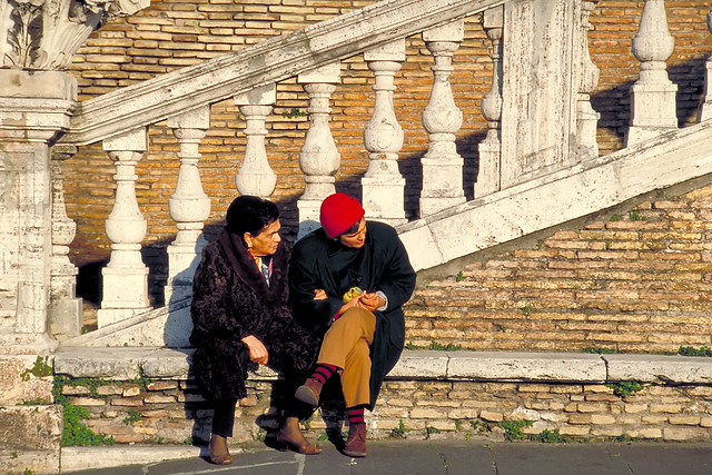 Rome by Kent DuFault, on Flickr
The Color Red
Take a look at the photograph above. This image has a busy background. There is a lot going on: different shapes (both vertical and horizontal), different textures, a broad contrast range from very light to very dark. The subjects of this photograph would almost be invisible if it weren't for one thing – that red hat. When a viewer first places their eyes upon this image, the eyes are immediately drawn to the red hat, which then leads the viewer down to the faces, and finally on down to the red striped socks. Instead of disappearing into the background, these two pop right out. This is the photographic value of the color red!

Why Incorporating Red Color Increases Impact in Your Images
1. Acts as an Invisible Leading Line
 Flags by Kent DuFault, on Flickr
Since the color red attracts the viewer's eyes, having multiple red objects can lead the viewer into the photograph. Remember the eye will go to the largest red object first.
2. Enhances Color Contrast
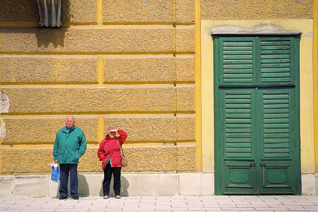 Vienna by Kent DuFault, on Flickr
When you place the color red within a frame of contrasting colors the brain will always direct the eyes to the red object first. We've all been conditioned to do that. Think of yourself sitting in your car, staring out your windshield at a sea of stagnant traffic. Most likely there would be every color of the rainbow all around you. But what does your brain focus on? Those flashing red lights in the distance. (The ones that tell you that you're going to be sitting there awhile!) That's the power of RED! The photograph above contains some very dominate colors – particularly the color yellow. But he mind ignores them and immediately focuses on the woman with the red jacket. It's only after that part of the image has registered with the brain that it will then take in the rest of the image.
3. Creates a Focal Point (an anchor, something red, that isn't the subject, but supports it)
 Phoenix by Kent DuFault, on Flickr
In the above photograph, the red object isn't the subject. It's purpose in the photograph is to help anchor the viewers eyes near the subject. In this case, the boy staring out the window. The photographer included just enough red to solidify that center portion of the frame without overwhelming the boy (who is the subject). Imagine this photograph without the top of the red stop sign. It would be much more difficult for a viewer to settle in on the boy's face as he is surrounded by bright yellow shapes. Conversely, imagine it with the entire stop sign included. The boy would be a lost, and inconsequential, element of the photograph.
4. Creates a Point of Interest When There Isn't One

The photograph above depicts a beautiful scene. It was quite painterly. But, it lacked a pleasing composition as there was almost nothing to catch the eye and lock it into the photograph. This is where the color red really shines. The red number 40 becomes that special element that provides a focal point. Imagine this photograph if the numbers had been black. The color red took this image from an ordinary snapshot to a work of art.
We hope this article has stirred your interest in placing an element of red in your photographs. Remember though, this is only one tool in your toolbox of special tricks. Keep your eyes open for opportunities and when they present themselves – Go Red!


2 Comments
Except in some cultures – Oriental? African? – white is associated with Death.
had a fantastic shot at a blood red moon but my camera phone recorded it as almost white. what gives?