The aim of post-processing, broadly speaking, is to bring an image as close as possible to how you visualized it when taking the photo. A camera can only do so much in capturing a photograph but post-processing, when done correctly, can bring out the best in the photo.
While post-processing workflows vary from one photographer to another based on their requirements and preferences, there are some steps that are generally deemed essential to get the best results.
Most of us are aware, to some extent, of the common steps involved in post-processing like color correction, brightness adjustment, contrast and saturation enhancement, sharpening and the like. In this post, we are going to look at some essential steps that often get overlooked in a post-processing workflow.
1. Monitor Calibration
If you like to print your photos but the prints don’t look the same as the photos do on your computer screen, it is likely that your monitor isn’t properly calibrated.
Monitor calibration is an important step if you want the colors and shades in your photo to be reproduced correctly in prints and to be sure that your photos look their best when you post them online for others to see.

For best and most accurate results, a monitor calibration device like Datacolor Spyder or X-Rite ColorMunki is recommended and is definitely worth the price you pay for it. However, you can also calibrate your monitor by using the built-in Windows and Mac tools, using the steps outlined here, though they are not half as accurate as a dedicated calibration device.
This isn’t something that you do every time you post-process your photos, but is a key one-time step that prepares your monitor to correctly display colors. If you have a monitor calibration device, you may want to recalibrate your display every month or so for consistency, if you’re really serious about it.
2. Working in the Correct Color Space
A digital color space is similar to a painter’s palette – it governs the range of colors or shades that one can draw from. Technically, a color space is how colors are organized and quantified which allows for reproducible representations of color. Let’s take a look at the image below to understand it better.
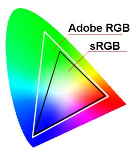
The horseshoe shape encapsulates all the visible colors, while the outlined regions or ‘color spaces’ cover a portion of it. Many color spaces have been created, but the image shows two main types of color spaces in digital photography – Adobe RGB (Red-Green-Blue), and sRGB (standard RGB).
If you’ve dug through your camera settings, you would have encountered the Color Space setting where you have to choose one of the two. Or you might have also come across this option in your post-processing software. As you can see from the image above, Adobe RGB has more color range than sRGB, which would make you think that a bigger color space like Adobe RGB should be a logical choice while working on your photos. Not really.
sRGB came first, and is the most widely used color space. In fact, almost everything on a computer is built around sRGB – the internet, applications, mobile devices – everything has sRGB as their standard color space. You cannot go wrong with sRGB – it has a simplified workflow, displays correctly for web, and is suitable for prints.
If you’re a professional photographer and want more accurate colors for prints and know how to work with the more complicated workflow associated with Adobe RGB, you can choose it over sRGB. You can learn more about the differences here.
3. Keeping an Eye on the Histogram
A histogram is a great tool to help you assess the lighting and exposure in an image. It is a graph that represents how light is distributed through the image. You come across histograms in your digital camera settings as well in your photo editing software.

It’s important to know how to read a histogram as it can help guide you not only when you’re taking a photograph but also during post-processing. Technically, a histogram represents the number of pixels in the photo distributed according to their brightness or luminosity, from shadows on the left to highlights on the right, with midtones in the middle.
A photograph with a histogram bunched to the left has a lot of shadows and can mean that the photo is underexposed, unless it’s of a dark subject or is a low key image. Similarly, a photo with a histogram bunched to the right has excess of highlights and can mean that the photo overexposed, unless it’s of a light subject or is a high key photo. A photo with a bell shaped histogram curve with the peak in the middle is usually considered a ‘well exposed’ image.
During post-processing, keeping an eye on the histogram can help you avoid clipping highlights and shadows, and retain details in those regions, especially when applying adjustments that change luminosity of the image like brightness, contrast, curves, etc. You can read more about histograms here.
4. Sharpening for Output
Almost all photos benefit from a certain amount of sharpening in post-processing, to eliminate those fuzzy edges and make the photos pop. Of course, it’s important to consider if and how much sharpening was applied in-camera when the photo was captured.
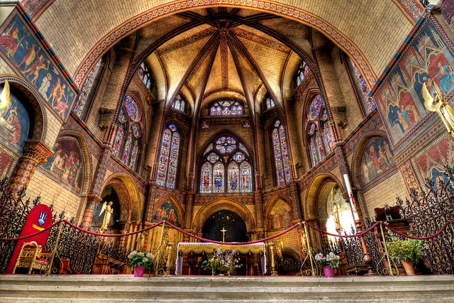
Sharpening is often the last step in a post-processing workflow. And how much sharpening a photo will need depends on the intended output, which can be print or digital. When outputting for print, the amount of sharpening required varies with the type of paper used – a glossy paper requires less sharpening compared to that for matte paper.
When sharpening photographs, always look at the photo at 100% size and beware of creating halos due to excessive sharpening. You can learn more about sharpening here.
Get Awesome at Post-Processing
If you want to get the most out of your photos by utilizing the power of post-processing but do not know where to start and how to proceed, we have a solution for you – The Ultimate Guide to Fundamental Editing. Produced by our friends at Photzy, the bestselling guide gives you a step-by-step post-processing workflow to help you create great-looking photos efficiently and consistently, using popular programs like Lightroom, Elements and Photoshop. Click here now to check it out.


1 Comment
The histogram’s information is not important to me, since it does not change in any manner the way I would expose an image. Yes, it tells me what I’ve got. But what I’ve got is what is needed for the out comes I want. For example, I shoot night cityscapes. I shoot these for highlights which are not blown out. This usually gets me an underexposed image; but, with a little help from Lightroom I can get all the detail out of deep shadows without too much noise when I begin with a low ISO setting.