There is something a bit special about a black and white image don’t you think? The problem is that in this digital age, shooting black and white is often an afterthought. We usually think in colour, shoot in colour and then in hindsight, think a picture would look great in black and white.
Converting images conceived in colour sometimes works well, sometimes not. Today we are going to have a look at training yourself to think and shoot in black and white by devoting a week to doing it.
Why Shoot Black And White?
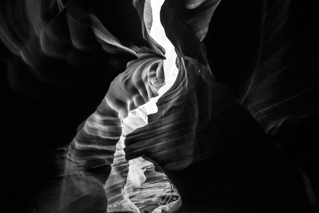
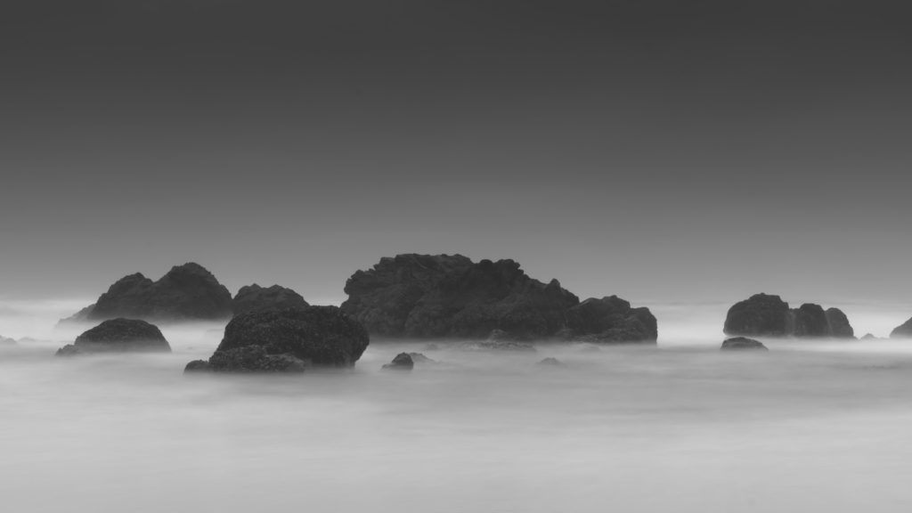
Black and white is photography stripped down to its purest form. It works well in so many aspects of photography, landscapes, portraiture, architecture, the list goes on. It also trains your mind to see light and shade. A good black and white image will use either or both to highlight a subject. Being able to see the way light intertwines with shade will stand you in good stead for colour photography as well.

Shooting one-week several times a year purely in black and white is a great way to train yourself to see and shoot in monochrome on spec. By focussing your shots solely to capture light, shade, and tones you will quickly learn the nuances of exposure. Beyond that, you will start to see abstracts, negative space and many other compositional elements that can sometimes be confused by colour.
Thinking And Shooting In Black And White
Some might say that modern cameras are not set up well to shoot black and white. This of course conveniently forgets that in the days of film although we might be shooting a monochromatic film, we were still looking through an optical viewfinder in full colour. Digital cameras actually have the advantage in this respect. DSLRs will allow you to review a shot after taking it, whilst most mirrorless cameras have electronic viewfinders that can actually display in monochrome if set.
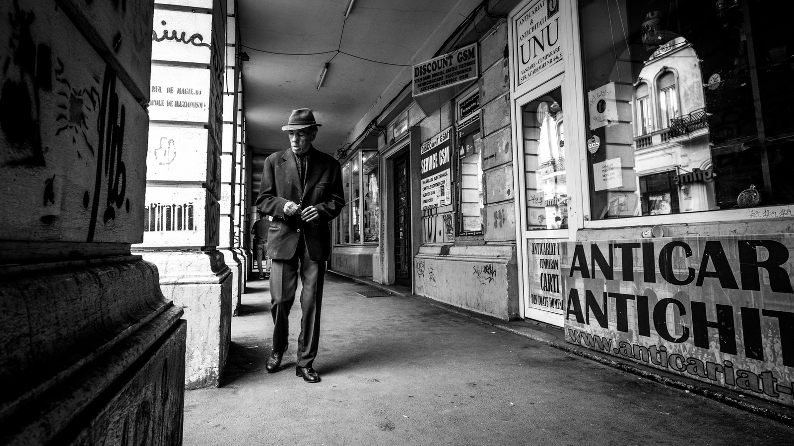
Virtually all digital cameras have some form of film simulation modes at least one of which will be black and white. If you are a RAW shooter then change to shooting RAW plus Jpeg. Although the RAW will remain in colour the Jpeg will be recorded monochromatically and will serve as a good reference for post production.
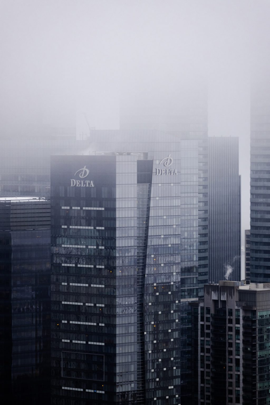
Learning to see in black and white takes time. Breaking down the learning process into one week steps can make the process more manageable. Your first weeks should concentrate on what makes a black and white image work. You are looking for scenes with good contrast and tonal range with lots of fine detail. Cloudy days often work better for black and white than sunny. This is because the soft lights allows details to be seen in shaded areas. Our camera sensors handle the flat light much better than high contrast. We can then boost that contract in post producing much like printers did with film.
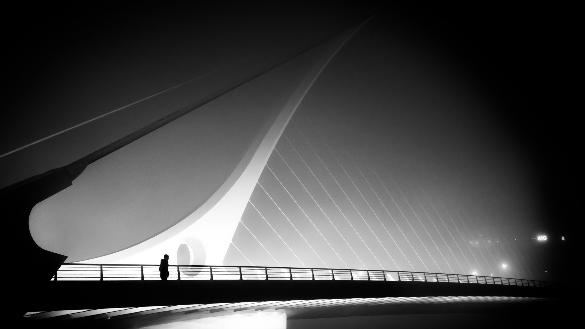
Once you have the art of seeing, next weeks should be devoted to exposure. Learn and understand what you histogram is telling you. It is an encyclopaedia of tonal information. A graph that is evenly spread across the whole width is flat, low contrast. If you have little information on the edges and a towering peak in the middle you have much higher contrast. If your histogram is spilling off one of either ends, then increase/reduce the exposure to suit. If it is spilling off both end then you are exceeding the limits of your sensors. Very often this might be the sky pushing the histogram off the right side. This can be countered with graduated neutral density filters.
As your monochromatic knowledge improves, you will start to see how different colours effect the end result of monochrome images. In the film days we would control this using filters however today it is perfectly easy to use post production.
The Keys to Post Production for Black and White Photography
If the weather is not playing ball or you have plenty of images that would look good in monochrome, then why not spend a week working in post production. The key to converting images to black and white is not to rely solely on sledgehammer tools as black and white or desaturation. You can use these to get the image into black and white but then you will need to work on it the same way you would with a colour image.
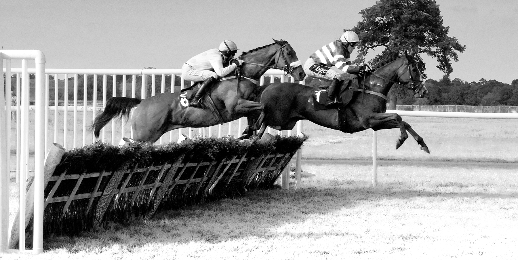
Start by tweaking the blacks, whites, highlights and shadows to get the right contrast to your image. Increasing the distance between black and white will increase the image contrast. Then we can move on to adjusting the colours within our black and white image. In Lightroom we can use the colour sliders in the B & W tab of the HSL panel. Here we can control 8 different colour ranges within the image. For example, sliding the blue slider left will darken parts of the image that were originally blue. Moving the green slider right will make foliage and other green items lighter.
In Photoshop we can use the default Black and White Conversion under Image Adjustments. This allows you to adjust the primary and secondary colour channels individually for similar effect. These are very powerful tools that can completely change the mood of a monochrome image.
Black and white photography is immensely rewarding but it can take some time to master. Rather than shooting monochrome on an ad-hoc basis, set yourself one week segments and tasks to achieve. You will find that by concentrating solely on black and white you will soon become tuned into the monochromatic way of thinking. The end result of that will be some great images.

3 Comments
I think taking a black and white picture is fun, however coming up with a strong concept without color is pretty challenging
“A graph that is evenly spread across the whole width is flat, low contrast. If you have little information on the edges and a towering peak in the middle you have much higher contrast. ”
Actually, it is the other way around. A graph that is evenly spread across the whole width has blacks, shadows, mid-tones, highlights and whites – a nice spread of contrast. The towering peak in the middle means everything is almost tonally the same – and flat.
You have nailed it. To all those who think that people convert to B/W to hide their brain drain as to how colours respond or do not. Please check my gallery, if you may– has been a fanatic of the shades and the lights- all 9 blades! https://www.flickr.com/photos/chayamitra/