There was, for a long time, a difficult-to-define color type in photographs that I admired. Finally, I learned that the color that was seducing me so much was produced by a now-extinct film called Kodachrome. Most of my photographs are ultimately displayed in black-and-white. The reason is utilitarian: since my images are from the streets, they aren’t taken in a controlled environment, and too much color in the scene can distract the viewer. At the time, this was the perfect excuse for investing so little time in learning about precise color correction. Oh, poor, naive me.
One of the most common descriptions I found in Fujifilm camera reviews involved a thing called “Film Simulation”. Within this small repertoire of effects lived the king of color films, for me and many other photographers: the famous Kodachrome, dubbed “Classic Chrome” in the world of digital photography. Fujifilm humbly describes this profile as offering “Added tonal depth for a documentary photography look.” The Classic Chrome profile is a pretty precise simulation of Kodachrome’s behavior when exposed to light.

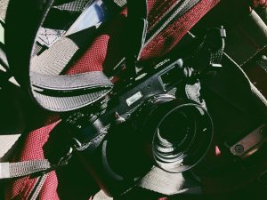
Almost immediately after un-boxing my new camera and turning it on, I searched for that profile. I was astonished with the colors that my camera's LCD screen was showing me. But something odd happened next: after importing the RAW files into my computer, I stopped seeing those wonderful colors. I blamed it on the Adobe Lightroom Software I was using, since it was outdated. I decided to upgrade, and found that in the new version of Lightroom I could choose the camera profile for the image, just as if I was changing White Balance settings. This was amazing to me, because I could switch between Velvia, Provia, Astia, Across, Standard, and the wonderful Classic Chrome. But I still wasn't seeing the colors in that old seductive way.
It's here where a life-changing event came into play – an event that took me back to my photographic childhood. The simple trick is called display calibration. It was a huge mistake on my part to have been working all these years without adjusting my displays, I know. Shame on me. But I hope my experience will help someone else out there.

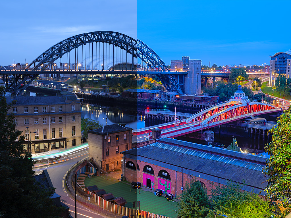
It all started thanks to a friend's concern for calibrating the screens on his computers. After doing so, he discovered a massive difference in the “before” and “after” calibration results. He bought this software, which within a couple of clicks after installation calibrates the screen in a fairly precise and curious way. The process takes about ten minutes, and is almost standalone. I really appreciated the gesture, because my friend had invested about $200 in the system and gave free calibrations to a group of fellow photographers.
Photographers invest a serious amount of money in gear, which create files that are visualized on our built-in camera screens to a different screen altogether. After learning the importance of having all my devices calibrated so they interpret light in a precise way, I now consider (like many out there) that calibrating displays as a top priority.
Here are a couple of reasons why we should calibrate our displays:
Every Screen is a Different World
Most people nowadays view photographs through screens, and each and one of these screens reproduces light in a unique way. Most screens today are very bright, and offer many kinds of screen qualities. I'm not going to lie: my computer is certainly not the most powerful thing on the market, but it does what I need it to do, quickly, in a way that doesn't affect my workflow. All displays must be seen as machines, and every machine, over time, suffers wear either from mechanical stress or deterioration of its internal components. As contradictory as it sounds, standards are helpful in the creative world. Formally, I have studied the Science of Quality Management, and standards are something I have been keen on for a long time. Standards allow us to do things well, repeatedly, with an openness to improvement.

It helps us print exactly what we see
The world of printing is another discipline by itself, with its own peculiar tricks and techniques, and it is totally foreign to most photographers. Seeing our printed work is also a delight, a fundamental part of our relationship with our images. If we can set our displays according to a standard (which is logically rigorous for almost any serious printing professional), all our images can “speak the same language” as the machines used by the people we trust to convert our work into a physical thing.
There are many ways to calibrate our displays – from using the settings on our devices, to the integration of highly sophisticated devices designed exclusively to see and measure light in ways far beyond our understanding. The important thing is that the decision we make helps us attain the exact color standard we seek. Remember, we have invested significant amounts of money in our photographic equipment, so it is logical and wise to invest a little more toward the way we see the results that our photographic devices produce.

This action has undoubtedly changed the way I see my photographs (and many other things, like movies and photographs online). Today I can say, without fear of being mistaken, that even if the streets present environments with a low level of control, colors can help deliver the photographic message more efficiently. This is totally contrary to what I believed before I felt comfortable working with color – that is, before I calibrated my computer's display. My next step will be to invest in a good monitor that allows me to reach very close to 100% of the existing RGB color spectrum.


3 Comments
Federico, it goes a lot further than that, these days.
During the analogue era, I shied away from colour film and shot mainly B&W. The main reason was that most colour stuff targeted slides and I’ve never been interested in them.
You mention Kodacolor – IMHO you are altogether too kind to that film – “classic chrome”? – only in the eyes of its devotees – I regarded it as garish (pretty much the reaction people used to have to early HDR stuff) and refused to use it. Instead, I used AgfaColor and Kodak’s Eastman color negative – using both of them to produce prints, not slides. Their Eastman range targeted mainly pros, leaving the Kodacolor slide film for enthusiastic amateurs, who seemed to be attractive by the “bright colors” it produced.
These days, I am shooting solely digital – I’ve had my time with analogue and I’m doing this to explore the new technology in my old age. And I’ve abandoned the use of computer screens for post processing, or for printing. I’m printing mostly color – only occasionally converting a particular shot to B&W. Computer screens, as you recognise, each produce images in a different way. Over time, even the same screen does.
Instead, I am using a dedicated EIZO screen which automatically recalibrates itself on a regular basis. Which makes it vastly easier to produce acceptable prints.
Before that, I was recalibrating my computer screen on a regular basis, but to be honest, the computer screen is no competition for EIZO’s screens. There are other specialist screens for photography out there, I just happen to select EIZO’s for my purposes, but if it’s of interest, you might prefer to shop around.
If you are in a group and you prefer to keep using computer screens, you might consider the
Datacolor Spyder5 ELITE Display Calibration System. A bit expensive for one user, but if you share the cost it wouldn’t be so difficult. And it does a great job on calibrating computer screens. If I hadn’t switched to the EIZO screen I would certainly have bought one – I was using the Spyder Monki on my computer screen, at that stage, but the more recent Spyder5 ELITE system is far easier and quicker to use – and more suitable if you want to do it on a regular basis.
Another thing I found is that the color gamut of the files that paper manufacturers like Epson & Ilford produce are rather limited. So instead of using theirs, I’ve had several made specially for me by a color photography consultant. If accuracy of color reproduction is critical, this seems to be a “must do”. Skin tones particularly, are affected by the limitations of the standard files.
WOOOW, what an insightful post, thanks Mate, I’m sure displays are a whole new world, just like printing. Thanks for enlightening me and everybody else that will find your words deeply helpful.
This help me a lot. Thanks. Now I need to get a calibrator and improve my skills.