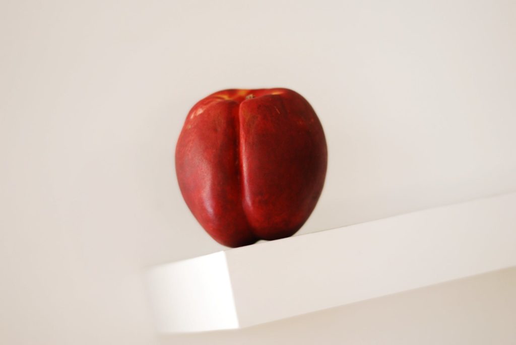
Red and white make an excellent color combination! Many famous brands use this color scheme in their logos or products such as chairs, table cloths or gadgets to create a strong impression on their customers.
Check out these 20 gorgeous examples of using red and white in photography and feel free to experiment with these colors in your portraits, landscapes and abstract images. You will be surprised by how bold your images can become if you embrace certain color combinations.


Composing In Color
Composing in color begins with understanding color. The color wheel starts out with the prime colors. There are several color wheels out there, but since we are working with screens (on computers and cameras) you should keep things simple and just go for the RGB (red, green, blue) wheel.

When opposing colors meet in a single composition, contrast is achieved in the most magnificent ways. When adjacent colors – like an array of warm or cold tones are together without an opposing hue – low levels of contrast are achieved.
Creatively selecting color when composing your images will take them to the next level. It is definitely an advanced composition technique that you should work with.
Advanced Composition And Composing In Color
Getting photography composition right has always been the greatest challenge for the photographer. If you’d like to get better at photography composition and learn concepts that go beyond the basics, you should take a look at Kent DuFault’s guide to advanced composition.
In Kent Dufault's Advanced Composition, you'll discover advanced composition concepts such as:
- Compression
- Color Placement
- Contrast Overlap
- Rhythm
- Color Wash
- Texture
- Stacking
Get it here today


[thrive_text_block color=”note” headline=””]Advanced Composition – will ensure you create images that pop. You'll get more out of your photography and start taking images that will truly capture your creative vision. If you’d like to improve your composition skills and learn concepts that go beyond the ‘rule of thirds’, do take a look at Kent DuFault’s guide Advanced Composition.[/thrive_text_block]


To learn more about powerful color combinations in photography, check out the following links!
Further Reading:
- Understanding Primary, Secondary And Complementary Colors In Photography
- Create Amazing Compositions Simply By Using Color
- How To Use Colors In Your Portraits
- Color Theory For Photographers: An Introduction
- 8 Great Tips For Using Color In Photography
- Photographing Color Combinations In The Streets
Further Learning:
If you are looking to improve your photography composition and learn concepts that go beyond the ‘rule of thirds’, do take a look at Kent DuFault’s guide Advanced Composition. With this guide, you will learn all about:
- color
- light
- shadow
- lines
- curves
- repetition
- juxtaposition
- anticipation
- pre-visualization
- timing


1 Comment
Great photos. I have always been a bit of a fan of adding one main colour element to photos although never really done it myself .