Here’s part 3 of our Black Friday tips series. Click here for part 1. And, click here for part 2.
Fundamental Editing isn’t about repairing a photograph- It’s about Polishing it.
(Tip from The Ultimate Guide to Fundamental Editing – 75% off today)
There is a big difference between repairing something and just polishing it up.
Polishing is about making what’s already there- look better.
This is one of the most common mistakes by photographers that do not understand fundamental editing… Sharpening up an image.
For this quick tip, we are going top give you the short answer. The long answer is located in the full guide.

Since, Adobe has included tools in Lightroom, Photoshop, and Elements that are labeled to “sharpen” an image file. It would be reasonable to assume that if you have taken an un-sharp picture, (such as the one above); these tools would help you put it back in focus. Right?
WRONG!
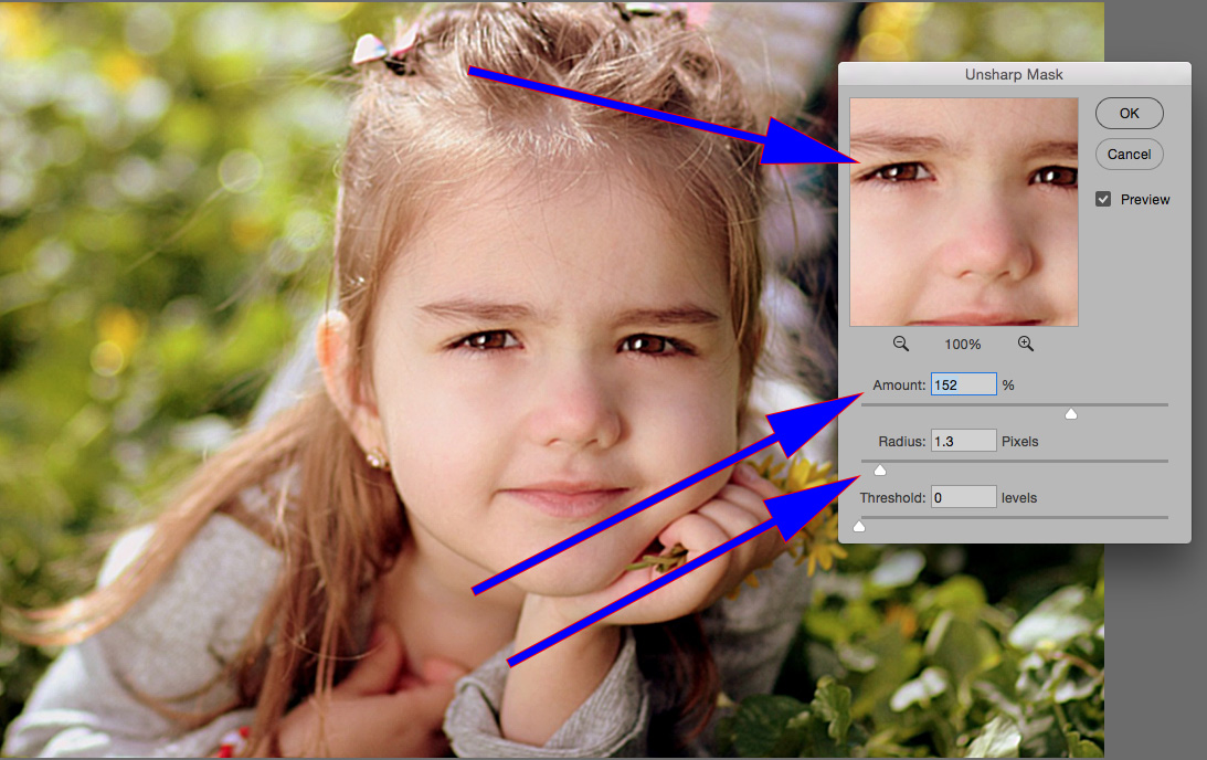
In order to “pull” that image back into focus, the sharpening tools must be maxed out. This might look fine to you, when viewed on your screen. However, you are potentially creating even bigger problems!
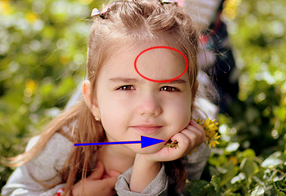
Over-sharpening creates artifacts that are quite visible to a trained eye, or when printed into a photographic print, or when viewed large on a computer screen (even an untrained eye can recognize the problems at that point).
These artifacts often appear as discolored lines along areas of differing contrast (the blue arrow). Over-sharpening will also create an artifact that looks like a “mottled tone” (the red circle).
Quick Tip-
- Get it sharp when you take the photograph.
- Don’t attempt to pull a blurry picture back into focus in post-production.
- Learn how to subtly sharpen an image in post-production, so that it looks natural, sharp as a tack, and without artifacts.
If you’d like to learn more about sharpening an image and the other fundamental edits– Click here now to check out The Ultimate Guide to Fundamental Editing (75% off today)
Take This Quiz on B&W Photography
(Tip from the Better Black and White Guide – 76% off today)
I’m going to ask you 3 questions taken directly from our premium guide, “Better Black and White”
I’m also going to give you the answer to those questions.
Let’s see how you do-
- If a black and white photograph is too high in contrast- what happens to the image?
- Name a simple method to determine if a scene will look good in black & white.
- The Zone System helps you determine what when taking your picture?

Question One- If you convert your color image file into a black and white photograph, and you set your contrast levels too high, you will lose valuable detail in the highlight and shadow areas.
Question Two- View your intended scene through a monochrome filter. The filter removes color and forces you to see the scene in shades of tone only.
Question Three- The Zone System was a valuable part of determining exposure back in the film days. In the digital world, it has less use in camera. However, it is INVALUABLE when it comes to converting your color image files into black and white photographs during post-production. It is one of two key tools that are provided in editing software to help you get a perfect black and white conversion!
If you are interested in producing your own dynamic and share-worthy B&W images, without spending money on fancy plugins or presets– Go here to check out our Better Black and White Guide now » (76% off today)
What the Heck Just Happened to My Histogram!
(Tip from the Complete Landscape Photography Guide – 66% off today)
The “Histogram” can be a mysterious little fella.
A photographer can be going about his or her business… editing a photograph… and all of a sudden the Histogram goes “BAZZINGA” and implodes.
Today, the Quick Tip is going to explain one example of a destructed Histogram, so that you can recognize it in your own work and thus avoid it.
Have you seen this before in your landscape photography?
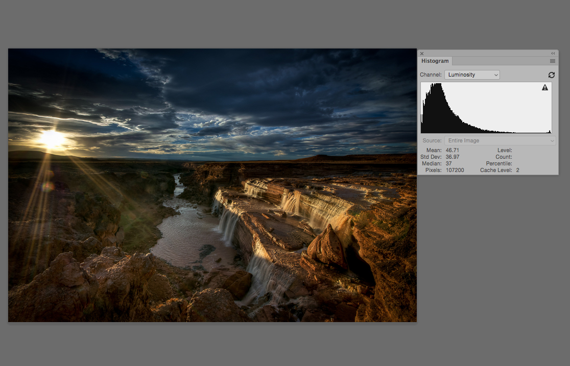
Photograph by Charlie Stinchcomb
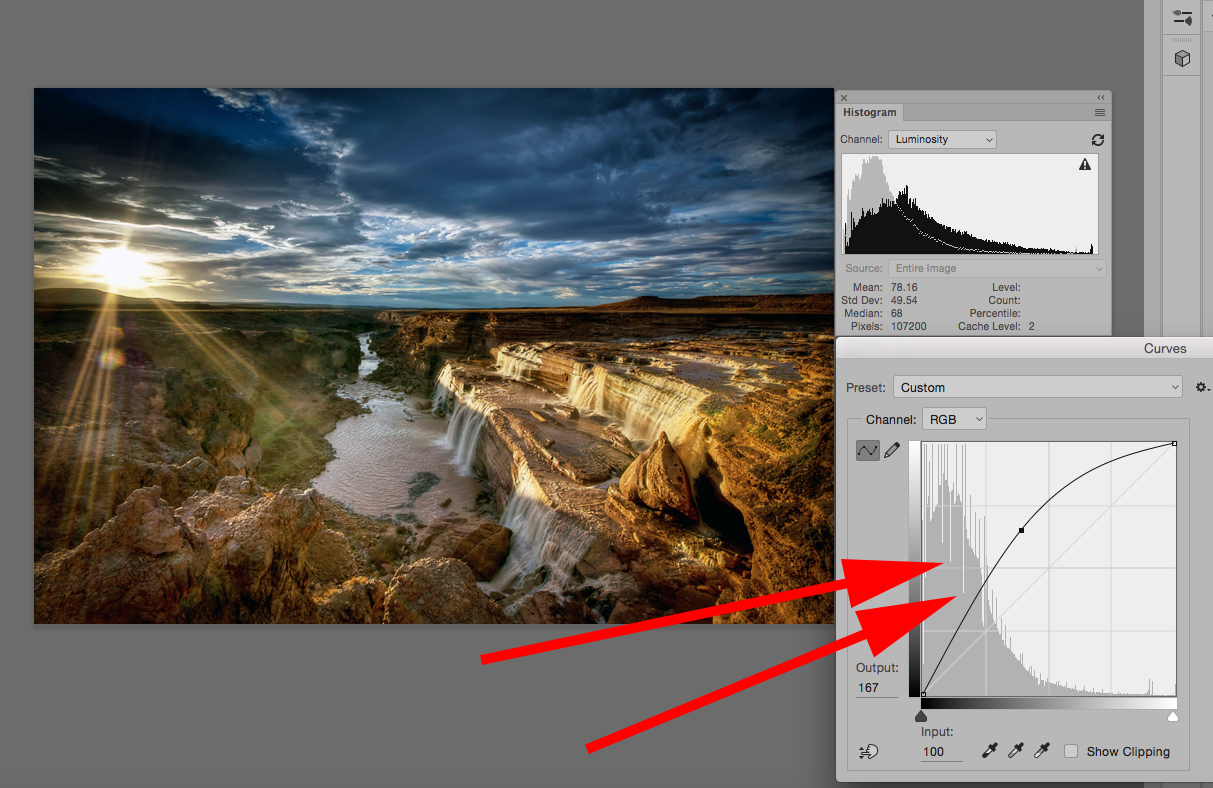
As you make your adjustments, you begin to see cracks forming in the Histogram. This is not good. Those cracks are tonal values that are being lost.
Think of the Histogram as a rubber band. When you stretch a rubber band, it begins to show where the weakness in the material is located. If you stretch it far enough, those weak points will break.
The Histogram works the same way. If you stretch it too far, it will break at the weak points, and you will have drops in tonal value.
Key Lesson: Be conscious of these breaks. There will be times when you can’t avoid creating some of them. However, if you are constantly having to form breaks in your Histogram during post-processing adjustments, you are not exposing your landscape images properly in camera; study up on your metering and exposure techniques.
If you want to learn exactly how to create professional level landscape photographs today– Go here to check out our Complete Landscape Photography Guide now » (66% off today)


