window._wpemojiSettings = {"baseUrl":"https:\/\/s.w.org\/images\/core\/emoji\/14.0.0\/72x72\/","ext":".png","svgUrl":"https:\/\/s.w.org\/images\/core\/emoji\/14.0.0\/svg\/","svgExt":".svg","source":{"concatemoji":"\/\/www.lightstalking.com\/wp-includes\/js\/wp-emoji-release.min.js?ver=00ee2dc9c4a47c0421c3a1063c12ecee"}};
/*! This file is auto-generated */
!function(i,n){var o,s,e;function c(e){try{var t={supportTests:e,timestamp:(new Date).valueOf()};sessionStorage.setItem(o,JSON.stringify(t))}catch(e){}}function p(e,t,n){e.clearRect(0,0,e.canvas.width,e.canvas.height),e.fillText(t,0,0);var t=new Uint32Array(e.getImageData(0,0,e.canvas.width,e.canvas.height).data),r=(e.clearRect(0,0,e.canvas.width,e.canvas.height),e.fillText(n,0,0),new Uint32Array(e.getImageData(0,0,e.canvas.width,e.canvas.height).data));return t.every(function(e,t){return e===r[t]})}function u(e,t,n){switch(t){case"flag":return n(e,"\ud83c\udff3\ufe0f\u200d\u26a7\ufe0f","\ud83c\udff3\ufe0f\u200b\u26a7\ufe0f")?!1:!n(e,"\ud83c\uddfa\ud83c\uddf3","\ud83c\uddfa\u200b\ud83c\uddf3")&&!n(e,"\ud83c\udff4\udb40\udc67\udb40\udc62\udb40\udc65\udb40\udc6e\udb40\udc67\udb40\udc7f","\ud83c\udff4\u200b\udb40\udc67\u200b\udb40\udc62\u200b\udb40\udc65\u200b\udb40\udc6e\u200b\udb40\udc67\u200b\udb40\udc7f");case"emoji":return!n(e,"\ud83e\udef1\ud83c\udffb\u200d\ud83e\udef2\ud83c\udfff","\ud83e\udef1\ud83c\udffb\u200b\ud83e\udef2\ud83c\udfff")}return!1}function f(e,t,n){var r="undefined"!=typeof WorkerGlobalScope&&self instanceof WorkerGlobalScope?new OffscreenCanvas(300,150):i.createElement("canvas"),a=r.getContext("2d",{willReadFrequently:!0}),o=(a.textBaseline="top",a.font="600 32px Arial",{});return e.forEach(function(e){o[e]=t(a,e,n)}),o}function t(e){var t=i.createElement("script");t.src=e,t.defer=!0,i.head.appendChild(t)}"undefined"!=typeof Promise&&(o="wpEmojiSettingsSupports",s=["flag","emoji"],n.supports={everything:!0,everythingExceptFlag:!0},e=new Promise(function(e){i.addEventListener("DOMContentLoaded",e,{once:!0})}),new Promise(function(t){var n=function(){try{var e=JSON.parse(sessionStorage.getItem(o));if("object"==typeof e&&"number"==typeof e.timestamp&&(new Date).valueOf()<e.timestamp+604800&&"object"==typeof e.supportTests)return e.supportTests}catch(e){}return null}();if(!n){if("undefined"!=typeof Worker&&"undefined"!=typeof OffscreenCanvas&&"undefined"!=typeof URL&&URL.createObjectURL&&"undefined"!=typeof Blob)try{var e="postMessage("+f.toString()+"("+[JSON.stringify(s),u.toString(),p.toString()].join(",")+"));",r=new Blob([e],{type:"text/javascript"}),a=new Worker(URL.createObjectURL(r),{name:"wpTestEmojiSupports"});return void(a.onmessage=function(e){c(n=e.data),a.terminate(),t(n)})}catch(e){}c(n=f(s,u,p))}t(n)}).then(function(e){for(var t in e)n.supports[t]=e[t],n.supports.everything=n.supports.everything&&n.supports[t],"flag"!==t&&(n.supports.everythingExceptFlag=n.supports.everythingExceptFlag&&n.supports[t]);n.supports.everythingExceptFlag=n.supports.everythingExceptFlag&&!n.supports.flag,n.DOMReady=!1,n.readyCallback=function(){n.DOMReady=!0}}).then(function(){return e}).then(function(){var e;n.supports.everything||(n.readyCallback(),(e=n.source||{}).concatemoji?t(e.concatemoji):e.wpemoji&&e.twemoji&&(t(e.twemoji),t(e.wpemoji)))}))}((window,document),window._wpemojiSettings);
window.advanced_ads_ready=function(e,a){a=a||"complete";var d=function(e){return"interactive"===a?"loading"!==e:"complete"===e};d(document.readyState)?e():document.addEventListener("readystatechange",(function(a){d(a.target.readyState)&&e()}),{once:"interactive"===a})},window.advanced_ads_ready_queue=window.advanced_ads_ready_queue||[];
//www.lightstalking.com/wp-includes/js/jquery/jquery.min.js
//www.lightstalking.com/wp-includes/js/jquery/jquery-migrate.min.js
var breeze_prefetch = {"local_url":"https:\/\/www.lightstalking.com","ignore_remote_prefetch":"1","ignore_list":["\/wp-admin\/"]};
//www.lightstalking.com/wp-content/plugins/breeze/assets/js/js-front-end/breeze-prefetch-links.min.js
//www.lightstalking.com/wp-content/plugins/intelly-countdown-pro/assets/deps/moment/moment.js
//www.lightstalking.com/wp-content/plugins/intelly-countdown-pro/assets/js/icp.library.js
//www.lightstalking.com/wp-content/plugins/wp-user-avatar/assets/flatpickr/flatpickr.min.js
//www.lightstalking.com/wp-content/plugins/wp-user-avatar/assets/select2/select2.min.js
//www.lightstalking.com/wp-content/plugins/tag-groups/assets/js/frontend.min.js
var advads_options = {"blog_id":"1","privacy":{"enabled":false,"state":"not_needed"}};
//www.lightstalking.com/wp-content/plugins/advanced-ads/public/assets/js/advanced.min.js
var advanced_ads_pro_visitor_conditions = {"referrer_cookie_name":"advanced_ads_pro_visitor_referrer","referrer_exdays":"365","page_impr_cookie_name":"advanced_ads_page_impressions","page_impr_exdays":"3650"};
//www.lightstalking.com/wp-content/plugins/advanced-ads-pro/modules/advanced-visitor-conditions/inc/conditions.min.js
//www.lightstalking.com/wp-content/themes/lightstalking/assets/js/index.js
document.createElement( "picture" );if(!window.HTMLPictureElement && document.addEventListener) {window.addEventListener("DOMContentLoaded", function() {var s = document.createElement("script");s.src = "https://www.lightstalking.com/wp-content/plugins/webp-express/js/picturefill.min.js";document.body.appendChild(s);});}
var essb_settings = {"ajax_url":"https:\/\/www.lightstalking.com\/wp-admin\/admin-ajax.php","essb3_nonce":"410b949229","essb3_plugin_url":"https:\/\/www.lightstalking.com\/wp-content\/plugins\/easy-social-share-buttons3","essb3_stats":true,"essb3_ga":false,"essb3_ga_ntg":false,"blog_url":"https:\/\/www.lightstalking.com\/","post_id":"181280","internal_stats":true};
https://www.lightstalking.com/wp-content/uploads/breeze/google/gtag.js
!function(f,b,e,v,n,t,s)
{if(f.fbq)return;n=f.fbq=function(){n.callMethod?
n.callMethod.apply(n,arguments):n.queue.push(arguments)};
if(!f._fbq)f._fbq=n;n.push=n;n.loaded=!0;n.version='2.0';
n.queue=[];t=b.createElement(e);t.async=!0;
t.src=v;s=b.getElementsByTagName(e)[0];
s.parentNode.insertBefore(t,s)}(window, document,'script',
'https://connect.facebook.net/en_US/fbevents.js');
fbq('init', '1079708588874183');
fbq('track', 'PageView');
var head = document.head;var script = document.createElement('script');script.type = 'text/javascript';script.src = "https://178444.tracking.hyros.com/v1/lst/universal-script?ph=6df64206c166a45894d8b8d2beeed3f98ece187ef7e83c10a2acca9a68e688a5&tag=!tracking";head.appendChild(script);
(function(c,l,a,r,i,t,y){
c[a]=c[a]||function(){(c[a].q=c[a].q||[]).push(arguments)};
t=l.createElement(r);t.async=1;t.src="https://www.clarity.ms/tag/"+i;
y=l.getElementsByTagName(r)[0];y.parentNode.insertBefore(t,y);
})(window, document, "clarity", "script", "jzjsbgih7m");
var advadsCfpQueue = [];
var advadsCfpAd = function( adID ){
if ( 'undefined' == typeof advadsProCfp ) { advadsCfpQueue.push( adID ) } else { advadsProCfp.addElement( adID ) }
};
document.documentElement.className = document.documentElement.className.replace( 'no-js', 'js' );
Skip to the contentIf you're a movie buff like I am, you’ll notice that movies often look quite different than photos, in both framing and color balance. I mean, aside from the obvious fact it's a motion picture versus a still shot of course.
Most movies are shot in a cinematic aspect ratio, using anamorphic lenses – therefore changing the aspect ratio of the picture, which is scaled back later in post production to achieve sharper images with a cinematic aspect ratio (21:9).
When you have that anamorphic aspect ratio with your camera, you're halfway there in achieving that cinematic look. All you need to do now is color grade your picture.
The process (once you have decided which color you’ll go towards) is fairly easy to do, some hue and curves and you're all set. However, what color should you lean towards?
This requires a good understanding of the color wheel, which colors are neighboring and which are complementing. You can’t just combine 2-3 random colors, let's be honest, it would look plain rubbish. The key is knowing which color to use in order to emphasize certain aspects.
You’ll firstly have to understand that every color has a certain set of emotions and ambients attached to it. Therefore, some background in color won’t do any harm.
If you're looking for a really detailed rundown of understanding light, then Light Stalking writer and professional photographer, Kent Dufault's guide to the subject is a very good place to start. (If you're interested, you can see the results here).
White for Purity
White color tones symbolize purity and cleanliness – this is one of the neutral color sets. You’ll have to technically overexpose a bit and go high key. That would be how you “grade” with white. In order to figure out why this color represents those things, think of weddings.
Wedding dresses are white, resembling something clean and pure. The same goes with lab coats, doctor coats, and so forth. That’s why in most of the medical commercials and photos you’ll see that there is plenty of white included and the photos are borderline high key.
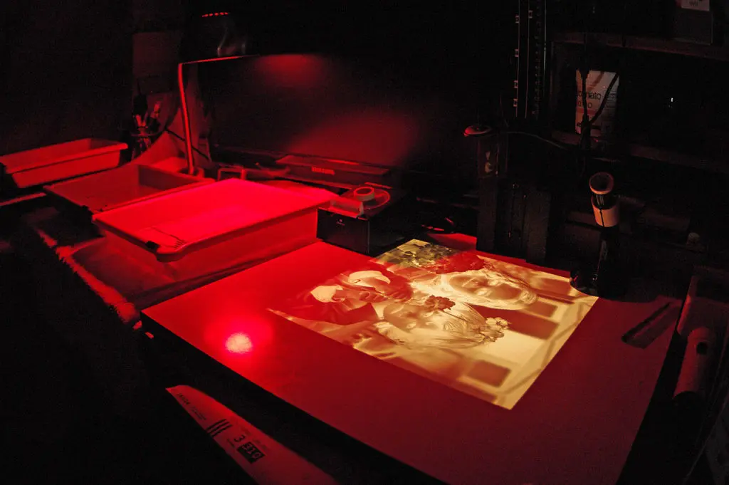
Photo by ribena_wrath
Orange/Yellow for Happiness
These represent warmth and happiness. The color of the sun resembles everything the sunny and warm. Whenever it's sunny, people tend to be in a better mood, happier and more relaxed. You can bring in the same things if you color grade your pictures towards some orange or yellow tones.
 Photo by payalnic
Blue/aqua for Cold
The complete opposite of orange and yellow tones, blue represents cold and dark. Here movie producers often tone night scenes with a lot of blue. You can simulate night shots with adding bunch of blue grading and underexpose by two stops. Sad scenes are often graded in blue as well, symbolizing sad and dark emotions.
Red for Passion
Though not often seen as general grade, red colors symbolize love and passion. Red elements in the picture are often emphasized and highly saturated, while the overall scene is graded orange with a hint of more red. It's tricky to pull off since you’ll need perfect conditions to do it, but that's not to say it's impossible though.
 Photo by VaMedia
Green with Nature
Green. The color of nature. Scenes happening in forest areas during spring are color graded towards green to bring the subject closer to nature itself. Not used that often, but interesting nonetheless. Especially when combined with other color elements, both neighboring and complementing.
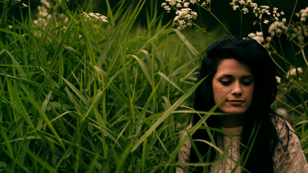 Photo by Mycatkins
Purple/Magenta for Vintage
Even though it sits between blue and red, purple tones are often used in vintage scenes. If you aim to create that vintage look, purple tones are the way to go. Purples are hard to combine with other elements without risking it looking cheap, i.e. like any common filter.
Note here though the color grading is best done in moderation, usually by shifting the black point away from the black just a tad, so the color grade can soak in the shadow areas too.
You can take everything to another level by combining a color grade which is complemented by a color used in a picture. For example, orange grade with green foliage, or blue graded with orange highlights in a portrait. There are infinite options and each has its own benefit.
As a guide, combining two colors is always a good thing, but it must be done accurately in order to work. If you fail at it, it will look like some cheap filter has been applied. So, the best way to do so is to photograph with the intention to grade it afterward, so you’ll plan and execute the scene with that in mind.
If you're thinking about leaving black bars as you see in movies, don’t forget to mask out the color grade from them – it shouldn’t affect the black bars anyhow. That's how you show that they aren’t part of the picture even though they technically are.
As mentioned earlier, understanding colour is part of the wider subject area of understanding light – a critical skill for a good photographer. Kent Dufault's guide on understanding light is well worth reading on the subject.
Hope you enjoyed and this gives you some food for thought!
Photographer who loves challenging and experimental photography and loves sharing his knowledge about it.
(function(d, s, id) {
var js, fjs = d.getElementsByTagName(s)[0];
if (d.getElementById(id)) return;
js = d.createElement(s); js.id = id;
js.src = "//forms.aweber.com/form/96/435600896.js";
fjs.parentNode.insertBefore(js, fjs);
}(document, "script", "aweber-wjs-8cq4o7hvd"));
document.getElementById( "ak_js_1" ).setAttribute( "value", ( new Date() ).getTime() );
if (typeof jQuery !== 'undefined' && typeof jQuery.ui !== 'undefined' && typeof jQuery.ui.tabs !== 'undefined' && typeof jQuery.widget !== 'undefined' && typeof TagGroupsBase !== 'undefined') {
TagGroupsBase.tabs('tag-groups-cloud-tabs-66138405cdebb', {"active":false}, true);
} else {
jQuery(document).ready(function(){
setTimeout(function(){
if (typeof jQuery !== 'undefined' && typeof jQuery.ui !== 'undefined' && typeof jQuery.ui.tabs !== 'undefined' && typeof jQuery.widget !== 'undefined') {
TagGroupsBase.tabs('tag-groups-cloud-tabs-66138405cdebb', {"active":false}, true);
} else {
console.log('[Tag Groups] Error: jQuery UI Tabs is missing!');
}
}, 500);
});
}
( $ => {
/**
* Displays toast message from storage, it is used when the user is redirected after login
*/
if ( window.sessionStorage ) {
$( window ).on( 'tcb_after_dom_ready', () => {
const message = sessionStorage.getItem( 'tcb_toast_message' );if ( message ) {
tcbToast( sessionStorage.getItem( 'tcb_toast_message' ), false );
sessionStorage.removeItem( 'tcb_toast_message' );
}
} );
}/**
* Displays toast message
*
* @param {string} message - message to display
* @param {Boolean} error - whether the message is an error or not
* @param {Function} callback - callback function to be called after the message is closed
*/
function tcbToast( message, error, callback ) {
/* Also allow "message" objects */
if ( typeof message !== 'string' ) {
message = message.message || message.error || message.success;
}
if ( ! error ) {
error = false;
}
TCB_Front.notificationElement.toggle( message, error ? 'error' : 'success', callback );
}
} )( typeof ThriveGlobal === 'undefined' ? jQuery : ThriveGlobal.$j );
(function($) {
$('.home #custom-home-more-categories').on("click", function() {
$(this).parent('.custom-home-categories').find('.custom-home-categories-list').toggleClass('show');
});
})(jQuery);
//www.lightstalking.com/wp-content/plugins/metronet-profile-picture/js/mpp-frontend.js
var pp_ajax_form = {"ajaxurl":"https:\/\/www.lightstalking.com\/wp-admin\/admin-ajax.php","confirm_delete":"Are you sure?","deleting_text":"Deleting...","deleting_error":"An error occurred. Please try again.","nonce":"b6fea378b0","disable_ajax_form":"false","is_checkout":"0","is_checkout_tax_enabled":"0"};
//www.lightstalking.com/wp-content/plugins/wp-user-avatar/assets/js/frontend.min.js
//www.lightstalking.com/wp-includes/js/jquery/ui/core.min.js
//www.lightstalking.com/wp-includes/js/jquery/ui/tabs.min.js
//www.lightstalking.com/wp-includes/js/jquery/ui/accordion.min.js
var advanced_ads_cookies = {"cookie_path":"\/","cookie_domain":""};
var advadsCfpInfo = {"cfpExpHours":"3","cfpClickLimit":"3","cfpBan":"7","cfpPath":"","cfpDomain":"www.lightstalking.com"};
//www.lightstalking.com/wp-content/plugins/advanced-ads-pro/assets/js/advanced-ads-pro.min.js
//www.lightstalking.com/wp-includes/js/comment-reply.min.js
var beloadmore = {"url":"https:\/\/www.lightstalking.com\/wp-admin\/admin-ajax.php","query":{"post__not_in":[181280],"category_name":"post-production","posts_per_page":3}};
//www.lightstalking.com/wp-content/themes/lightstalking/assets/js/load-more.js
var tve_dash_front = {"ajaxurl":"https:\/\/www.lightstalking.com\/wp-admin\/admin-ajax.php","force_ajax_send":"1","is_crawler":"","recaptcha":[],"post_id":"181280"};
//www.lightstalking.com/wp-content/plugins/thrive-visual-editor/thrive-dashboard/js/dist/frontend.min.js
_stq = window._stq || [];
_stq.push([ "view", JSON.parse("{\"v\":\"ext\",\"blog\":\"12538233\",\"post\":\"181280\",\"tz\":\"-4\",\"srv\":\"www.lightstalking.com\",\"j\":\"1:13.3\"}") ]);
_stq.push([ "clickTrackerInit", "12538233", "181280" ]);
//www.lightstalking.com/wp-content/plugins/akismet/_inc/akismet-frontend.js
var eztoc_smooth_local = {"scroll_offset":"30","add_request_uri":""};
//www.lightstalking.com/wp-content/plugins/easy-table-of-contents/assets/js/smooth_scroll.min.js
//www.lightstalking.com/wp-content/plugins/easy-table-of-contents/vendor/js-cookie/js.cookie.min.js
//www.lightstalking.com/wp-content/plugins/easy-table-of-contents/vendor/sticky-kit/jquery.sticky-kit.min.js
var ezTOC = {"smooth_scroll":"1","scroll_offset":"30","fallbackIcon":"<span class=\"\"><span class=\"eztoc-hide\" style=\"display:none;\">Toggle<\/span><span class=\"ez-toc-icon-toggle-span\"><svg style=\"fill: #666666;color:#666666\" xmlns=\"http:\/\/www.w3.org\/2000\/svg\" class=\"list-377408\" width=\"20px\" height=\"20px\" viewBox=\"0 0 24 24\" fill=\"none\"><path d=\"M6 6H4v2h2V6zm14 0H8v2h12V6zM4 11h2v2H4v-2zm16 0H8v2h12v-2zM4 16h2v2H4v-2zm16 0H8v2h12v-2z\" fill=\"currentColor\"><\/path><\/svg><svg style=\"fill: #666666;color:#666666\" class=\"arrow-unsorted-368013\" xmlns=\"http:\/\/www.w3.org\/2000\/svg\" width=\"10px\" height=\"10px\" viewBox=\"0 0 24 24\" version=\"1.2\" baseProfile=\"tiny\"><path d=\"M18.2 9.3l-6.2-6.3-6.2 6.3c-.2.2-.3.4-.3.7s.1.5.3.7c.2.2.4.3.7.3h11c.3 0 .5-.1.7-.3.2-.2.3-.5.3-.7s-.1-.5-.3-.7zM5.8 14.7l6.2 6.3 6.2-6.3c.2-.2.3-.5.3-.7s-.1-.5-.3-.7c-.2-.2-.4-.3-.7-.3h-11c-.3 0-.5.1-.7.3-.2.2-.3.5-.3.7s.1.5.3.7z\"\/><\/svg><\/span><\/span>"};
//www.lightstalking.com/wp-content/plugins/easy-table-of-contents/assets/js/front.min.js
var tcb_current_post_lists=JSON.parse('[]'); var tcb_post_lists=tcb_post_lists?[...tcb_post_lists,...tcb_current_post_lists]:tcb_current_post_lists;
/(trident|msie)/i.test(navigator.userAgent)&&document.getElementById&&window.addEventListener&&window.addEventListener("hashchange",function(){var t,e=location.hash.substring(1);/^[A-z0-9_-]+$/.test(e)&&(t=document.getElementById(e))&&(/^(?:a|select|input|button|textarea)$/i.test(t.tagName)||(t.tabIndex=-1),t.focus())},!1);
if ( !window.TL_Const ) {var TL_Const={"security":"1347e448fa","ajax_url":"https:\/\/www.lightstalking.com\/wp-admin\/admin-ajax.php","action_conversion":"tve_leads_ajax_conversion","action_impression":"tve_leads_ajax_impression","custom_post_data":[],"current_screen":{"screen_type":4,"screen_id":181280},"ignored_fields":["email","_captcha_size","_captcha_theme","_captcha_type","_submit_option","_use_captcha","g-recaptcha-response","__tcb_lg_fc","__tcb_lg_msg","_state","_form_type","_error_message_option","_back_url","_submit_option","url","_asset_group","_asset_option","mailchimp_optin","tcb_token","tve_labels","tve_mapping","_api_custom_fields","_sendParams","_autofill"],"ajax_load":1};} else { window.TL_Front && TL_Front.extendConst && TL_Front.extendConst({"security":"1347e448fa","ajax_url":"https:\/\/www.lightstalking.com\/wp-admin\/admin-ajax.php","action_conversion":"tve_leads_ajax_conversion","action_impression":"tve_leads_ajax_impression","custom_post_data":[],"current_screen":{"screen_type":4,"screen_id":181280},"ignored_fields":["email","_captcha_size","_captcha_theme","_captcha_type","_submit_option","_use_captcha","g-recaptcha-response","__tcb_lg_fc","__tcb_lg_msg","_state","_form_type","_error_message_option","_back_url","_submit_option","url","_asset_group","_asset_option","mailchimp_optin","tcb_token","tve_labels","tve_mapping","_api_custom_fields","_sendParams","_autofill"],"ajax_load":1})}
window.advads_admin_bar_items = [];
var TVE_Ult_Data = {"ajaxurl":"https:\/\/www.lightstalking.com\/wp-admin\/admin-ajax.php","ajax_load_action":"tve_ult_ajax_load","conversion_events_action":"tve_ult_conversion_event","shortcode_campaign_ids":[],"matched_display_settings":[],"campaign_ids":[],"post_id":181280,"is_singular":true,"tu_em":"","evergreen_redirects":[]};
https://www.lightstalking.com/wp-content/plugins/thrive-ultimatum/js/dist/no-campaign.min.js
!function(){window.advanced_ads_ready_queue=window.advanced_ads_ready_queue||[],advanced_ads_ready_queue.push=window.advanced_ads_ready;for(var d=0,a=advanced_ads_ready_queue.length;d<a;d++)advanced_ads_ready(advanced_ads_ready_queue[d])}();
(function() { var po = document.createElement('script'); po.type = 'text/javascript'; po.async=true;; po.src = 'https://www.lightstalking.com/wp-content/plugins/easy-social-share-buttons3/lib/modules/conversions-pro/assets/share-conversions-tracker.js'; var s = document.getElementsByTagName('script')[0]; s.parentNode.insertBefore(po, s); })();(function() { var po = document.createElement('script'); po.type = 'text/javascript'; po.async=true;; po.src = 'https://www.lightstalking.com/wp-content/plugins/easy-social-share-buttons3/assets/modules/pinterest-pro.min.js'; var s = document.getElementsByTagName('script')[0]; s.parentNode.insertBefore(po, s); })();(function() { var po = document.createElement('script'); po.type = 'text/javascript'; po.async=true;; po.src = 'https://www.lightstalking.com/wp-content/plugins/easy-social-share-buttons3/assets/modules/subscribe-forms.min.js'; var s = document.getElementsByTagName('script')[0]; s.parentNode.insertBefore(po, s); })();(function() { var po = document.createElement('script'); po.type = 'text/javascript'; po.async=true;; po.src = 'https://www.lightstalking.com/wp-content/plugins/easy-social-share-buttons3/assets/js/essb-core.min.js'; var s = document.getElementsByTagName('script')[0]; s.parentNode.insertBefore(po, s); })();
let ccwpDOMLoaded=!1;
let ccwp_loaded = false;
let resources_length=0;
let resources =undefined;
let is_last_resource = 0;
ccwpUserInteractions=["keydown","mousemove","wheel","touchmove","touchstart","touchend","touchcancel","touchforcechange"];
ccwpUserInteractions.forEach(function(e){
window.addEventListener(e,calculate_load_times);
});
function calculate_load_times() {
// Check performance support
if (performance === undefined) {
console.log("Performance NOT supported");
return;
}
// Get a list of "resource" performance entries
resources = performance.getEntriesByType("resource");
if (resources === undefined || resources.length <= 0) {
console.log("NO Resource performance records");
}
if(resources.length){
resources_length=resources.length;
}
for(let i=0; i < resources.length; i++) {
if(resources[i].responseEnd>0){
is_last_resource = is_last_resource + 1;
}
}
let uag = navigator.userAgent;
let gpat = /Google Page Speed Insights/gm;
let gres = uag.match(gpat);
let cpat = /Chrome-Lighthouse/gm;
let cres = uag.match(cpat);
let wait_till=300;
let new_ua = "Mozilla/5.0 (Linux; Android 11; moto g power (2022)) AppleWebKit/537.36 (KHTML, like Gecko) Chrome/109.0.0.0 Mobile Safari/537.36";
let new_ua2 = "Mozilla/5.0 (Macintosh; Intel Mac OS X 10_15_7) AppleWebKit/537.36 (KHTML, like Gecko) Chrome/109.0.0.0 Safari/537.36";
if(gres || cres || uag==new_ua || uag==new_ua2){
wait_till = 3000;
}
if(is_last_resource==resources.length){
setTimeout(function(){
console.log("ccwpTriggerDelayedScripts timeout : "+wait_till);
ccwpTriggerDelayedScripts();
},wait_till);
}
}
window.addEventListener("load", function(e) {
console.log("load complete");
setTimeout(function(){
calculate_load_times();
},100);
});async function ccwpTriggerDelayedScripts() {
if(ccwp_loaded){ return ;}
ccwpPreloadStyles();
ccwpPreloadDelayedScripts();
ccwpLoadCss();
ccwpScriptLoading();
ccwp_loaded=true;
}
function ccwpPreloadStyles() {
let e = document.createDocumentFragment();
var cssEle = document.querySelectorAll("link[rel=ccwpdelayedstyle]");
for(let i=0; i <= cssEle.length;i++){
if(cssEle[i]){
cssEle[i].href = removeVersionFromLink(cssEle[i].href);
let r = document.createElement("link");
r.href = cssEle[i].href;
r.rel = "preload";
r.as = "style";
e.appendChild(r);
}
}
document.head.appendChild(e);
}
function ccwpPreloadDelayedScripts() {
var e = document.createDocumentFragment();
document.querySelectorAll("script[type=ccwpdelayedscript]").forEach(function(t) {
var n = removeVersionFromLink(t.getAttribute("src"));
if (n) {
t.setAttribute("src", n);
var r = document.createElement("link");
r.href = n, r.rel = "preload", r.as = "script", e.appendChild(r)
}
}), document.head.appendChild(e)
}
function ccwpScriptLoading(){
var jsEle = document.querySelectorAll("script[type=ccwpdelayedscript]");
jsEle.forEach(function(t) {
t.type = "text/javascript";
if(t.src)
{
t.src = removeVersionFromLink(t.src);
}
});
}function ccwpLoadCss(){
var cssEle = document.querySelectorAll("link[rel=ccwpdelayedstyle]");
for(let i=0; i <= cssEle.length;i++){
if(cssEle[i]){
cssEle[i].href = removeVersionFromLink(cssEle[i].href);
cssEle[i].rel = "stylesheet";
cssEle[i].type = "text/css";
}
}var cssEle = document.querySelectorAll("style[type=ccwpdelayedstyle]");
for(let i=0; i <= cssEle.length;i++){
if(cssEle[i]){
cssEle[i].type = "text/css";
}
}
}
function removeVersionFromLink(link)
{
if(ccwpIsValidUrl(link))
{
const url = new URL(ccwpFormatLink(link));
url.searchParams.delete("ver");
url.searchParams.delete("time");
return url.href;
}
else{
return link;
}
}
function ccwpIsValidUrl(urlString)
{
if(urlString){
var expression =/[-a-zA-Z0-9@:%_\+.~#?&//=]{2,256}\.[a-z]{2,4}\b(\/[-a-zA-Z0-9@:%_\+.~#?&//=]*)?/gi;
var regex = new RegExp(expression);
return urlString.match(regex);
}
return false;
}
function ccwpFormatLink(link)
{
let http_check=link.match("http:");
let https_check=link.match("https:");
if(!http_check && !https_check)
{
return location.protocol+link;
}
return link;
}
 Photo by payalnic
 Photo by VaMedia
 Photo by Mycatkins

