Web design has come a long way since the days of plain white pages with lists of blue links. Just think of the first website on the internet launched by Tim Berners-Lee in 1991, who began the digital revolution. More than 20 years have passed since then and it’s hard to imagine a life without internet. A lot has changed on many different fronts, one of them being web design.
Thanks to the service Wayback Machine, we can follow the trends from the very beginning and see what our favorite websites looked like 2, 5, or even 10 years ago. Wayback Machine is a digital archive of the World Wide Web which was created by a non-profit organization from California in 1996. This tool allows users to see archived versions of web pages across time. I selected a few photography blogs and using Wayback Machine analysed them to see how web trends have changed over the years.
Stuck in Customs
Stuck in Customs is the #1 travel photography blog on the internet. It was started as a site just to share some travel pictures along with stories of their creation, and now it’s highly ranked by Google and has billions of views. Let’s see how Stuck in Customs looked like in 2008.
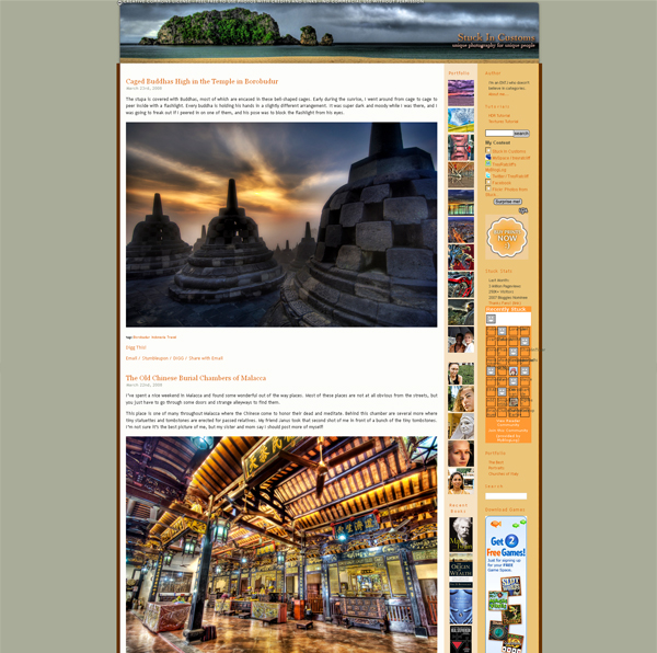
As you see, the design of Stuck in Customs was quite usual for 2006. Narrow content zone to fit in any screen resolution as there was no responsive design that time. Beautiful photography header and typography with 3D elements and shadows to show that they’re volume.
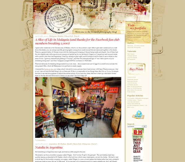
In 2009 the design of Stuck in Customs has changed. The content zone became wider. The background and header had different travel attributes such as stamps and pieces of old paper which gives a blog some vintage look.
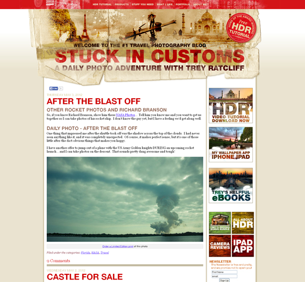
In 2012, the design was changed once again. This time we see sans serif fonts. The color scheme and vintage feel stayed the same.
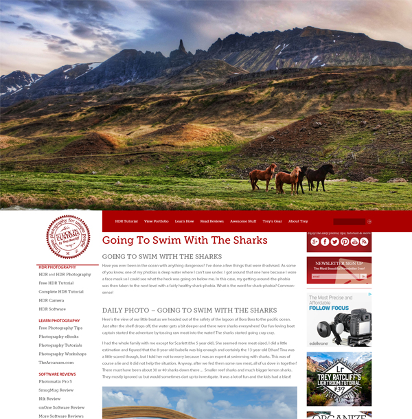
This up-to-date clean design appeared at Stuck in Customs in 2014. It saved this deep red color for menu and sidebar banners. The huge full-size photography header impresses at once the user enter the site. The blog has a flat design which looks trendy. Content area is clean, fonts are big enough to be readable and understandable.
Photodoto
Photodoto exists from 2006 and contain over 1000 articles on photography. Photodoto is an educational and inspirational blog that provides information for both amateurs and PROs. If you want to learn about photography business, photo editing or get to know how to photograph anything, you’ll find answers here.
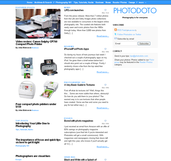
That’s how Photodoto looked like in 2009. It seems like columns in newspaper which was the trend of that year. Black text along with blue links give an impression of simple elegant design.
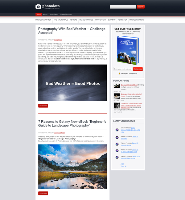
In 2012 the design has changed dramatically. It was connected with new design trends for bulky buttons, dard deep colors and large images. Content zone became wider and text bigger.
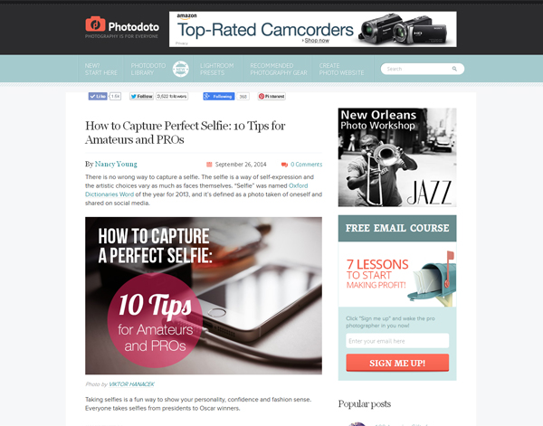
This is a screenshot of website how it looks today. The design concept was not changed a lot, but the color scheme was. It has clean minimalistic look within light, elegant colors. Flat buttons, icons and other design elements, preview images with wording.
Light Stalking
(Well, of course) Light Stalking is a photography blog and community that combines talented photographers and beautiful photography, sharing photography tutorials and image collections.
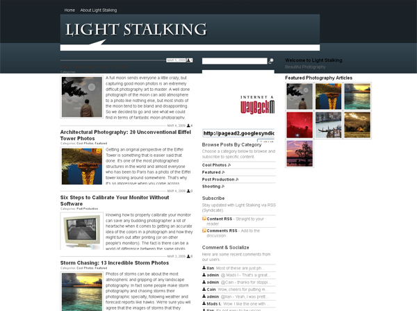
In 2009, the design was a bit cluttered. The narrow content zone, small images and inefficient use of space characterizes almost all blog designs of that time.
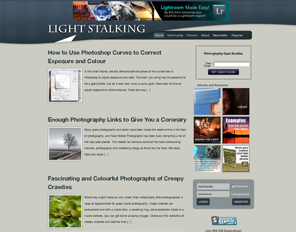
In 2012, the content zone became wider and headlines bigger. The site turned green.
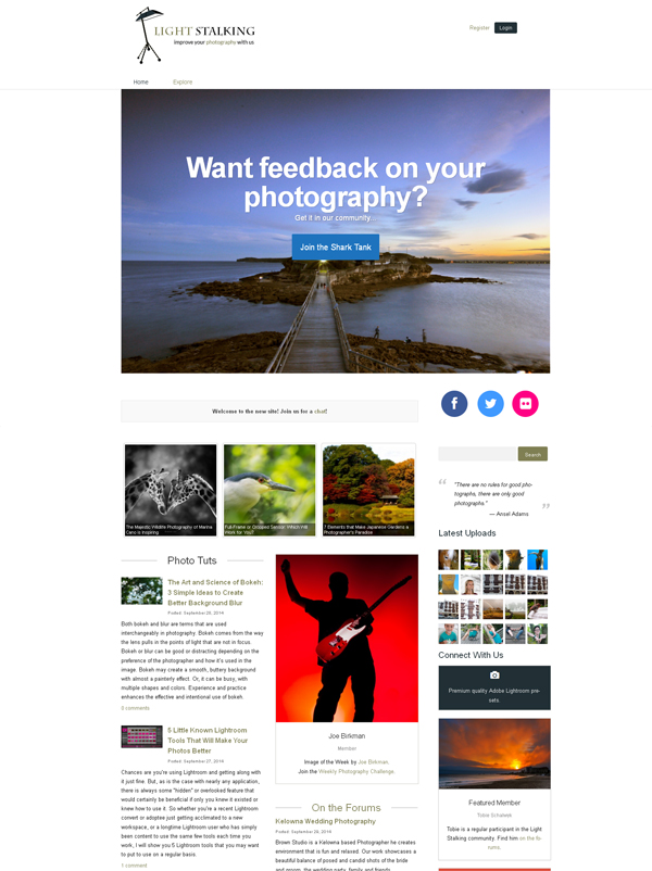
The modern version of Light Stalking that emerged this year is clean and up-to-date. In 2014, appeared a huge image header to attract visitors’ attention, image slider with most recent blog posts and two-columns design.
FStoppers
Fstoppers is a photographer's community with daily news, behind-the-scenes videos, and gear reviews. It also features a store with tutorials, software and accessories.
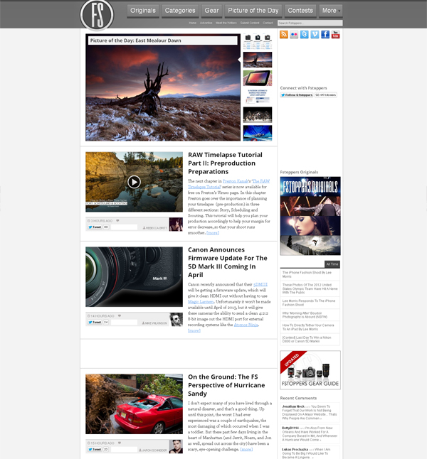
In 2012, Fstoppers looked almost the same as today, except shadows and textures used to show that the blog details are volume, not flat.
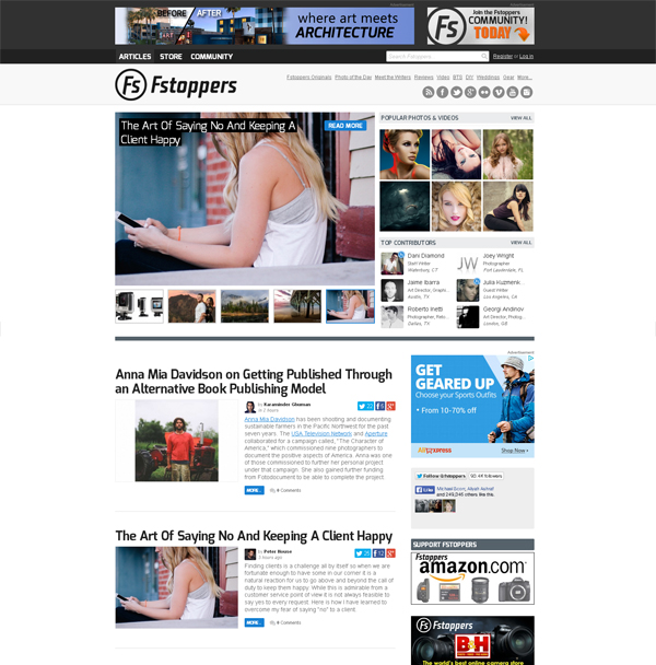
In 2014, they kept the whole concept, just made the design cleaner and more minimalistic. It became attractive and more readable.
Digital Photography School
Digital Photography School is a leading photography blog, one of the most influential and with a huge following across social media. It helps digital camera owners to get the most of their devices.
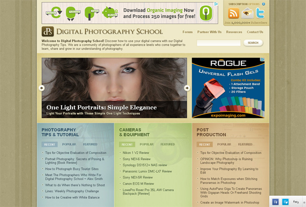
DPS as an old blog has changed for a lot of times. This heavy design was there in 2012 and seemed to be really trendy. It had a big image slider on the top and blog sections divided by colors.
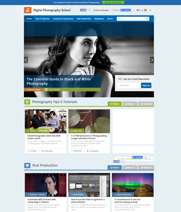
After the redesign in 2014, DPS rocks! The design is clean, simple, and intuitive. You may navigate the site using the header slider which became bigger this time or scroll down to see the sections. Color scheme is pleasant and eye-catchy.
The Photo Argus
The Photo Argus is another old blog that was founded in 2009. It provides useful information, tips, techniques, and inspiration for photographers.
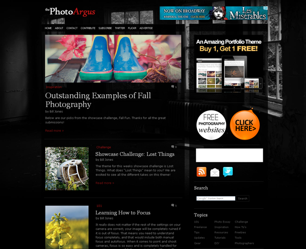
That’s how TPA looked like in 2012. It had black and white background image and dark color palette. The text was hardly readable on the black substrate.
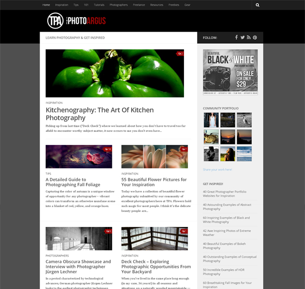
In 2014, the design was changed. The substrate turned white that eases readability a lot. The headings and wording became bigger along with images.
Photography Blogger
Photography Blogger is a creative photography journal that shares inspiration and tips.
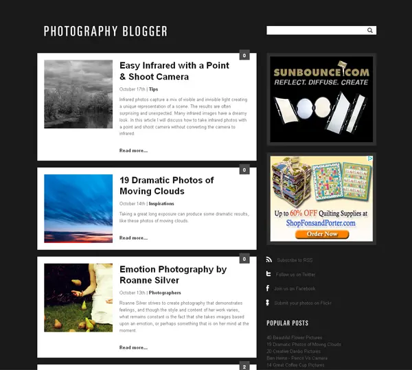
In 2011 each article in the content zone was included into a separate block with text snippet and image.
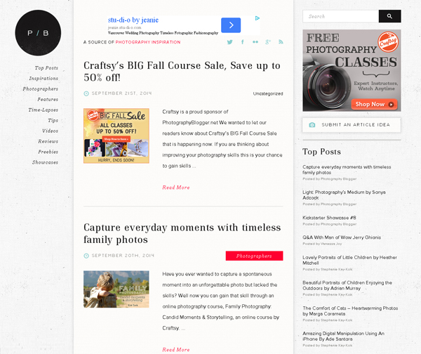
In 2014, Photography Blogger looks gorgeous with its clean light elegant design. Red buttons showing the article section gives some special glow to the site.
Top 5 Tools to Build a Modern Photography Blog
Defrozo (I also happen to work with them) is a free platform for photographers that enables you to easily create and manage both your online portfolio and photography blog.
Format is an easy-to-use website builder with clean customizable themes. It's great for showcasing photography works.
Zenfolio is a giant in digital marketing for photographers. They have an impressive amount of cool features, including blogging, portfolio, photo proofing, photo books, and many more.
Koken.ME is a content managing system specifically made to showcase works of photographers, designers, illustrators and other creatives. It’s a self-hosted solution so you need to be tech-savvy in order to use it.
For only $139 you’ll get a sleek website template powered by MotoCMS. It includes drag and drop website builder, social sharing tools, shopping cart widget and a lot of other stuff to fit in any your needs.
Conclusion
Thanks to Wayback Machine we can take a glimpse into the past and see how some websites looked a few years ago. The services contains 430 billion web pages so you can do the same with your favorite website.
The analysis showed that all popular blogs try their best to keep up with the times. Of course, a good design could cost money, but it's worth it. An up-to-date design tells the users that the blogger cares about the blog. It could convert to more traffic and sales. Feel free to join the discussion in the comment section below.



1 Comment
Incredible info and very inspiring.
Thanx
Harry