Composition is one of the most important skill areas of photography. Of course, some may argue that it is the camera, while others would say it is light. But when looking at it closely, photographic art seems to rely mostly on composition and how elements interact inside a frame. Think about this: the technical side of photography, which covers the camera, lighting, post-processing, and the techniques used in specific genres of photography, is all about how well one is able to make elements work together – which is what composition is all about.
What Constitutes Composition?
When you learn more about your camera, you learn how to use settings and techniques like long exposures, depth of field, white balance, and the right exposure – these affect sharpness, blur, tones and color which are all elements of composition. Lighting affects tone and color. Post processing is also about enhancing the elements of design and composition – making the colors and tones look better, making the lines work well in the frame, removing elements that are distracting, and so on. Specific photography genres like portraiture and fashion are particular about posing which is actually all about form and balance – two things that are covered in composition. Similar observations can be made with the other genres.

This allows us to conclude that the technical side of the photographic process seem to point to composition. Therefore, limiting your knowledge of composition to the rule of thirds, fill the frame, leading lines, and the golden spiral will allow you to miss out on the abundance of other rules or guides that composition has to offer. Most of these rules, are in fact, unnamed, simply because composition is actually intuitive rather than technical in nature. You may already be using some of these rules unconsciously but the awareness of these rules will help you create better images.
To add a bit more to your knowledge, here are three composition rules that you probably have never heard of before:
1. Rule of Isolation
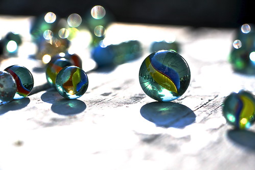
Composition has many objectives. One of its major objectives is to highlight a subject – to make your main element stand out. There are different ways to do this. One of the ways to emphasize a subject is by means of isolation. In psychology, isolation means having no contact with other people. Therefore, isolation in art is setting an element apart from the rest of the other elements. Since photography is visual art, the way to show isolation visually is by having the reference. Having an element occupy a space in the frame on its own while other elements in a group exists in another area will show isolation. Take a look sharpest marbles in the photo below. You just know that the one on the right is the main element even if some of the other marbles are also following the rule of thirds. This is because the ones in the left are in a group while the one on the right is isolated in distance and size. There is a certain attraction that draws the eye to an isolated element compared to elements in a group.

2. Rule of Contrast
Contrast creates emphasis. Do you know that your eye is drawn towards the highest area of contrast in an image? If you want to draw attention a specific subject or element, try moving it to the area of highest contrast. You can do this by moving your subject to create high contrast or changing positions until your perspective forces your element to be on the highest area of contrast or at least near it. In the same way, if you want to deemphasize attention, draw an element closer towards a low contrast area. The idea is to make an element blend with other elements or the background to deemphasize it and moving it towards a high contrast area to highlight it.
3. Rule of Sharpness
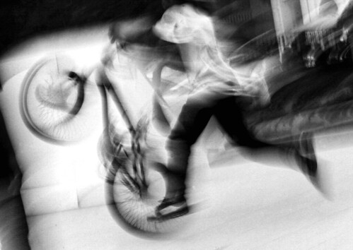
The most obvious conclusion to the rule of sharpness is that your eyes are drawn to the sharpest point of your image. While this is true, there are parameters to follow. The more blur there is in the frame, the more your eyes are attracted to sharpness. This is why a sharp subject against a blurry background makes the subject stand out. Your eyes are drawn towards the sharper part because the overall result is a sharp element in the midst of a blurry image. Techniques like wide depth of field and panning are perfect examples of this condition. With panning, even if the subject isn't too sharp, the relative blur created by background makes the subject look sharper.
The not so obvious conclusion of the rule of sharpness is that the more sharpness there is in an image, the more your eye is attracted to blur if it exists. Although eyes are attracted to sharpness more than blur in general, when the overall result of an image shows sharpness and a smaller area yet obvious blur, the blurry area becomes more attention grabbing than the sharper ones. This is why long exposure photography emphasizing motion blur works. While everything looks tack sharp and still, your eyes are attracted to the blur.
Try editing a close-up portrait of a person where everything is sharp and obviously blur out part of head like the ears or the nose. Ask anyone to evaluate your image. It is highly possible that the person will immediately notice the blur instead of the eyes which are usually always first to be noticed.
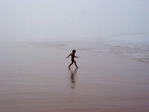
Now that you know these three rules, let me leave you with one final note. Like the other known rules of composition, these rules are not meant to be a standalone guides. In fact, when looking at a photograph, you may find numerous rules in a single image. Take a look at the other photographs in this article and see which of the rules you can identify.


6 Comments
Thank you for this. This is definitely for me, who broke the rules of thirds, you said, haha. Best lucks to you.
That’s cool! 🙂 Most welcome
Clever! I especially like the Rule of Isolation. Its something I do as a Photographer, without thinking. This rule relatively applies to many areas of photography, I think.
Refreshingly new insight into pictorial composition. Very interesting!
Like Eddie, I also enjoy the thought of the “rule of isolation.” This can be compared to intention use of negative space. No mater how you see it, those lone subjects make for great shots. Thanks for the read.
all of these are nuances of the main three; rule of thirds, leading lines and fill the frame. The marbles pic is technically not isolation because the smaller marble to the left is in focus too causing confused concentration of the eye going back and forth to both marbles.