Here is something that you may, or may not, think about in your photography.
I think about it constantly, when I’m creating photographs, and there is a valid reason why.
For thirty years, I was a professional commercial photographer.
It was different being a commercial photographer, (from what most of you will likely experience), because I was often given a concept from an art director, and while that concept was open to interpretation, the resulting photograph had to successfully meet the objective of the art director’s original idea.
So, going back to my opening statement… Here is what you may, or may not, be thinking about in your own photography.
You should develop a plan for your photographs.
What kind of a plan should you develop?
You should develop a composition plan and a story plan. The story plan communicates a message, and the composition plan provides viewers of your photography with a roadmap through your images.
This doesn’t mean that you should always have a huge psychological thing toiling around in your mind before you snap the shutter.
A simple idea is what I am talking about. I’ll show you what I mean in a minute.
The idea of making a plan is important, because it will guide you toward creating more dramatic photographs- that willlikely resonate with more people than not, because there is a bona fide reason for that photograph to exist.
Planning is good for any photograph. However, today we are going to focus on black & white photography.
In our discussion-
- We will discuss what the original plan was at the moment of taking the photograph.
- We will talk about how the post-processing conversion to black & white affected the original plan
- Finally, we will analyze the end results.
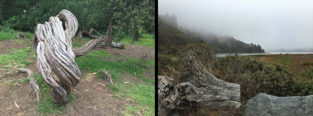
These two photographs are my test subjects for you. They have several things in common.
- They were both taken in locations where I had limited time to create photographs (a family vacation).
- The weather wasn’t favorable for photography (not great light to work with).
- In both cases, I recognized two elements that were the start of my “plan” (texture and shapes).
- Based on those two elements, my plan developed, and I decided right then and there that I wanted these two images to become black and white photographs.
I had the beginning of a plan.
These photographs were going to be black & white. The second stage of my plan was the composition. I will now outline that stage for you.
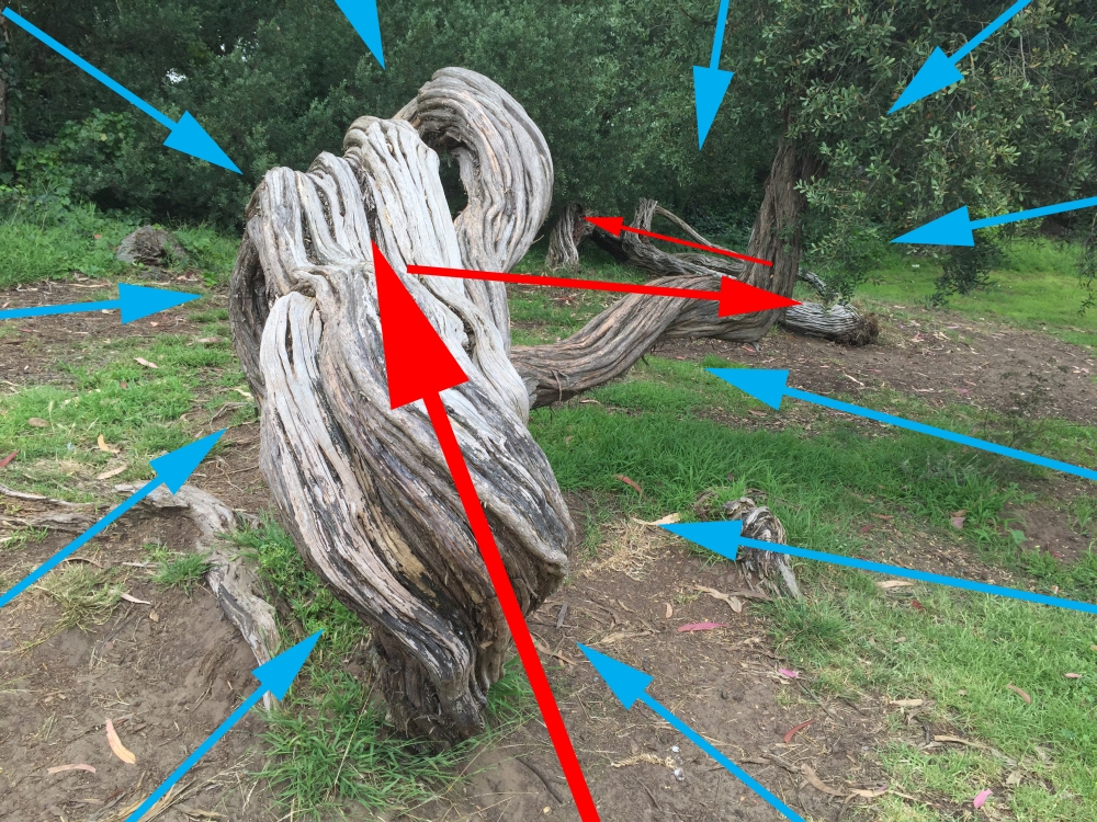
For this photograph, I wanted to go for an effect like an Ansel Adams, or an Edward Weston, picture. I wanted to highlight the shape and the texture of the gnarled tree, and make that the “subject” of the photograph versus a simple traditional landscape shot.
The red arrows indicate how I wanted a viewer’s eyes to travel through my photograph (the composition). The blue arrows indicate that in my post-production, I was going to force a viewer’s eyes inward toward the tree and minimize the surrounding areas.
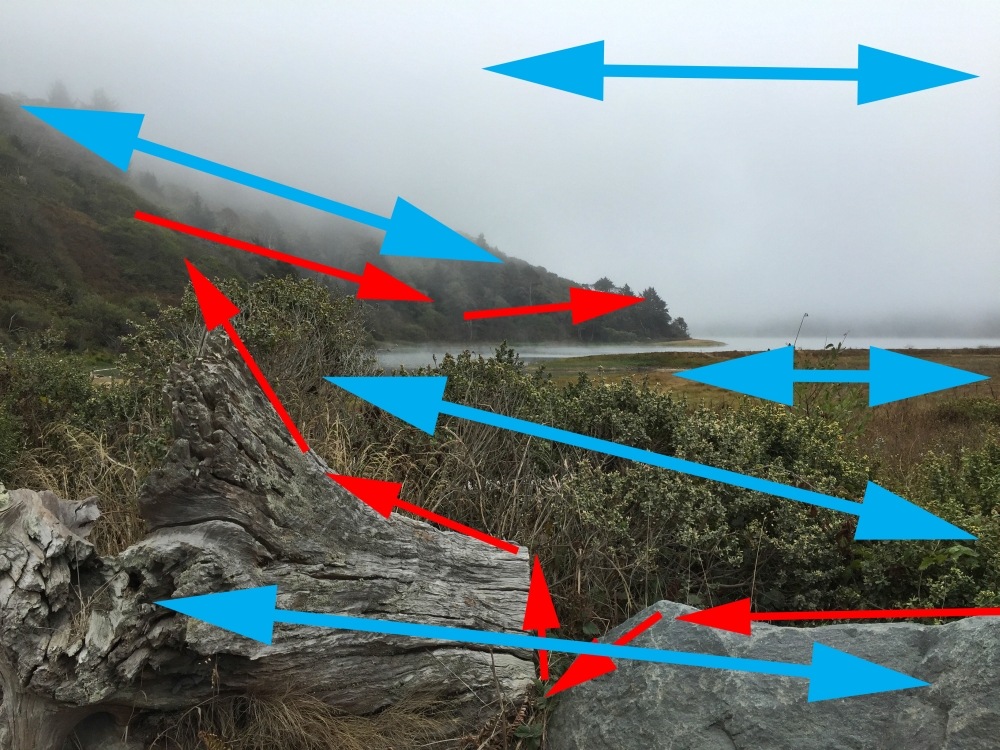
In the second photograph, the red arrows indicate the path that I wanted a viewer’s eyes to travel through the photo, and then ultimately come to rest on that point of land where the dark conifer trees meet the water. There were some natural shapes that I felt would help my cause, including the outline of the rock and log.
Part of my immediate plan, when I saw this scene, was using the tool of composition called “planes”. Each blue arrow indicates a separate plane within the composition. Using “planes” helps to establish depth in a photograph. This is particularly useful when you don’t have leading lines or other easily used methods of incorporating depth perception.
Unfortunately, the natural light did nothing to help my cause in this situation (using the concept of planes). I had to rely on the black & white conversion process, as well as some fundamental editing, to “finalize my plan”.
When converting a digital file to black & white there are three primary considerations: brightness, contrast, and tonality conversion (how a color will turn into a tone).
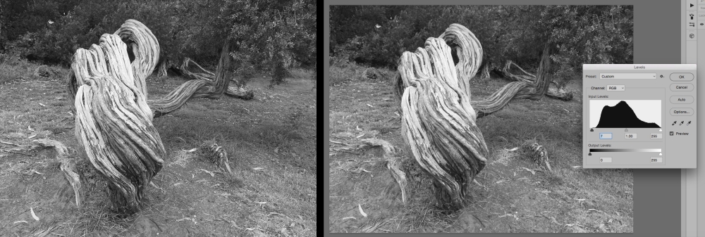
The photograph above is a standard black & white conversion with no colored filters (adding a colored filter alters the conversion process). On the right you can see the Histogram for this conversion. On the face of it, the Histogram would indicate that this is a good conversion. However, it doesn’t meet my plan. The gnarled tree disappears into the background.
There are five colored filters that will affect tonal conversion when changing your color image into a black & white image. These colored filters are red, orange, yellow, green, & blue.
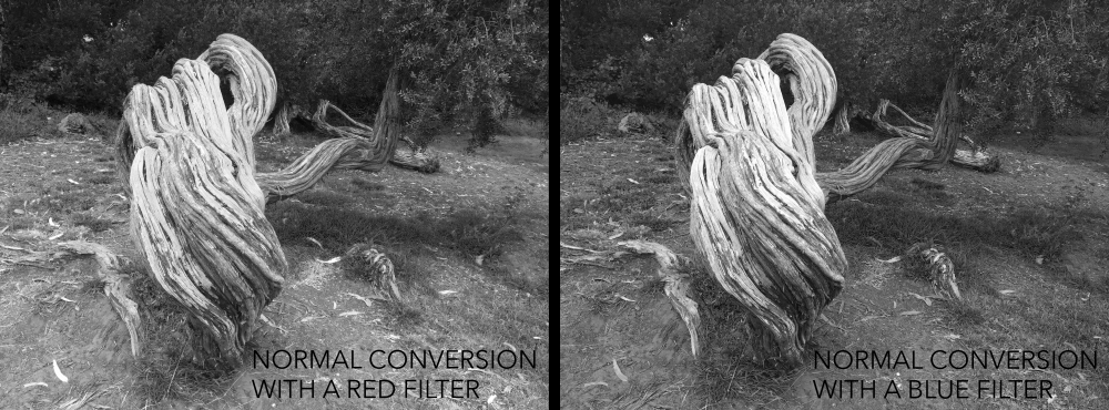
After playing with all 5 filter options- I decided that either the red or blue filters got me the closest to my plan, the plan being to make the gnarled tree standout from the background.
In the end, I decided to go with the blue filter conversion.
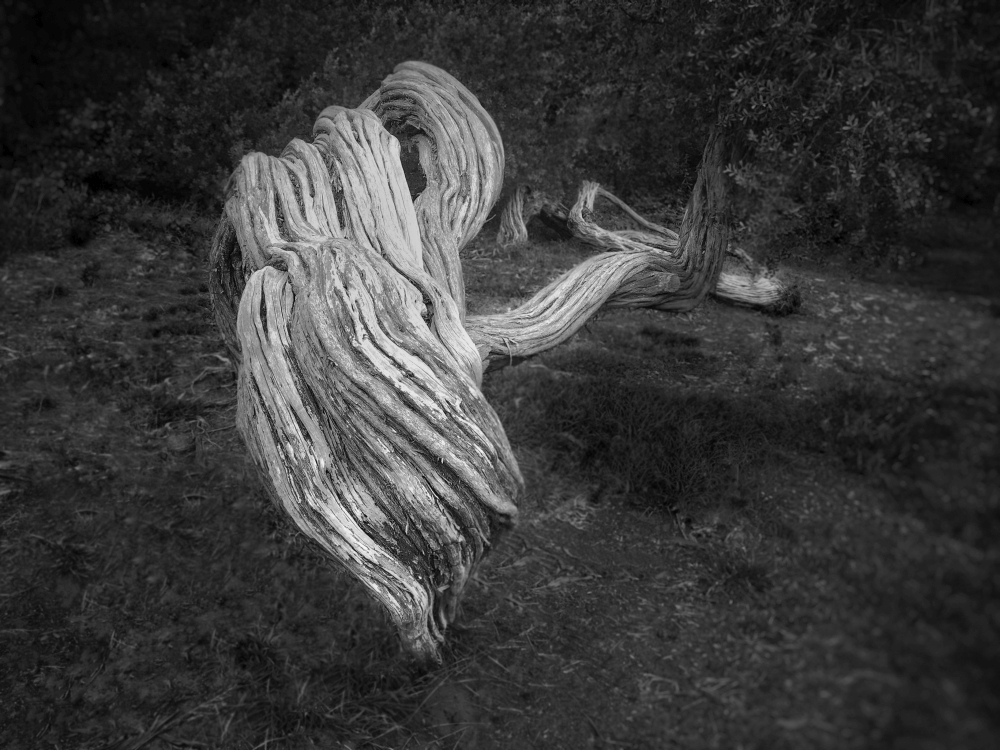
The photograph (above) is my final black and white conversion. I used a blue filter conversion, (it brought my image the closest to my plan), and then I used fundamental editing techniques, (primarily with the adjustment brush) to bring my plan to life. The gnarled tree is now clearly the focus of the shot.
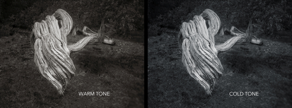
When converting to black and white, don’t forget about the possibility of adding a “tone” and making your photograph into a “toned monochrome” image. It might be just the perfect touch toward completing your plan.
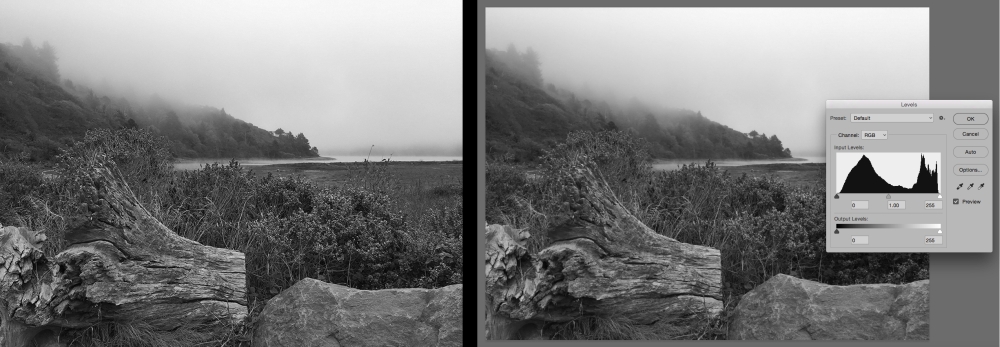
The second photograph is going to be a little more difficult to achieve my plan. There are three main reasons for this.
- The natural light was absolutely flat with no direction and very little specular quality.
- The color tones were very similar throughout the entire image.
- The composition is more complicated than the previous example.
This photograph is going to require careful consideration in the conversion process, and then some fundamental editing steps to bring the shot to life. If you look at the Histogram on the right, once again you can see that it (outwardly) looks pretty good. There is no clipping at either end of the scale, and there is a full range of tones presented.
However, the image is flat and doesn’t meet my visual plan for this photograph.

I played around with a number of different combinations with each of the following: brightness, contrast, and colored filters. For the sake of space, I’m not showing you all of the combinations. I picked three to demonstrate how vastly your image can change by just changing these three elements. This is why a plan is important. It keeps your decision making on track.
After some debate, I decided to make the conversion with the “High Contrast with an Orange Filter” option (center above).
This option got me the “closest” to my visual plan. There was still quite a bit of work that needed to be done. However, I now had a good “base” to begin with.
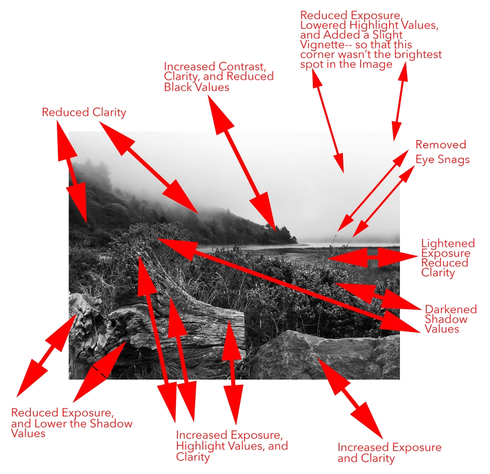
The image above shows you the extensive fundamental editing steps that were taken to bring my plan to life. The purpose of all those steps was threefold.
- Make each “plane” standout from the ones next to it.
- Create a visual path that starts with the rock, moves to the log, and then follows the tree line down to the point of land- where the path stops.
- Remove any obstacles that were a detour for the eyes (off of my intended path).
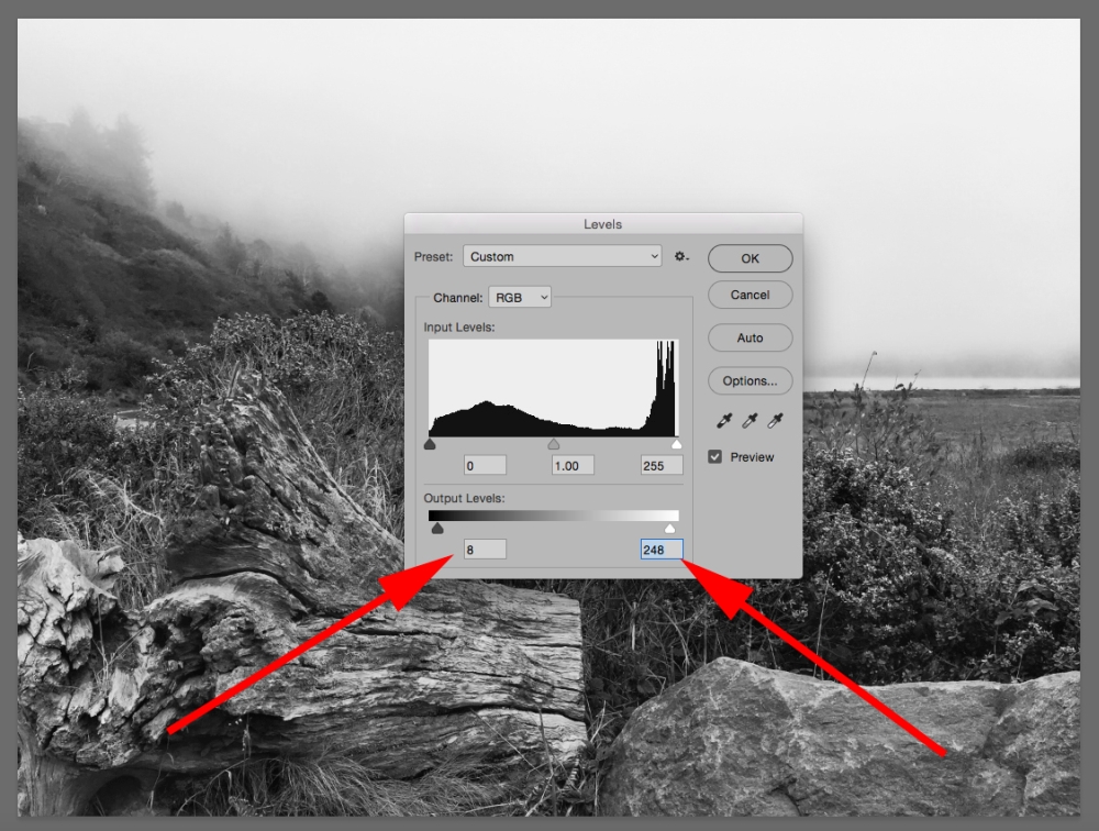
The last step in achieving beautiful black and white print quality is to set your black point and white point. Every photographer has their own feelings about what these settings should be.
Many photographers believe that the black point should be 0 and the white point should be 255. Those numbers indicate pure black and pure white.
After years of running the production facility for a portrait studio chain- I disagree with that. I always set my black point to 8 and my white point to 248. These settings provide a deep black and a vibrant white without becoming washed out or inky on either end of the tonal scale.
Here is the final image after working the shot to match my initial visual plan.
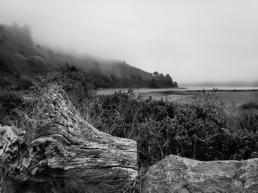
As you can see (above), my conversion of the color file, along with the fundamental editing steps completed afterwards retained the basic concept of the image (as it was taken).
However, because I had a visual plan, my composition has improved. On top of that, the image has a better balance of contrast and tone.
As a final step ina black and white conversion (or for that matter- fundamental editing on a color image file) it’s always a good idea to go back check for clipping, out of gamut colors (if working in color), and the Histogram overall.
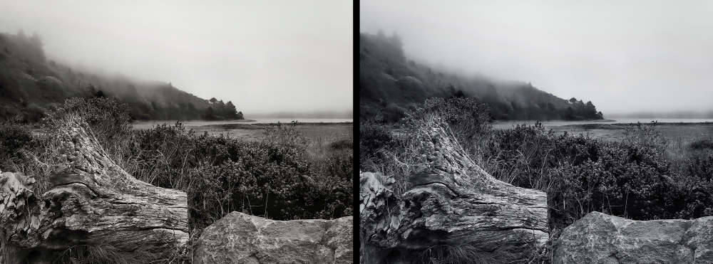
As with the first photograph used in this blog post- I once again looked at the image with a warm and cold tone.
With the first image I preferred the warm tone. With the second image, I preferred the cold tone. Again, I had a visual plan, and that makes it easier to make these final decisions.
If you would like to know more about how to get the most out of your conversions to a black and white photograph- check out the Photzy publication, “Better Black and White”.


2 Comments
Your comments generally apply to ALL photography, Kent – not merely to black and white.
You’re right. However, the examples were black and white… so I gave it a theme in that direction. Cheers.