Many aspiring photographers try to achieve that cinematic look, but they can’t quite get it. I hope to change that, since the process isn’t that hard. It just requires some understanding of what color grading is, and how to do it properly. Add a cinematic crop ratio of 21:9 and some smart framing, and you are all set.
Why 21:9 Instead Of 16:9?
Well, regular widescreen monitors are 16:9, but if you haven’t noticed yet, movies are even wider. If you play any movie on your widescreen monitor you’ll see that it will have black bars on the top and bottom of the frame. These wouldn’t exist if the monitor you had was 21:9 aspect ratio.
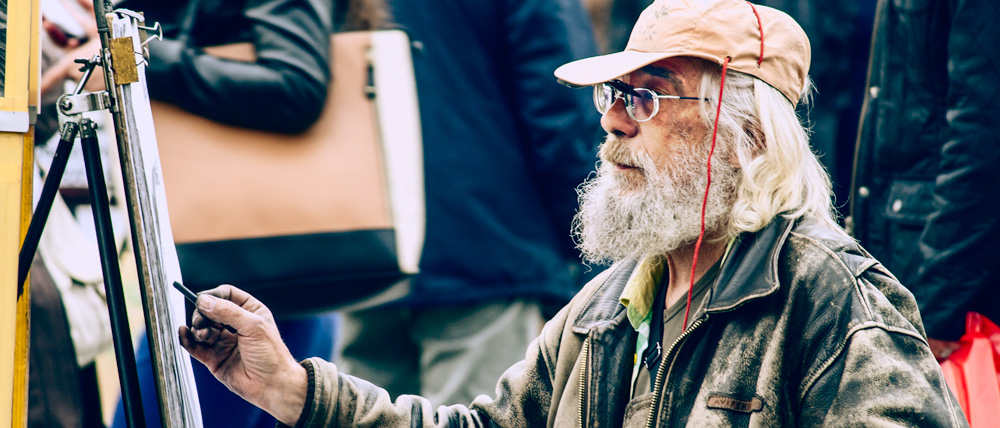
Cropping your image to that ratio instantly reminds the brain that the movies are like that too, getting you closer to the effect that is desired.
Color Grading
The idea is to use complementary colors to either highlight or tone down certain elements of the shot, while using contrast to guide the eye to the important parts. As you might have noticed by now, many movies have a greenish tint to the darker areas, that sometimes shifts towards blue. The idea behind this is that you use the skin color of the model as a prime color, and you cast the complementary color to the rest of the image.
How Is It done?
Cropping should be pretty straightforward. You can crop the image in Photoshop or in Lightroom. Just set the 21:9 ratio and crop the image accordingly.
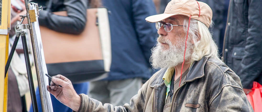
Next, create a curves-adjustment layer and set the blending mode to Luminosity. This way, it will affect just the luminosity, and not the color saturation. Using the Black Point and White Point eyedropper tools on the curves layer, set the black and white point of the image.
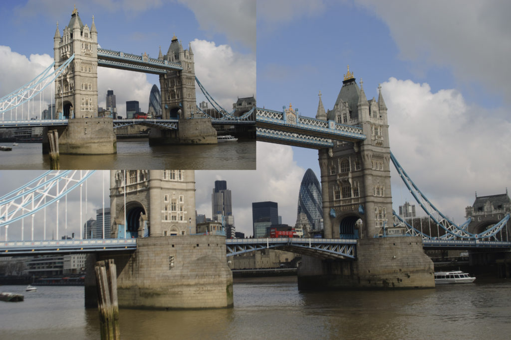
In my example here, I created some contrast and smoothness using another luminosity layer. This is to make the image more appealing to the eye and closer to what a movie contrast would look like.
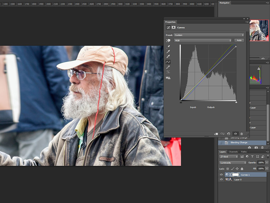
Now it is time to add the color grade, and add another curves-adjustment layer, this time setting the blending mode to Color. With this layer we will affect just the color, without messing with the luminosity. Take the gray point eyedropper and select an area of the image that you know is supposed to be gray. This will set the proper white balance of the image.
Since we have the proper white balance now, it is time to find the complementing color to the skin tone the model has. Using the eyedropper tool set on 31 by 31 average (you can use different sample size), I took the color from the model’s face, and then I did some math to find the exact counterpart.
Each color has RGB values which go up to 255, so we subtract the values from the color selected to get the exact opposite. The color I have selected has R:155, G:131, B:96. This is the saturation on each of the red, green and blue channels. Subtract each value from 255 and you’ll get the opposite color: R:100, G:124, B:159. Plug those values into the color window in Photoshop and you’ll see the resulting color you need.
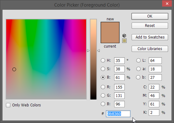
An alternative method is to use www.color.adobe.com. Set the colors to complementary, enter the color hex value of your selected color in the first field, press the small triangle to set it as the base color, and it will do the math for you.
Once we have the color we desire, it is time to apply it with the curves layer.
One important thing to know is how the curves work. I will explain the red channel, for example. The two points that make the diagonal line can be moved (also you can add more points to make it more complex, if you want) in any direction. If you move the top right point towards the left it will add more red color in the highlights, and if you move it down, it will subtract red from the highlights. If you move the bottom left point up, it will add red color to the shadows, and if you move it to the right, it will subtract red color from the shadows. The same goes for the green and blue channels. In manipulating these lines, I need to avoid affecting the midtones (somewhere in the center of the curves where the facial color is in order to keep it intact, while making the shadows and highlights go towards the blue tone we got from the complementary color).
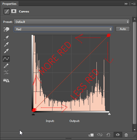
Sadly, this has to be done by eye, and if you were working too much in the image, then you can be visually-biased. The eyes often get used to colors fast and won’t notice that many differences, so if you have been staring at the monitor for 20-30 minutes trying to find the right hue, take a break and rest your eyes.
Once you are finished with the color grading, it is time to add some final touches, like dodging and burning to exaggerate some areas and tone down others. And that would be it – cinematic effect!



4 Comments
Hi Dzvonko, I got lost in the last two paragraphes (and I know what curves do). My subject sits in the shade and the RGB value was 87/69/59 using the 255 minus conversion. This turns into 168/186/196 which is a dirty kind of blue green. So I guess I don’t try to make the subject look blue…? I can’t hardly move my colour curve that dramatic. Can you please help me out and explain how to apply this colour match to the colour curve? And what to apply it to? E.g. does the spot I measured need to be changed to the now colour…? Sorry, just a bit lost here.
similar confusion as claudia. kindly explain the colour blend mode curves layer and the skin tone connection
I think as the author says, you find the colour you are wanting to achieve, then use the separate channels in the curves adjustment to reproduce that colour by eye in the shadows.
explanation doesn’t make sense – if you calculate the complimentary colour why do you need the set the curve by eye – don’t understand what adjustment is made to the curve{s)