Last few years web technologies have made a huge leap ahead. We have witnessed birth and death of new browsers; web standards got higher, and web enabled mobile devices appeared. Heavy Flash-based websites have fallen into oblivion, giving way to HTML5 and JavaScript to make user’s web experience more efficient and enjoyable. These days the web encompasses aesthetically pleasant design along with efficient functionality.
In today's world websites play bigger part than a practical communication. They are supposed to drive attention, traffic and sales, especially in photography business. Fortunately for photographers, along with the development of the web, a lot of new opportunities have come into scene. For instance, a few years ago we could not even imagine a system that will allow us to create a functional nice websites without knowing how to code, but today it’s reality. In this article I’m going to determinate the top web design trends of this year and show how they can be useful for photography websites.
1. Flat Design
I’m pretty sure you’re bound to hear this term many times this year. For those, who are still not familiar with flat design let me clarify it. Earlier there were a lot of shadows, 3D techniques, and embossed typography on sites all over the web.
Flat designs appeared as a way to simplify websites’ look by getting rid of all the elements which made objects appear jump off a web page. Flat design is sleek interface with simple clean appearance that is focused on important content, and of course, images.
2. Focus on Mobile
The rapid growth of technologies led to a huge number of smartphones and tablets enabled to browse the web. These days 30-35% of all your website visitors are using mobile devices, as it turns out people tend to use the gadget which is more suitable either at this very moment or in any other case, which is the gadget in their pocket.
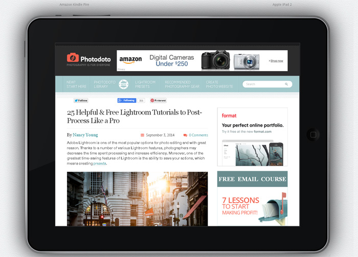
Unlike complicated design in full-size desktop version, in mobile design the number of text added in content blocks is limited. The main benefit of this approach is that your mobile website version looks cleaner, communication becomes more efficient, and in combination with flat design, it could help to bring focus back to your precious images. The best option for mobiles is responsive design that adapts to any screen extension without losing quality of text and images.
3. Full-Size Photo Background
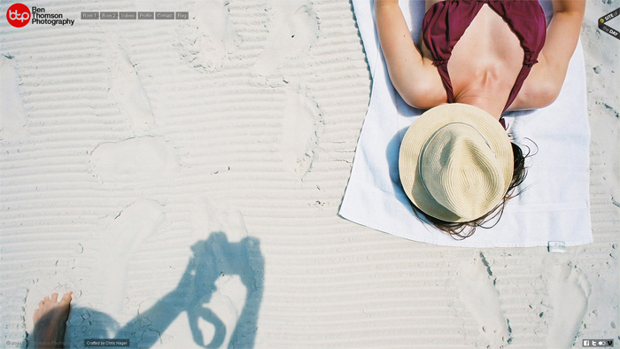
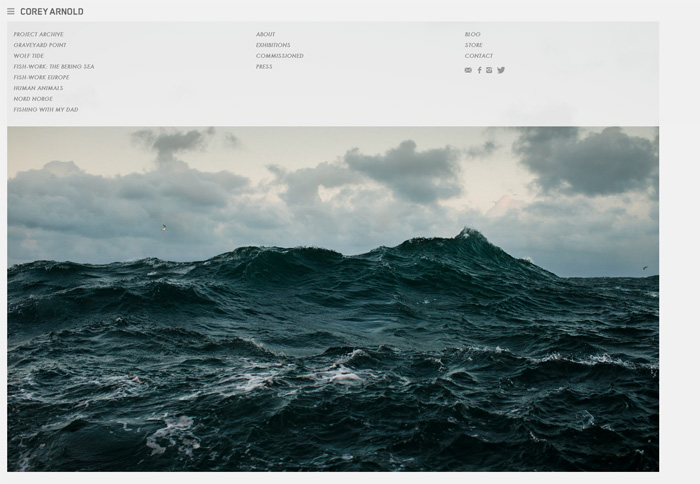
More and more photographers understand the magic of full-size large photos placed on the background. Especially often the photo background is used on homepage. Wide-screen slideshows are also becoming popular. The main image is aimed to create the whole website atmosphere and make great first impression.
Along with still-frame images, full-size homepage videos are becoming a great alternative for the text. You may place your promo photography video there, if you have one. The web world is moving to visual galleries and online stories, and the ability to share out your works in more interesting way means greater appreciation, and as a result, bigger sales and sessions.
4. Custom-Made Photo Galleries
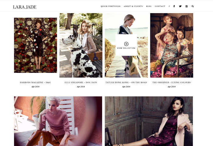
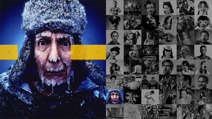
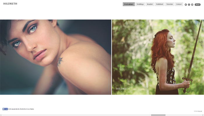
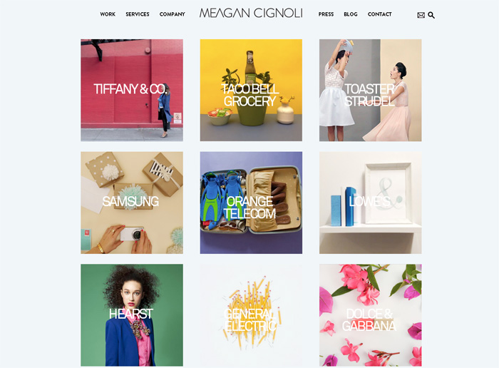
This year new ways of displaying images in galleries turned up, such as photo stripes and grids. The grid layout is one of the best option for photographers, as it gives the opportunity to a viewer to see all the works at once and open each one in a pop-up window.
Photo stripes is also a great variant as it creates a visual scrolling story in your gallery. As images are put right up against each other – you can be creative and play around with contrast and colors of the images to make the gallery even more pleasing. The constant uploading of the newest photos to the gallery increase chances that your visitors will come back.
5. Slide-Out Menus
Slide-out menus allow you to view the website content crisply and without distractions. A slide out menu could be toggled from the top or side of your screen to leave the rest of the page’s content in a seamless way that does not interrupt your browsing experience. It’s minimalistic and simple.
This year slide-out menus are hidden under the hamburger icon which symbolizes menu list itself. It is used to save space on the screen. For instance, if you have a full-size photo background, a small hamburger icon in the corner of the page would not be a hindrance.
6. Scrolling
Earlier, sites were built with complicated navigation trees which segmented each part of the content into separate pages. This way required a user to search for information and wait for a lot of pages to load. Luckily, clever web developers found out a new approach to the issue. Multiple pages loading is now replaced with a single-page layout. Content is differentiated there with typography and colors while a viewer is scrolling down.
Moreover, infinite scroll with endless well of information appeared. You may see this kind of scrolling on new Flickr site, on Pinterest, Facebook, and a lot of other sites with a huge amount of information. Previously, users were supposed to flip page by page to seek for information or images, infinite scroll needs justs scrolling and that’s it. But this approach has its disadvantages, – it would be difficult to get back to the top of the page (if there is no top back button).
7. Unique Fonts
These days photographers are able to choose from a wide variety of fonts to use for displaying their content. They do not have to figure out how to code or mess around with licences. In past we were limited to standard fonts, such as Times New Roman, Verdana and Arial that didn’t give your imagination a chance.
Thanks to Google who came up with Google Fonts, you have an option to choose from a huge number of typefaces.
Free Tools and Resources
1. Client Photo Galleries by Defrozo. Defrozo is an all-in-one platform that helps photographers to better organize and market their business online, as well as to save money with their feature-packed free plan. Moreover, they have a feature to create free websites for clients to share images.
2. Free WordPress Themes 2014. Here you’ll find brand new free themes for WordPress. I think, WordPress is one of the best and most popular website builders of all the times.
3. Google Fonts. Here you may see the number of fonts from Google you can use for your site for free. You can see all the typefaces and their variations.
4. Mobilest Me. This cool tool allows you to check how your site would look like on any mobile device starting from iPhone and iPad to old Motorola smartphones.
Conclusion
The new web design trends appear constantly and it’s really difficult to keep up with them. These design options just give you an extra room for creativity. But the main thing is to have all you need on the site you own (or made). Trends are the matter of taste. Any feedback is welcome! Feel free to share your thoughts and ideas.



4 Comments
Hi,
What would you consider to be good or the best website providers for photographers to create their own websites.
Regards Alan
Hi Alan,
I like free tools for creating websites, like and . They provide a full pack of features for free and that’s great! My blog is built on WordPress and I love it 🙂
About the free tool, I suggest to have a look at koken.me. I build my website there and I am very satisfied about the way it works and the service they provide.
Hi Nancy, nice review on photography website design. I would love to have my own website showcase my photography better but i got no experience in web designing or how to run it. i have researched on the internet and the rates what this kind of service providers are offering are a bit out of my reach. Anyhow i have found a website Revglue who is offering to redesign my website and also offering to make it monetize so that i can start making money from it and they will take a percentage of my earned revenue as their service charges. I want to ask that if you have any experience in working with such website or service provider because i really want to get their help but not sure if they are legit. You can check what they are offering here affiliate cms web design revglue{dot}com/bespoke . Your help will be greatly appreciated.