Have you ever looked at a really nice photo and felt that something was just not quite right? A feeling that something is jarring but you can’t quite put your finger on it. There is a good chance that the image is visually unbalanced.
Even a good composition can look jarring if some of the elements in it are not balanced. But what is visual balance and how do we create it. Today we are going to delve into its mysteries and hopefully shine a light on this important but underrated compositional element.
What Is Visual Balance?
We might tend to think of visual balance as being the physical elements in our scene but it is so much more than that. It can be defined by color, tones, position, perspective and even concepts. An image that is balanced visually is one where the eye will concentrate on the main subject, but also be aware of other elements in the scene. These other elements will visually complement the subject rather than detract from it. Visual balance is often complementary to other compositional techniques, the rule of thirds, golden spiral leading lines and many others all require the image to be visually balanced.
Symmetry And Asymmetry
These are the two pillars of visual balance. Symmetry, as we know is a well used compositional tool, but if one element of the two halves has greater visual mass than the other, we lose the effect. A classic example of a visually balanced symmetry would be a landscape reflected in a lake. With the lakeshore placed along the horizontal center of the frame, we have a symmetrically balanced image.

Asymmetry is where we use a secondary object to balance our main subject. For example in this shot of the Chain Bridge in Budapest, the main subject is the bridge but rather than place the bridge in the center, symmetrically, it is offset left. It is visually balanced by the beautiful buildings in the background that enhance the shot without detracting from the subject itself.

Physical Balance
Perhaps the most common form of visual balance, this requires us to get the physical elements of our scene working together. In this shot taken in Ghent, Belgium, the main subject is the cityscape along the canal. To balance the image not only have the bridge railings been included in the shot, but also the bicycles to the left. Both of these elements enhance the subject rather than detract from it. If the bikes were not there, the whole image would feel unbalanced, with more visual weight on the left, detracting from our main subject.

In this shot of icebergs in Greenland, the smaller iceberg is visually more appealing than the larger ones. In order to get a good visual balance, I have gone close and wide to the small one, while leaving the larger ones in the background. The smaller berg is clearly the subject yet complimented by the bigger, less significant ones in the background.

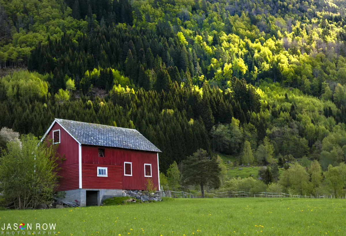
Colour Balance
We can also visually balance our images using color. One way is to use primary colors to contrast each other as can be seen in this shot of a Norwegian barn. We are using the two primary colors, red and green, to create a visual balance, the softer green hues cover much of the image but serve to highlight the red of the barn, bringing our attention to it.
As well as primary, or secondary colors, we can use similar color tones to balance an image. In this shot of an old car in an Odessa courtyard, the subject is complemented and balanced by the yellow of the leaves and the pastel colors of the surrounding buildings.

Light And Shade
Another area where we can strive to balance out images is through the use of light and shade, in other words, tones. In this shot, the shadow cast by the rocks on the water has created not only leading lines but a visual balance between the dark, empty waters and the lighter shades that lead us to the small boat. It is also both symmetrical on the vertical plane and asymmetrical on the horizontal. We can use shade to reduce the significance of visual elements in our shots whilst we use light to highlight them.

Balancing Concepts
Conceptual visual balance can be a tricky thing to understand but perhaps the most obvious example is old and new, ancient and modern. In this example, there are two conceptual balances going on. The ancient St Pauls Cathedral is reflected in the glass of a modern office building, while the tree contrasts the organic with the man-made. There are many examples of balancing concepts in life, once you start to make the connection you will see them everywhere.

Visual balance is a vital, but often overlooked, part of our photographic compositions. Some photographers can see if an image is balanced the moment they look through the viewfinder. For others, it takes practice and time. When you are next out shooting, think about some of the information above and see if your images are visually balanced.
For more on visual balance and advanced composition, see the Advanced Composition Guide over at Photzy


6 Comments
Thanks for explaining a very useful concept in simple words accompanied by very appropriate images.
Regards.
Thanks for you kind comments Ravindra
Love the photos Jason – question: are you right-handed? – because there’s a noticeable bias to one side of the frame.
My reason for saying so might seem awful to others, but I was particularly taken by the photo of the chain bridge in BP – the colours call out to my soul – bleu, blanc, rouge. 🙂
More importantly – this is one of the most interesting and intelligent articles on what is generally referred to as “composition” that I have read in a VERY long time. Thanks for sharing it with everyone.
Thanks Jean Pierre I am glad you liked the article. And yes I am right handed 🙂
I am not a photographer, I am an artist (colored pencil). I have learned a great deal about composition from reading your articles. Thank you so much!
thank you — some very useful pointers on balance.