Photoshop can be a lifesaver or the bane of a visual artist’s existence. While it makes so many things much easier than they ever were before, and even makes some things possible that never were before, it is a tool to be used with delicacy and reverence lest the whole Internet think you’re incompetent.
Upcoming science fiction dystopian film Ready Player One can’t seem to shake the bad press following it all the way to its premier. If you’re like many science fiction fans, you’ve probably read the nostalgia-fest that is Ready Player One and, whether you loved it or not, most will agree it was a worthy entry in a genre that too often values the dark and dreary over the vaguely relatable.
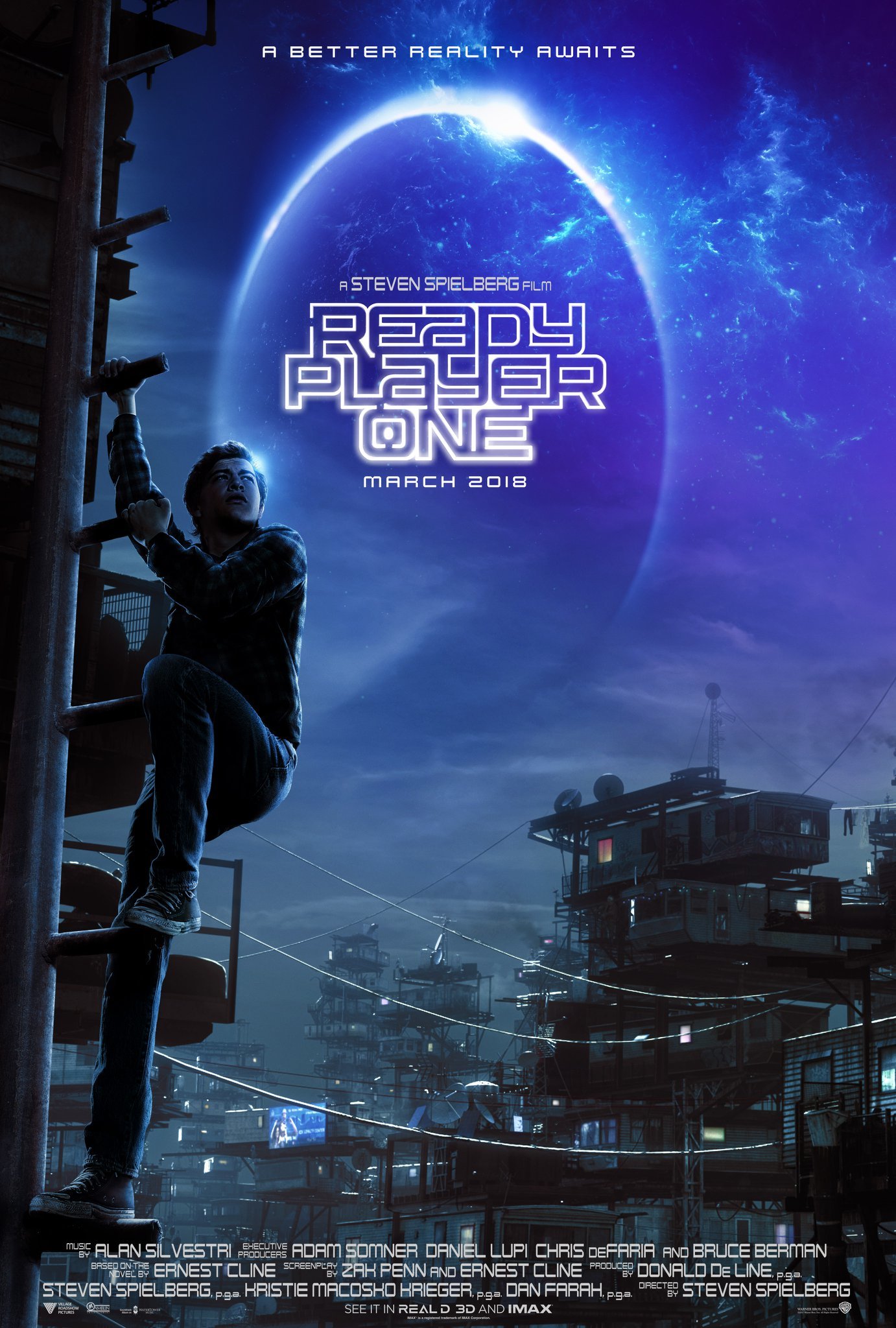
But none of that is the focus of this piece, instead we are going to turn our attention to the promotional materials for Ready Player One, specifically its marketing poster.

The Ready Player One poster caused waves on the Internet when it was released and not because it was some breathtaking work of glory. No, instead the poster demonstrates what many photographers have fallen victim to in their careers using Photoshop: Bad compositing.
Tye, the hero of the movie, is suffering from a horribly distended leg injury on the post, with his right leg extending the length of his entire body.
At least that’s what you would think, right? Well, this is the Internet, where being right is nonexistent and the only tangible goal.
After a lot of sleuthing, experts on Twitter deduced that this is no Photoshopping error and that Tye’s leg is anatomically in proportion with the rest of his body. The image just gives the appearance of something abnormal without anything abnormal actually being present. Ah, the magic of photography!


