Did you know that you can use color contrast to make your photos more interesting and attention-grabbing? You can achieve it only if you understand the basics of color. You need to know what primary and secondary colors are and how that knowledge can help you get a better image. Colors can represent a lot more than you think.
Associating Colors With Emotions
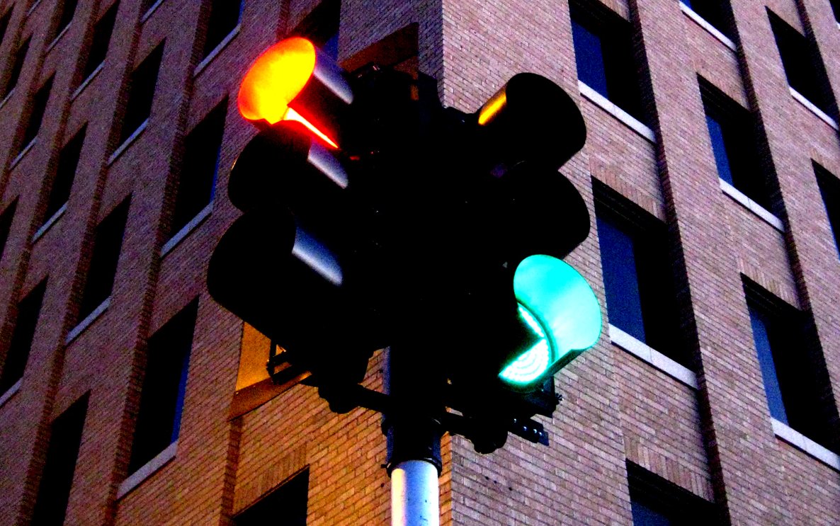
Human evolution has made color crucial when it comes to identifying and differentiating between certain things and their states. For example, take fruit – we can see when it’s ripe based on the color, not shape or size (in most cases). Also, humans have come to appoint attention to critical situations using red color (hence the red street lights, stop signs, warning signs and so on), while green is the color of approval.
Photo by slopjop
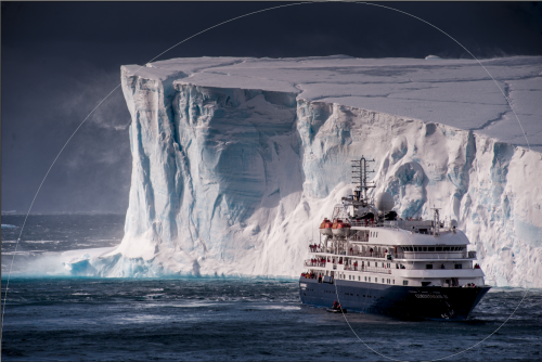
That is why certain colors bring out certain memories and emotions. For example, white is always associated to cleanliness and purity. Green is mostly associated with nature, eco system and life (due to the fact that green is commonly found in plants and young fruit). Red is associated with love, lust, passion – practically affection in general. That is why men find red lipstick so attractive. Blue resembles cold, ice, water and everything connected to lower temperatures (including night since there is lack of light and temperature goes down). Orange is the exact opposite of blue on the color wheel but also with the associated things, since orange resembles warmth, sun, mornings and dawns. Black can tricky because resembles elegance but also darkness (obviously).
Combining Colors
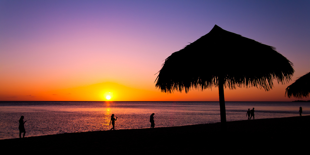
Combining colors brings out different stimuli to the viewer. For instance, combining black and red (often used in selective color photos, monochrome with red accent) indulges passionate yet elegant photos (if used correctly of course). If you are using per se white and green as dominant colors in a photo or illustration you enforce pure nature, that is why you see healthy food commercials being as bright as possible with green food. On the other hand, take some of the most famous sunset or sunrise photos and you’ll see that they both have blue and orange parts in the sky and around the sun, thus enforcing direct comparison between the daily cycle and the way nature works.
Photo by jaumescar
Let's Take an Example
Understanding the way colors correspond to people’s emotions will enable you to use color more appropriately and more efficiently. For example, take the sunset. You could photograph it as it generates light shades of orange that even become white near the sun. Nothing special. However, if you incorporate blue sky during sunset, where the blue hues fade slowly towards the orange then you get much better shot, especially if there are any orange or red clouds. Once you put the colors in context you tell the viewer what is actually going on there.
Even though the sun isn't moving in the picture and the ambient is not changing, you induce the change by presenting both colors and you point out a wider point in time in one place and it almost always looks stunning. You can see these color combination in nature as well. It is better seen at sunrise when the sky is blue and a bit darker the further away it is from the sun which is rising. That is why sunrise is magnificent occurrence, much more preferred than sunset. The notion of having a sky full of different colors is mesmerizing.
Color Contrast for That Extra Punch
Color contrasts can be incorporated in much more than in landscapes involving sunsets and sunrises. They are often seen in portraiture as well, having the makeup artist mix some colors up in order to give contrast from the skin and hair color. Then the photographer does the same with gels and/or background color.
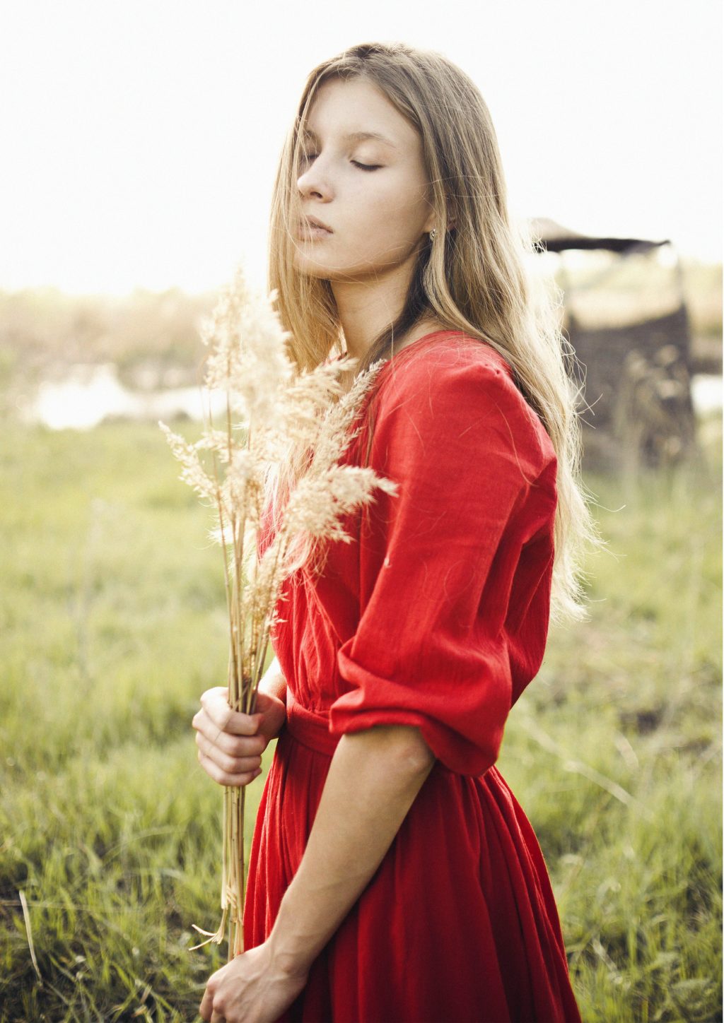
Image by Azamat Zhanisov
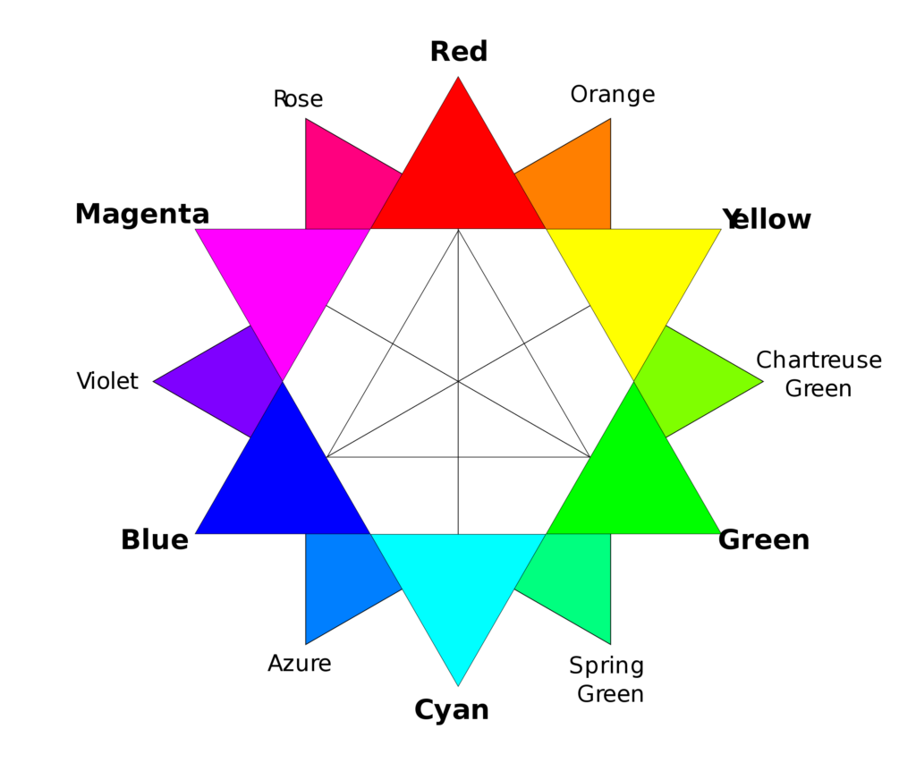
Have in mind that skin has a color too, that has to be appropriate with the other colors you pick. Using the color wheel you can go for contrasts or similar colors but the more you deviate the more the color combination loses meaning and is less effective.
Problem is there is a thin line between using color properly, thus nailing the shot and having bunch of colors mixed up without any context. It has to be done in moderation, as almost everything else in photography. Keeping it simple is the way to go, complementary colors, green, orange and violet or yellow, blue and red.
