The topic of color relationships in photography is somewhat akin to the topic of composition in that there are no set-in-stone rules governing these issues, yet there are plenty of useful guidelines that some photographers like to adhere to. Color relationships are essentially a set of principles or guidelines that serve to provide a deeper insight into how two or more colors interact from an aesthetic point of view, and how those colors — and ultimately a photograph — are perceived by the viewer.
Color is something most of us probably take for granted — with the obvious exception of those who suffer from colorblindness. Simply, color rules our world. While black and white photography certainly has its advantages and is even preferred by many photographers, we don’t generally perceive the world around us in monochrome. It is that color seems natural and normal.
Rather than delve into the expansive and arguably complex topic of color theory, we will just take a brief look at basic color relationships and discover a little bit about how those relationships might impact your photography.
Instead of getting bogged down by talk of primary colors (red, green, and blue) and secondary colors (cyan, magenta, and yellow) and the additive process versus the subtractive process, we can cheat a little bit and use a chart.
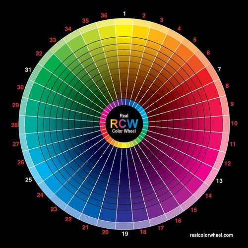
You will see that red, green, and blue occupy roughly opposing thirds of the wheel. Notice how violet (or purple) is situated somewhere between red and blue. This demonstrates that if you combine red and blue, you’ll get violet. Want yellow? Combine red and green. It’s somewhat of an oversimplification, but it illustrates the basic principles of how color reproduction works and the ways in which groups of colors are related to one another.
Complementary Colors
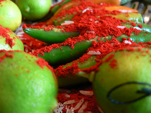
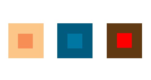
Colors that are positioned opposite of one another are referred to as contrasting or complementary colors.
Contrasting and complementary? Yes, it may sound counterintuitive but, to the eye, contrasting colors tend to look quite good together; they complement one another. In terms of photography, color contrast does more than just provide a pretty color scheme to look at, it also puts greater emphasis on your subject, irrespective of compositional technique, while also creating great overall interest in the whole image.
Split-Complementary Colors
An extension of the complementary color scheme is split-complementary color. This scheme is created by choosing a color and then using the two colors on either side of the original color’s complement.
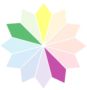
In this example, we start with violet; the color opposite violet on the color wheel (it’s complement) is yellow-green (chartreuse if you prefer). So we use green and yellow, the colors to the left and right of yellow-green, to complete the split-complementary scheme.
Analogous Colors
Also referred to as color harmony, analogous colors are adjacent to one another on the color wheel.
As the term suggests, color harmony helps bring a certain degree of uniformity, flow, and “ease” to an image. Analogous colors are typically perceived as being soothing.
Simultaneous Contrast
Illustrated below, simultaneous contrast is the effect that adjacent color hues have on one another.

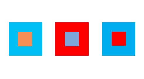
Look at the grey square located in the center of each image. Which one is darker? Neither. They are the identical shade of grey. Here you see the intriguing property of simultaneous contrast. This color scheme (though gray isn't a “true” color and black isn't a color at all, at least for the sake of this discussion — they illustrate the concept well) represents the greatest potential to affect perception, given that we judge colors based on the other colors in our field of view. Placing a dark color next to a light color will cause the dark colors to appear darker and the light colors to appear lighter; the same is also true of hue and saturation. This a wholly perceptual phenomenon, one that we experience rather abstractly; it is not something that can be measured.
By using this technique in your photography, you can create the appearance of having more variety of some kind (luminosity, hue, or saturation) than was truly present in the scene when you originally took the photo.

Photo by Raymond Francisco on Unsplash
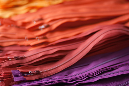
Saturated Color
We would normally think of saturation according to its more technical usage: how “deep” a particular color is. Is it pale or very strong?
In this case, however, saturated color is the dominant presence of one color in a photo. Obviously, it is not an interaction of two or more colors, but a saturated color scheme is yet another method to put your photographic subject front and center. Again, this has nothing to do with composition. It is an alternative approach to uniformity.

Subdued Color
In accord with what the term implies, this color scheme simply turns down the vibrancy or saturation in your photographs. Earlier I made quick mention of black and white photography and its presumed role as an outsider in this discussion. Well, here is where black and white photography gets invited to the party. Remember that a black and white image is one that completely lacks saturation; so, such an image could be considered an extreme example of subdued color. Aside from the extremes, any of the previously mentioned color relationships could be muted as an alternate take on the results provided by analogous color.
Isolated Color
Once again, the name says it all. Isolated color involves a single color standing out amongst another color in a photograph, but not in the domineering manner found in saturated color.
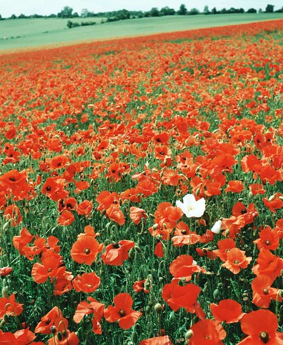
As always it’s all about the subject and how to bring the viewer’s attention to it.
It’s All Up to You
Photography is an art form. Sure, there’s a science to it — light, color, etc. But to become singularly concerned with the science is likely to take a toll on your creativity. The main purpose in learning about color relationships is not to be a photographer that takes photos only when recognizable and agreed upon color schemes present themselves; the purpose is to be more informed, more aware, and in turn, more creative by putting that knowledge to work. There are colors all around us. Learn to see all those colors in a new way and allow them to open up new perspectives in your photography.


1 Comment
very useful information, easier to take in than the usual colour theory.