Knowing how to properly use texture in your images can make a profound difference to your photography. Composition, lighting, and tonal range are all important elements to consider…but by looking at the texture as well you can really ensure that the image you create is a true work of art.
Texture and Tonal Range
When we think of the tonal range, we usually think of black and white images and how the highlights and shadows work together. With that in mind, the texture of your scene can completely change the tonal range of your photo. This is much easier to show than explain (like most things in photography), so let’s look at the photo examples below:
While most of the photo is out of focus, you can see how the raw, uneven texture of the stone walkway increased the tonal range (and thus interest) vastly – just look at the amount of highlights and shadows cast over the coarse texture. If this surface was smooth (such as marble), it would completely change the image.
The image above invokes an entirely different feeling – and a different tonal range. The transition from light to shadow is smooth and gradual.
Note: If you’re not familiar with tonal ranges, read my article on dodging and burning here which not only explains this photography technique, but also how to do it. Make sure you read through the comment section as well since there are some great tips from readers.
Texture and Composition
Texture is much more than highlights and shadows – it’s an important part of your overall image and how it can either work with or against the underlying emotion of your photo. For example, if you’re looking to photograph a rustic cabin in the woods, the most ideal texture would be of a raw, weather-beaten structure instead of one with vinyl siding.
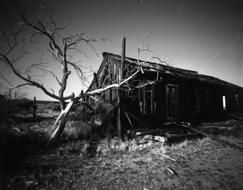
More so recently, we’ve seen weather-beaten backdrops of urban decay used for portrait settings – and quite successfully. While the initial interest is the color and surreal quality to the environment, much of the power comes from the detailed textures. Peeling paint, rusty metal, and other textured elements can play a huge part in your photo.
The portrait above is a high-impact, colorful image where the use of texture proved to be very successful. The deteriorated background was mirrored by the grunge-like texture of the tree, providing a highly complementary environment for the model.
The Weight of Texture
The level of interest texture creates can also affect the balance of your photo. Simply put – the more interest your photo has in a particular area, the more time you’ll spend looking at it. If there are other elements in your photo that you want to stand out, you may need to rethink your composition based on texture (interest).
For example, let’s look at a few different landscape images to see how texture in the sky can affect the balance.
In the first photo above, there is much texture in the sky – the highlights of the sun and detail of the clouds make it a prominent focal point. Although the lighthouse would be the main subject, I knew that the textured sky would weigh heavily, so I cropped it so that it took up 2/3rds of my image.
However, in this image, the smooth texture of the sky doesn’t stand a chance in weight when compared to the foreground waterway. So here, I chose to crop out most of the sky as it would just look unbalanced to have such an unvaried texture taking up a large portion of my image.
Also note how the texture of the sand makes for great interest, especially with the setting sun (the grainy highlights and shadows).
Learning to See in Texture
When choosing your scene, consider how the texture of your image plays into the total equation – that is, will the texture of my environment help or take away from what I want to accomplish? What can I do to improve the texture of my image? How does the light look when it hits a certain texture? Does it make sense to have this texture in my photo?
Of course, there are many things to think of before pressing the shutter button – such as composition, light, tonal range, etc….and this is only when you have the time to make these choices! However, as long as you learn one thing from each shoot – no matter how small – you’ll know that you’re on the path to success with your photography.
Read more great articles by Christopher O’Donnell on his website or follow him on Facebook.


6 Comments
One of my favorite in depth articles on composition yet! You did an amazing job describing texture so vividly and in depth (and supplying great examples). Thanks!
Thanks Chase….glad you enjoyed it.
Excellent article. Texture and light together make for great images.
An image of an old rusty pickup by an old broken down shed which is converted to B&W and a little tint added. Lots of texture in the pickup.
https://www.flickr.com/photos/ken-b-images/4484397955/
A very interesting article and very well illustrated (as usual Mr O’Donnell, your own photographs are beautifully crafted). I’m always drawn to textures when the light is diffuse. In this picture from my blog, http://www.northumberland360.com , direct sunlight would have caused too much contrast between the shadows and the lit surfaces.
https://i592.photobucket.com/albums/tt4/andycraigphotography/Northumberland360/2011/Mar11/200311_01.jpg
NOTE: Please keep embedded images below 500 pixels in width.
I am absolutely in love w your photos!!!!! Thank you for reminding me that there are still beautiful things in this world 🙂
Thanks for sharing a topic not covered often. Your explanation and photos are great.