To a novice photographer, Photoshop can seem daunting with its countless tools. To many experienced photographers, Photoshop’s curves can bring similar feelings of dread, yet for all it’s apparent complexity, curves are not only incredibly powerful but also not as difficult as you might think. Not only can you control exposure and contrast but also color, all using this one tool. Today we are going to have a look at Photoshop curves in layman's terms.
To understand curves, you first need to understand histograms. You often see histograms in your photographic life, they are the graphs that you see on your camera’s LCD and in your post production software. There are some article here on Lightstalking that will give you an in depth look at histograms but just as a refresher let’s take a simplistic look at a histogram.
Histograms and Curves
Imagine your histogram as an exposure bucket. To the left side of the bucket is are all the dark parts of our exposure. To the right are the light parts. If the exposure is spilling out of the left side of the bucket, we are underexposing, conversely if it spills out of the right it is over exposing. To get a correctly exposed image we need to keep all our exposure inside that bucket. Curves can not only help us do that but also control where we want the best part of the exposure to be in our bucket.
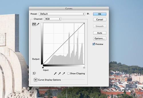
The histogram bunching to the right suggests slight over exposure
Opening the Curves Tool
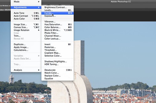
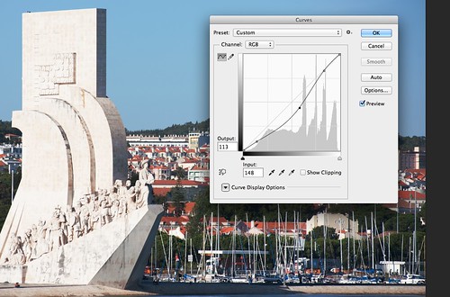
So, let's open an image in Photoshop and then open the curves tool. This is found from the menu Image – Adjustments – Curves. When the tool is open, you will see a histogram representing the exposure of your image with a straight line running through it from bottom left to top right. On the left of the histogram is the output scale and at the bottom the input scale. You will see that overlaying the histogram is a grid. The vertical lines represent, from the left, blacks, shadows, mid-tones, highlights and whites.
Manipulating Curves to Control Exposure and Contrast
To manipulate a curve, you simply click on the area you want to adjust and drag the line up or down. Moving it upwards will lighten that particular part of the tonal range, moving it down will darken it.
If we want to change the overall exposure of an image, we can click somewhere near the mid-tone point. Lifting the graph upwards will lighten the image, dragging it downwards will darken it.
If for example, we want to correct a washed out sky, we can click on the line in the highlights region of the graph then drag it down. You will see as you drag down, our straight line turns to a curve, the highlights become darker, but also so do our shadow areas. To counter this we can click in the shadow areas and drag the line upwards, giving us an S curve. The negative side to this is that we lower the contrast a bit. If we wanted to boost the contrast we can reverse that S curve, that is lower the shadow areas and increase the highlights. The beauty of the curve is that we can still boost contrast and save our blown sky. By increasing the exposure in the area just to the right of the mid-tones and lowering in the shadow areas we boost the contrast but will blow the sky a little. Now if we go to the area to the right of the highlights region close to the edge of the graph we can drag the curve down a little, recovering those lost highlights. It is this almost infinite control that makes curves so powerful.
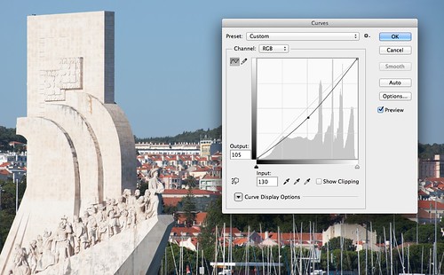
Decreasing exposure by lowering the midtones
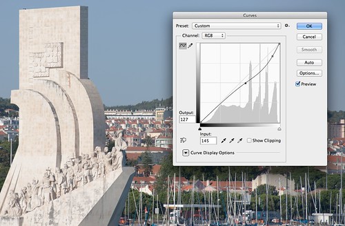
Reducing exposure in the highlights area
Recovering Lost Details Using Curves
Another useful feature of curves is to attempt to recover blown highlights and lost shadows, in other words clipping. As we said the left end of the graph is the dark areas with the left edge being the blacks. If we have lost detail in the blacks we can slide the leftmost edge of the curve line upwards, lightening the absolute black and introducing some detail into the shadows. Depending on your exposure, you might also introduce some noise in the shadows too. The same is true for lost highlights, you may be able to recover at least some of them by clicking the curve line at the very right hand edge of the graph and dragging it down.
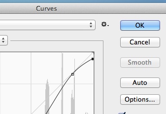
Attempting to recover clipping
Manipulating Color Using Curves
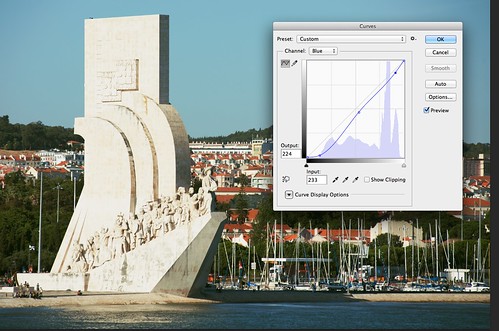
At the top we mentioned that you can also control color using curves. To do this, at the top of the curves window is the channel selector. By default it is set to RGB, in other words it manipulates the Red, Green and Blue channels together and by the same amounts. However by clicking on the drop down box you can choose to create a curve in just a single primary color channel. An example of why you might do this is if you have some blueness in your shadows. To eliminate the excessive blue, you would select the blue channel and drag the curve down near the right end of the graph. You will see the entire image swings blue but to counter this you can select a point between the shadow and mid-tones and drag the curve upwards, restoring the neutrality to the overall color.
Curves are an immensely powerful tool that you can use to control the look of your images. Don’t be afraid to try them and experiment with what they can do and you will soon pick up how they work.


2 Comments
I totally disagree. Levels are much more important than Curves.
If you don’t know how, you should practise with a few layers. Start with approx. 3 layers and merge
Very helpful details here. Thank you.