Have you ever entered a black & white photography contest, and then wondered, as you looked around at your competitors photographs, why does the competition look so awesome and my photo is a bit… you’re not even sure… you just know that your entry doesn’t have the snap and visual power of the competing photographs.
Perhaps, the situation was more like this.
You turned that beach photograph from your last vacation into a black & white image. You were so excited! You loaded it onto Flickr, sat back, and waited for the “likes” to roll in- and nothing happened.
You’re not alone.
The vast majority of today’s photographers are children of the digital age. They didn’t have the benefit of learning black & white photography with film and a darkroom.
The bad news is- there were lessons taught back then that don’t get taught today, and those lessons are key to great black & white photography.
There are any numbers of reasons that can drag the quality of your digital black & white image right down the proverbial drain- with the end result being the kind image that stinks (visually- not olfactory).
Today- I’m going to share with you two of the biggest reasons why that can happen and how to avoid them.
There are just too many other reasons to list all of them here in a blog post- but this will get you started in the right direction toward great black & white photography.
Stinky Issue #1 – The White Point
Do you know what the “White Point” is?
That’s a valid question, because I once worked with a guy who was (supposed) to be a Photoshop Expert (in my local area). I hired him as a “Retoucher” for a chain of portrait studios that I worked for; I managed the production facility. We retouched the photographs and prepared the digital files for printing at the photo lab.
Customers kept returning this employee’s efforts, they were unhappy with the results (and for good reason).
The employee knew the definition of the “White Point”, however he didn’t know how to properly apply it.
That is important to remember… You need to know HOW to apply it.
What is the White Point?
If you look up a definition online, it will be some daunting paragraph similar to this-
A white point (often referred to as reference white or target-white in technical documents) is a set of tristimulus values or chromaticity coordinates that serve to define the color “white” in image capture, encoding, or reproduction. –Wikipedia
I’m going to make it easy for you. It’s absolute white. It’s the whitest white in your photograph. It’s pure white with no detail- at all.
Some photographers out there might grumble about my use of the term, “White Point”, because White Point is an Adobe Photoshop term. Adobe Lightroom doesn’t even address this issue as the “White Point”.
So, let’s get past that, and we’ll just refer to it as “Pure White”.
Let’s look at some examples of Pure White being used properly to produce professional level results, and also improperly, so that we can identify the cause and effect, and thus improve our own results.
First, let’s look at a proper use:
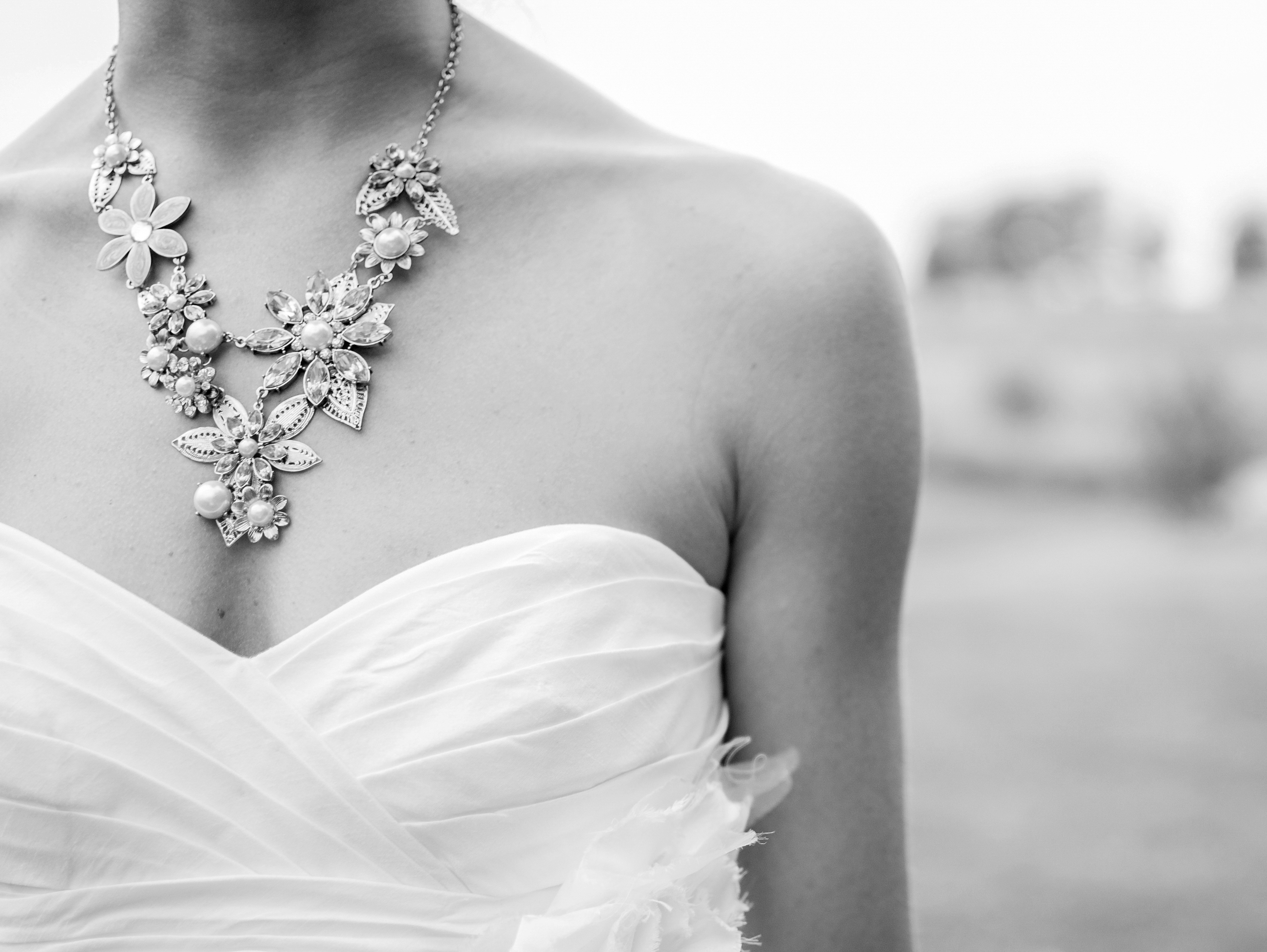
Photograph from Unsplash.
This image is a high key photograph. There are numerous elements within the photograph that one could easily identify as being “white”. It would be easy to an untrained photographer to “misplace” the White Point (Pure White).
When the White Point (Pure White) is properly set- let me show you what you should see.
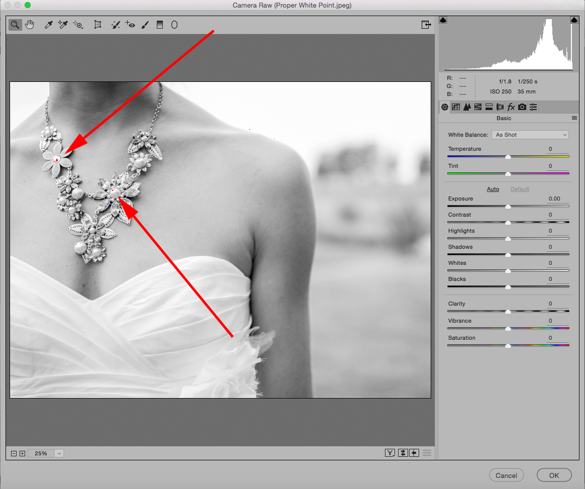
When you look at the image with “Clipping Indicators” turned on (and they should always be turned on), some small, insignificant, (not the main subject), area of the photograph should be showing some clipping. In this case, it’s a few highlights on the jewelry and some tiny spots in the sky.
If that dress is “white”, (and it is)… Why wouldn’t we want “Pure White” in that spot?
Let me show you why…
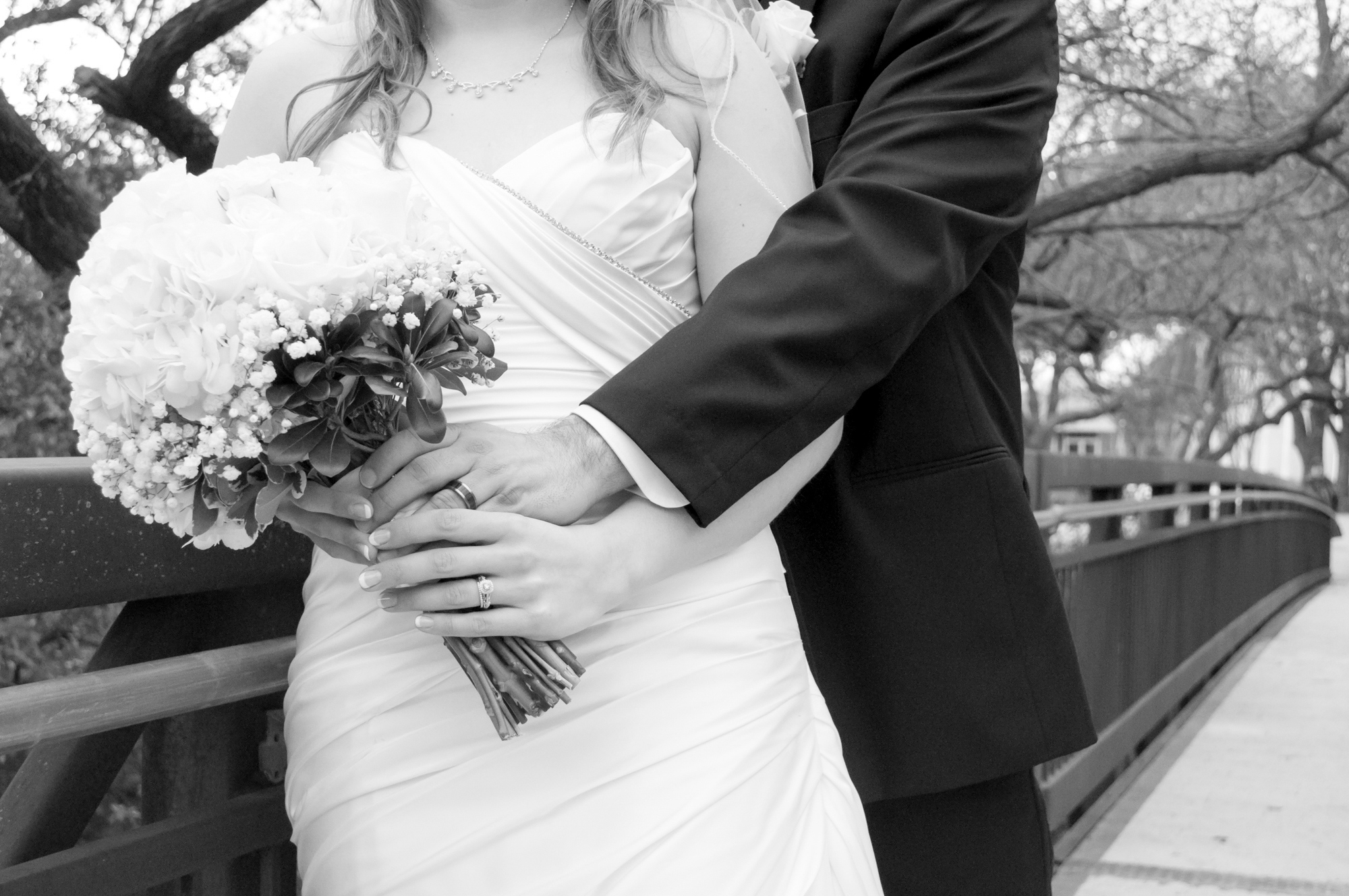
Photograph from Pexels.
An improperly set White Point (Pure White) results in lost detail in the highlight end of the tonal scale.
Look at the top of the flowers and the top of the dress. All detail has been lost there. This White Point (Pure White) was improperly set.
Let me show you what that looks like with the Clipping Indicators.
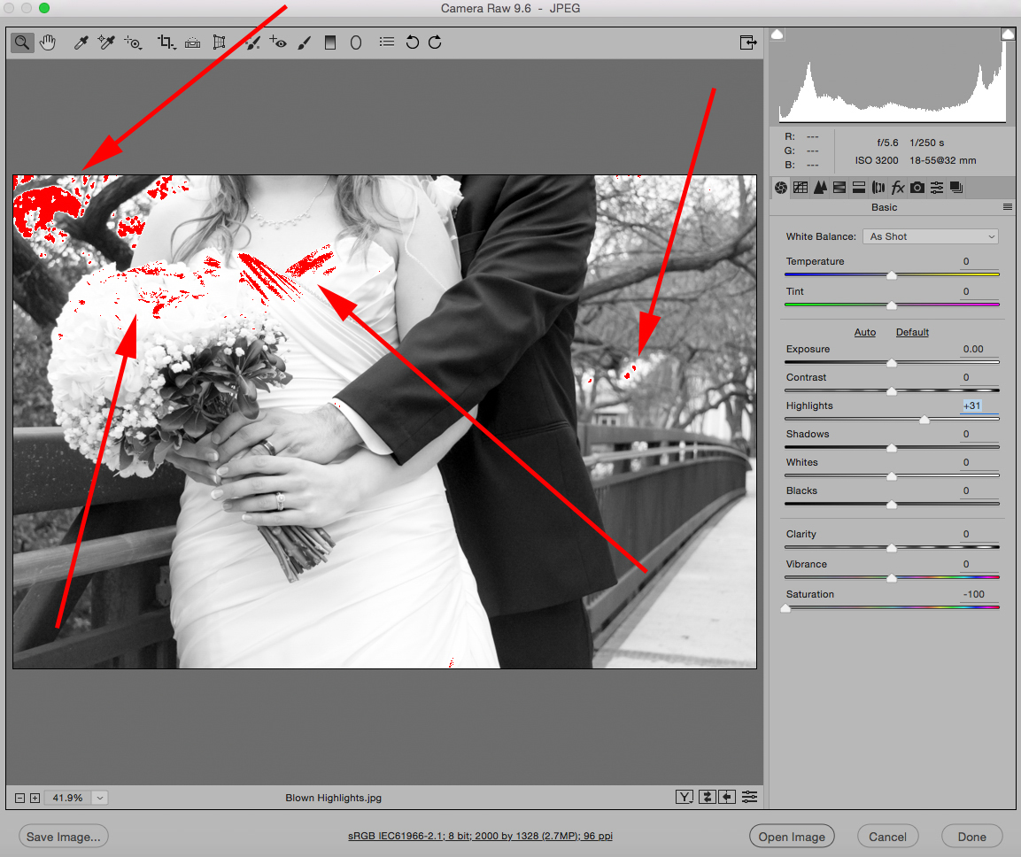
The Clipping Indicator shows us where we lost all detail (of particular concern is the flowers and dress because they are a part of our subject).
See the arrows- way to the upper left and mid-level right… those places would have been the ideal spot to set the White Point (Pure White). They are in the background and insignificant to our subjects- the bride and groom.
Let’s take a look at the opposite problem:
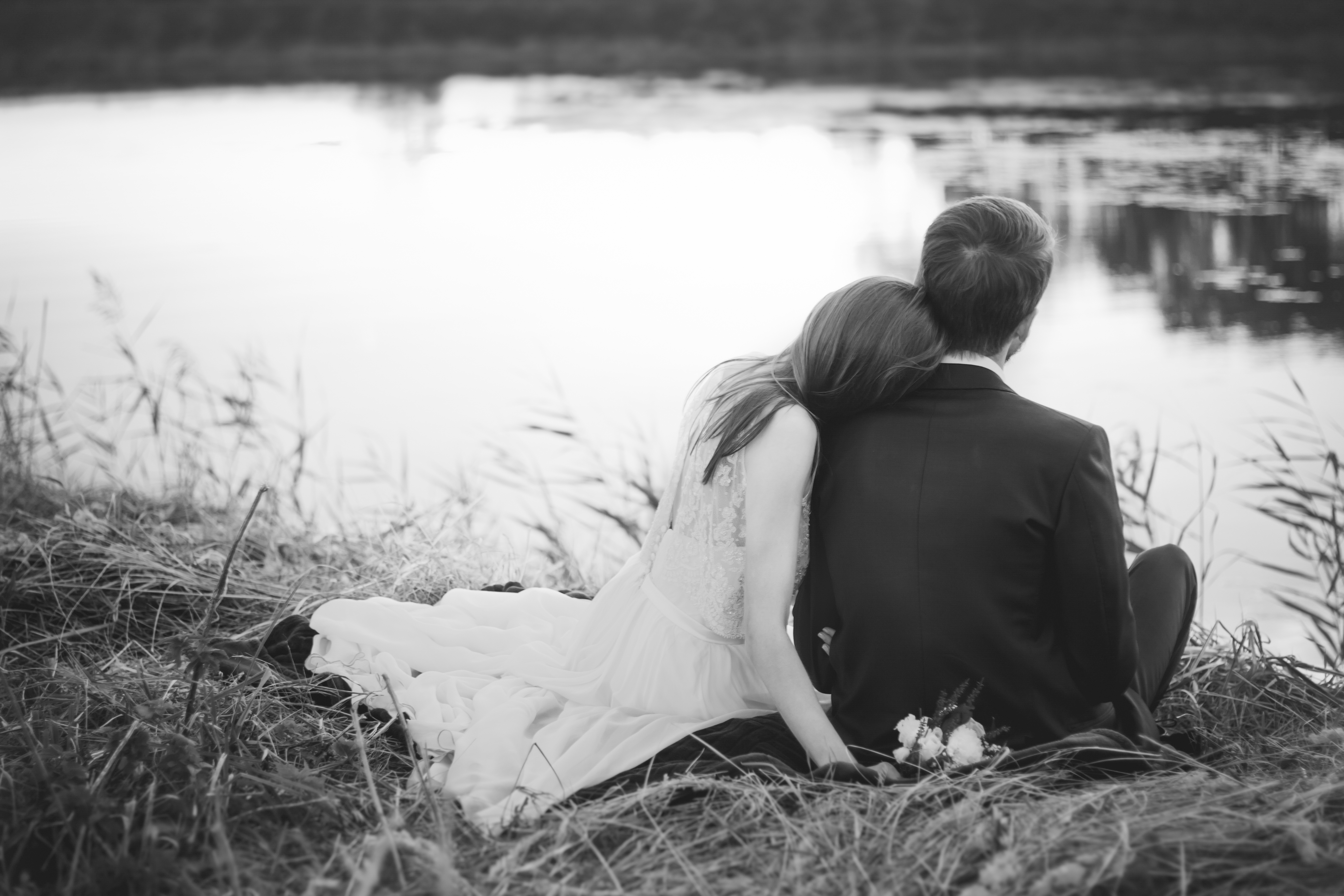
Photograph from Freestock.Org.
This photograph has the opposite problem.
The important white areas around the dress and flowers have turned into a dingy gray.
What caused this? There was an excessive amount of contrast. The photographer likely believed (and accurately) that if the White Point (Pure White) were set somewhere near the dress that the background would blow up into a white photo-bomb.
Remember: nothing will make your black & white photographs look more amateur than blown out highlights in an important area of the photograph or dingy whites that look like dirty laundry. (Unless- of course- you’re attempting some special effect.)
When you are converting your color image file to a black and white photograph- carefully determine where the White Point (Pure White) should be set!
Let’s take a look at the other end of the spectrum.
Quick side note – I’ve put together a complete eBook on how to produce your own dynamic and share-worthy B&W images, without spending money on fancy plugins or presets. It covers all of the Adobe products: Photoshop, Lightroom, and Elements. Take a look here »
Stinky Issue #2 – The Black Point
Do you know what the “The Black Point” is?
By now you can probably guess. It’s the blackest of blacks in an image. It’s pure black with no detail.
The Black Point is a subtler problem than the White Point. There are a lot of images out there that have messed up Black Points.
The “Black Point” is just like the “White Point” in that it is an Adobe Photoshop term. The “Black Point” is “Pure Black”, black with no detail.
I learned about the somewhat obscure details regarding the Black Point- the hard way. Very early in my career, I totally screwed up an assignment because I didn’t understand what the Black Point (Pure Black) really was.
To help you understand the Black Point- imagine a black cat on a dark background…
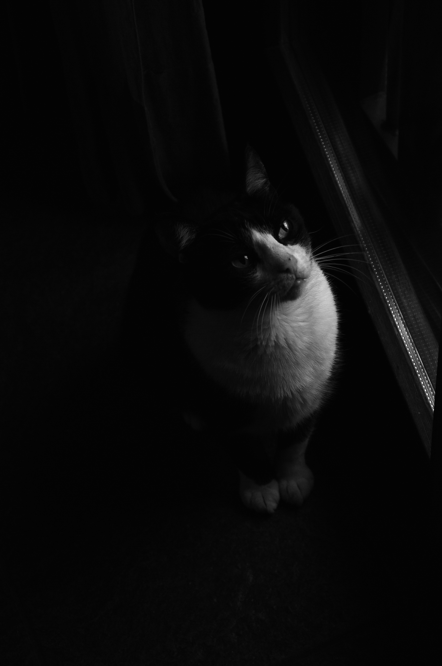
This photograph of the cat demonstrates a severely misplaced Black Point (Pure Black).
95% of the photograph has (inked up… that’s a photo lab term) disappearing into a sea of pure black. This type of problem isn’t as visible online. But oh beware… should you be attempting to sell your work to a customer for print use. A print with large areas of “Pure Black” looks like someone poured ink all over the photo.
Important- There is pure black, almost pure black, dark black, black, almost black, etc. On the opposite end there is pure white, almost pure white, white white, white, almost white. By the way- I just made up all of those terms up. There actually is a real system for gauging this, which we will talk about shortly. The point is- just because something in your photograph is black in color or tone, doesn’t necessarily mean it should be “BLACK”.
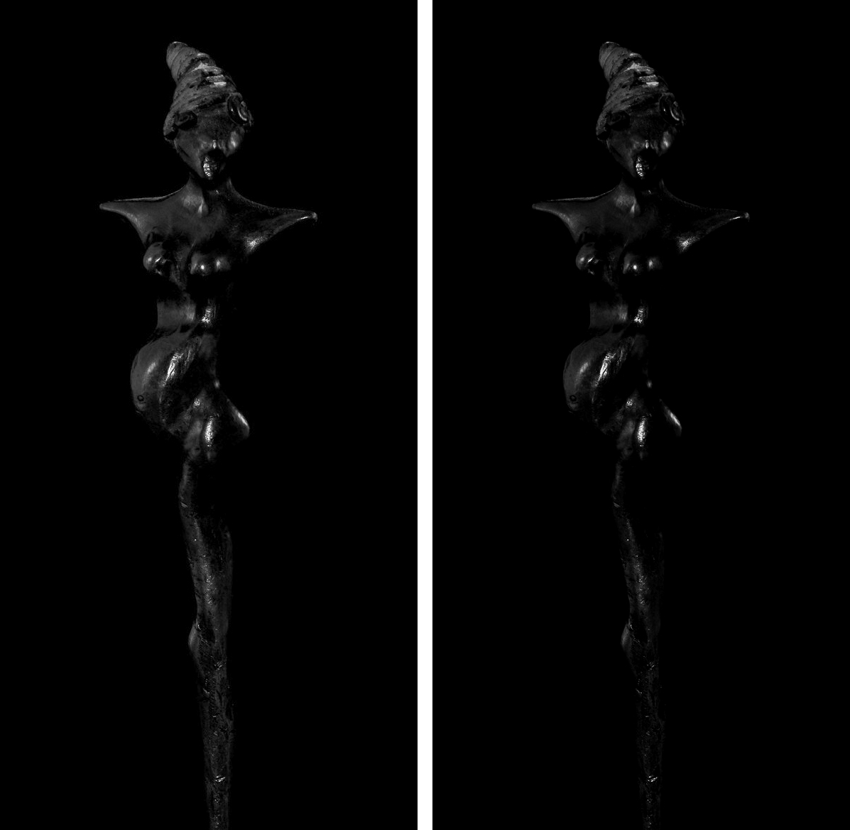
This photograph of a black statue on a black background is the “poster child” for setting the Black Point (Pure Black). Imagine that you are the artist, and you commissioned a photographer to create a dramatic photograph of your statue. You imagined it being black on black. The photographer delivers you the version on the right.
You’re not likely to be happy… most of your statue has disappeared into an inky abyss. However, the version on the left accurately depicts your black statue on a black background. You are now a much happier client.
Creating dramatic low-key images, such as this statue, are quite difficult, and it also has to do with how you shoot it. I present this to you merely to get you thinking about the levels of black.
Let’s look at an image that has a properly set Black Point: (Pure Black)

Photograph from Unsplash.
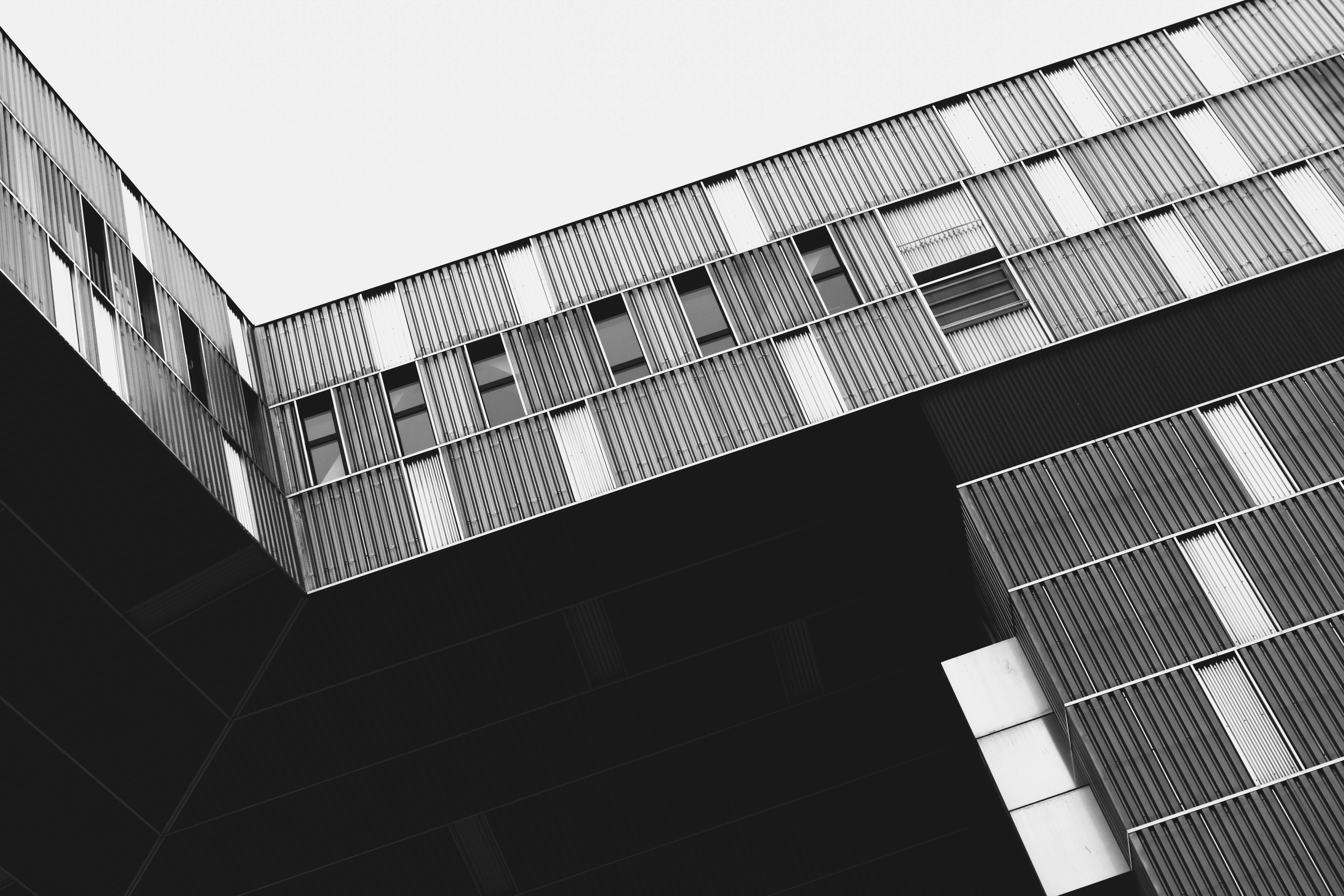
This architectural photograph has a large dark BLACK area that is significant to the composition. Look at how delicately this Black Point (Pure Black) was set. You can stare into that shadowed areas and see every detail. Where was the Black Point set? Look at the shadowed areas in the second row of windows from the top of the building. No detail. Those shadows are Pure Black, and the detail located there is insignificant to the image.

Photograph by Pexels.
If you get all scared and set your Black Point to low- what happens? Your black areas will turn to mud. Come on! Admit it. How many washed out photographs, just like this, have you seen on the Internet? You knew there was a quality problem. Now you know why.
Let’s go back to the original concept of the blog post- 2 ways to help you get the BEST black and white photographs that you can- from your color image files.
The White Point (Pure White) and Black Point (Pure Black) are often screwed up in the conversion process.
If you don’t know what you’re doing, if you’re relying on a “Preset”, or an “Action” to do a black and white conversion for you… Well… you’re likely as not to end up with these less than satisfactory results.
Now, we know what messed up whites and blacks look like… and we also know what good whites and blacks look like… and we’ve learned that there are a gazillion shades of white to black… How do we do we accurately set these points as we go about doing a professional quality conversion from a color file to a black and white photograph?
Unfortunately, that complete answer takes more space than this blog post will permit.
For example, earlier I alluded to the fact that there was a systematic approach to determining Pure Black, Sort of Black, Kinda White, White White, etc. That system is called the Zone System, and it is invaluable toward teaching you how to understand tone value in your black & white photography. The famous landscape photographer, Ansel Adams, developed the Zone System if that tells you anything. He is world-famous for the extended tonal range of his black & white photographs.
But for today, let’s focus in on Pure Black and Pure White. What do we know?
• We only want a small, insignificant, part of our image to be Pure White (unless we’re going for a special effect).
• We don’t want important white areas to appear dingy gray.
• Those important white areas of a photograph should be “close” to Pure White without actually getting there.
• We know that we don’t want our areas of black to appear inky. This means that only a small insignificant portion of our photograph will be Pure Black- even if the image has a lot of black area in it.
• We also don’t want our black areas to be gray and muddy looking.
How do we set these all-important settings of Pure White and Pure Black?
There are actually numerous ways to accomplish this step. Most of them are WAY too complicated in my opinion.
I like to keep things as simple as possible- professional- but simple.
Here is how I do it.
I open my image and turn on the Clipping Indicators. This will vary depending on what program you’re using.
Let me show you in Lightroom.
This beautiful landscape photograph has clipped areas occurring at both ends of the scale (Pure White and Pure Black). The two upper right red arrows are pointing at the Clipping Indicator Radio Buttons. The left is the Pure Black indicator, and the Right is the Pure White indicator. Clipping is also indicated on the Preview Image via a mask appearing: Red for Pure White and Blue for Pure Black. Look at the Histogram. The Pure Black side (the left side) is cut off much higher than the Pure White side (the right side). The Pure black side is going to be more of a problem.
Let’s deal with the Pure White side first.
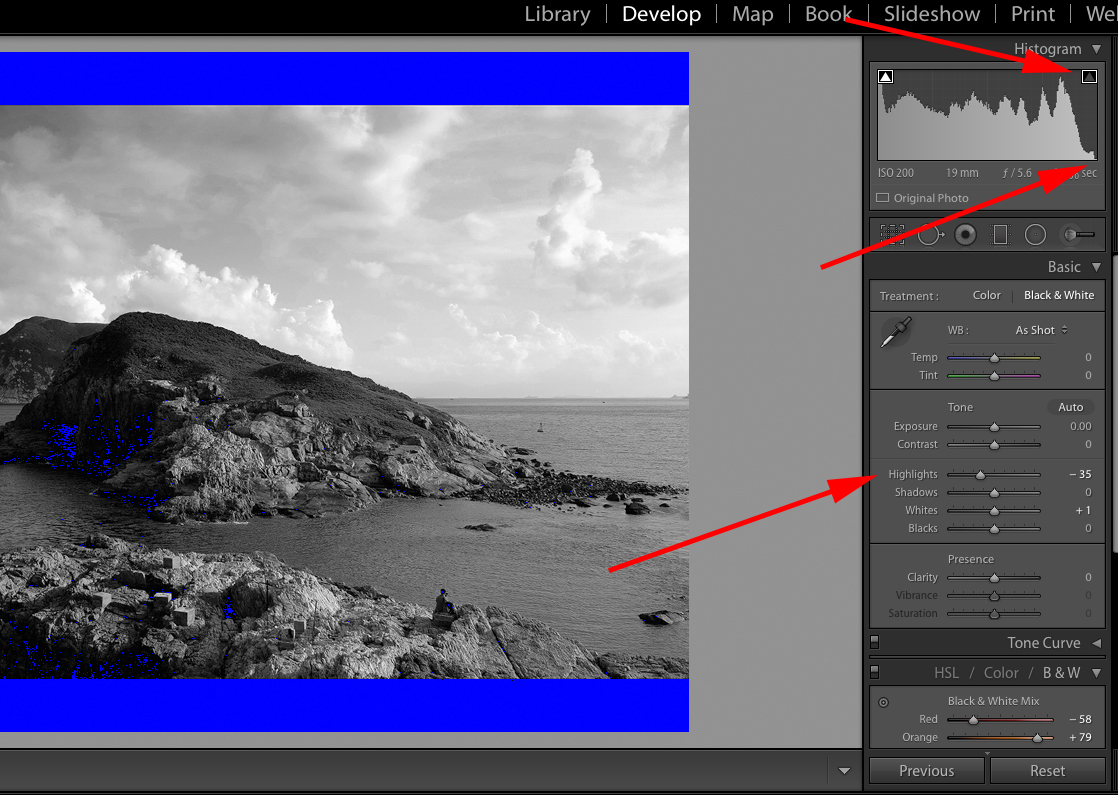
I made my adjustment using the “Highlights” slider. I was able to remove the clipping easily, and I even went a little further than necessary. You’ll see why in a minute.
Let’s look at the Pure Black clipping. (Ignore the Pure Black bands at the top and bottom of the photograph please. They are just part of a black border.)
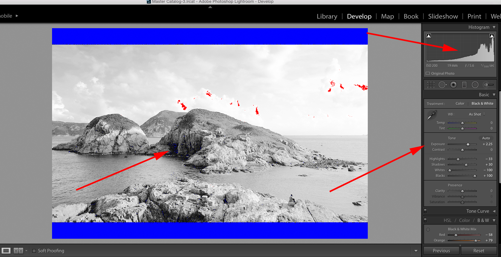
It took a combination of extreme pushing of the “Exposure”, “Shadows”, and “Black” sliders to almost eliminate the Pure Black clipping. Doesn’t look so good. Does it? There is an important lesson here. Sometimes you’re not going to be able to eliminate the entire clipped area. You have to use a combination of the Clipping Indicators, the Histogram, and your eyes.
Let’s start over.
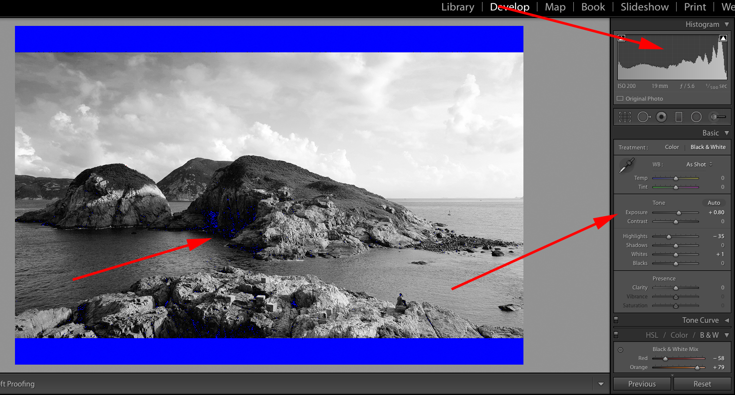
I raised the “Exposure” slider to +80. I normally try NOT to use the Exposure slider when setting my Pure White and Pure Black points. However, if the original exposure was way off, or if there was a contrast range that vastly exceeded the ability of the camera to record it, I may have to use a combination of the Exposure and other sliders.
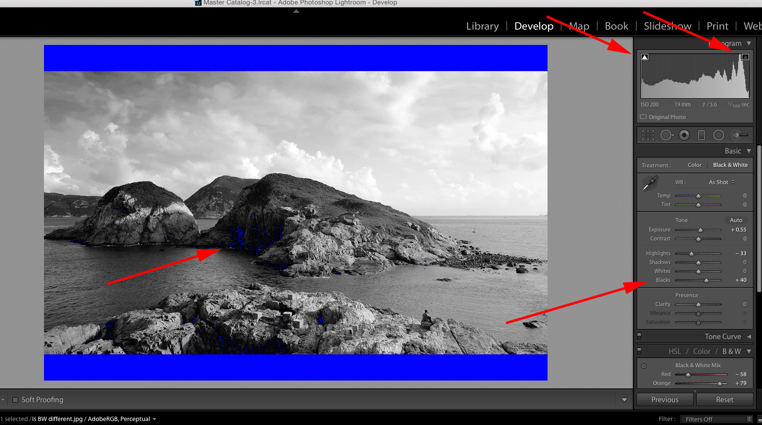
My goal is to eliminate that Pure Black clipped area as much as possible without washing out the photograph. I did this by raising the “Blacks” slider to +40, and then going back to the “Exposure” slider, and reducing it to +55.
What have we accomplished?
• Our Pure White clipping has been reduced to several pinpoint areas in the sky.
• Our Pure Black clipping has been reduced to several small insignificant shadowed areas in the rocks.
• Our tonal range overall has been evened out- giving us a better full tonal range black and white photograph.
Quick Note: In the photograph above, look at the two red arrows pointing at the Clipping Indicators. I adjusted the Pure White areas back a little to eliminate all clipping so that you can see the difference in the indicator radio buttons. When there is a clipped area they turn white. When there is no clipped area, they turn dark gray (this is for Lightroom).
We have now successfully set the Pure White and Pure Black points for this image.
I’m sure that you understand that there is a lot that goes into a quality professional level black and white conversion from a color file.
I’ve put together a complete eBook on how to produce your own dynamic and share-worthy B&W images, without spending money on fancy plugins or presets. It covers the steps in all of the Adobe products: Photoshop, Lightroom, and Elements. However, any user could benefit from the information that’s included in the guide. Take a look here now »
If you’re serious about being a black & white photographer; you should check it out. “Better Black & White”



2 Comments
It is a sad thing that there are so many people out there doing tutorials on youtube and completely ignoring the white and black point and most of their followers get indoctrinated through that process. If people would just go ahead and print their photos.
Hi Kent,
Thanks a lot for that explanation, really helpful 🙂
After reading, I’m interested in buying your e-book. However, the link doesn’t seem to work?
Timo