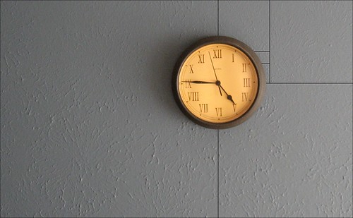
Composition, composition, composition! That word has no doubt been drilled into your head by a photography instructor or by every article or book you’ve ever read or by your photographer friend who won’t shut up about it. Composition.
Composition is everything. No matter how many different “official” definitions you come across or how many different ways some online photography guru tries to explain it to you, it all boils down to a matter of visual appeal. You can have a sharp, noise-free image of the coolest subject in the world and it will fail to garner the attention you want for it if it is poorly composed.
Subject matter notwithstanding, the hallmark of memorable photos is thoughtful composition. But if talking about the elements of photography in terms of “good” and “bad” belies the subjectivity of the art form, how then do we in fact determine what is…good or bad?
Let’s just altogether avoid the impending infinite loop. Instead, we can look to some of the classic guidelines of composition to learn what works and why and, thus, become better equipped to do what truly creative people do: break the rules.
The Rule of Thirds
The most basic of compositional guidelines, the rule of thirds suggests dividing an image into thirds — both horizontally and vertically — and placing important visual elements at or near these imaginary boundaries.
Apply a ratio of 1:1.618 (the “golden ratio”) instead of the equidistant parameters of the standard rule of thirds and you’ve instantly opened up several alternate techniques.
The Golden Spiral
The Golden Rectangle
The Golden Triangle
Framing
This technique uses naturally occurring elements to frame a subject and isolate it from the rest of the image.
Leading Lines
Whether straight or curved, implied or geometric, the human eye tends to be drawn into an image via lines; lines keep the viewer’s eyes from simply wandering aimlessly around a photo.
Filling the Frame
Not to be confused with crowding the frame, filling the frame is simply the process of giving the subject a position of prominence in the frame and greatly minimizing (or eliminating) the impact of whatever may be in the background.
Symmetry
If you have a strong point of interest and a scene/subject that lends itself to it, creating a symmetrical composition can result in some striking imagery.
Patterns
Whether the result of nature or the work of human hands, patterns exist absolutely everywhere in the world. Use patterns to bring a sense of rhythm to an image.
Balance
A balanced composition isn’t necessarily about symmetry. Balance, in this case, refers to the presence of a secondary point of interest that serves as something of a counterpart to the main subject; something to fill in the blanks, to provide a counterweight, to balance the image.
In Conclusion
Notice anything interesting about the compositional styles and their accompanying photographic illustrations?
The “rules” and images could easily be mixed and matched; there’s more than one photo here that fits more than one of the rules of composition. That’s art for you. And there are plenty of artists and those with an interest in art who subscribe to the idea that, like photographer Bruce Barnbaum proclaimed, “Rules are foolish, arbitrary, mindless things that raise you quickly to a level of acceptable mediocrity, then prevent you from progressing further.”
Use composition rules to establish some foundational knowledge; use them to get in some good practice. Then get over them. If something works for you, by all means use it. But in your quest to create art and establish your own style, you can’t feel obligated to stick to any particular rule.
So, then, what is composition? Once again, Bruce Barnbaum: “[Composition is] an arrangement of the parts of a work of art so as to form a unified, harmonious whole.”
That's all the composition advice anyone really needs.


11 Comments
Fantastic! Jason, I read all your posts and try to incorporate the techniques you share. Thank you, from an amatuer !
I should be thanking YOU. So, thanks. : )
well then…Hey, you’re welcome.
lol!
Your ‘Golden Triangles’ diagram is misnamed. It shows a main diagonal and its two reciprocals (the perpendicular lines from the other two corners).
Diagonals and reciprocals are important in dynamic symmetry. (See Jay Hambridge, “Elements of Dynamic Symmetry”>)
In a 1:1.5 rectangle (such as the 35mm film frame) they have nothing to do with the golden ratio.
Oops – Jay HAMBIDGE not Hambridge (typing too fast!)
Nice read…
Composition is indeed very important; there are so many variables involved that the best thing to do, as you explain very well, is to get to know them inside out first, so after that you can move ahead. I’m still learning and practicing them, but enjoying the process. See examples of most of them in my last blog entry: https://gonzalobroto.blogspot.com/2014/03/bang-kachao-lung-of-bangkok.html
Some good examples there. Nice work!
Still valuable for still subjects…
Thank you for your inspiring articles Jason.
I enjoyed your Barnbaum quote, “Rules are foolish, arbitrary, mindless things that raise you quickly to a level of acceptable mediocrity, then prevent you from progressing further.” But it is only by understanding the rules that you know when you are breaking, and hopefully why.