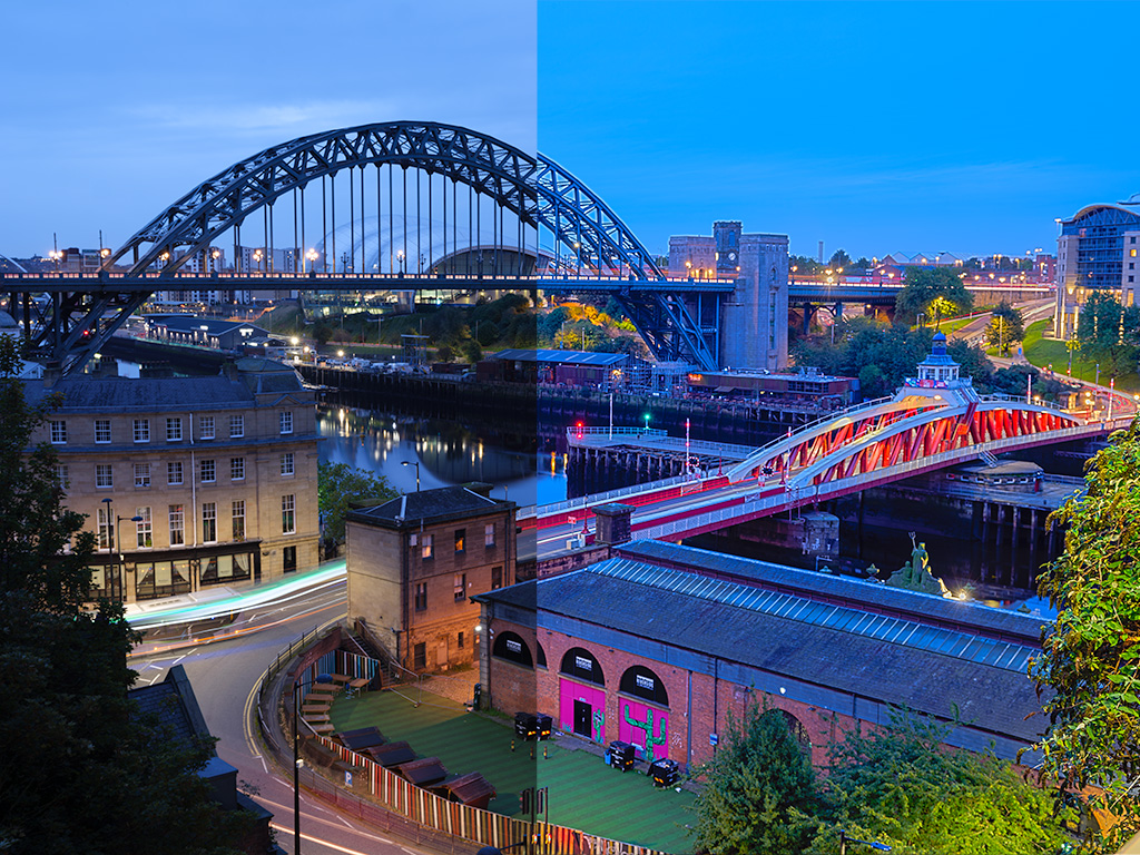
Have you ever wondered how some photographers managed to get those old-school cool looks in their color photographs? You know the ones that look like old film, at least in terms of the colors? The answer is by Color grading. In digital terms that usually means applying or removing color from specific tones within an image.
If that's a bit confusing, don't worry we'll go into it in some detail so that by the end of this article you will know more about color grading than 99% of the population. You will be able to achieve the outcomes within this article with most photography software including Adobe Lightroom, Photoshop, Photopea, or any of the other popular software.
If you're anything like me you will probably find yourself adding color grading to your general workflow as you process your photographs.
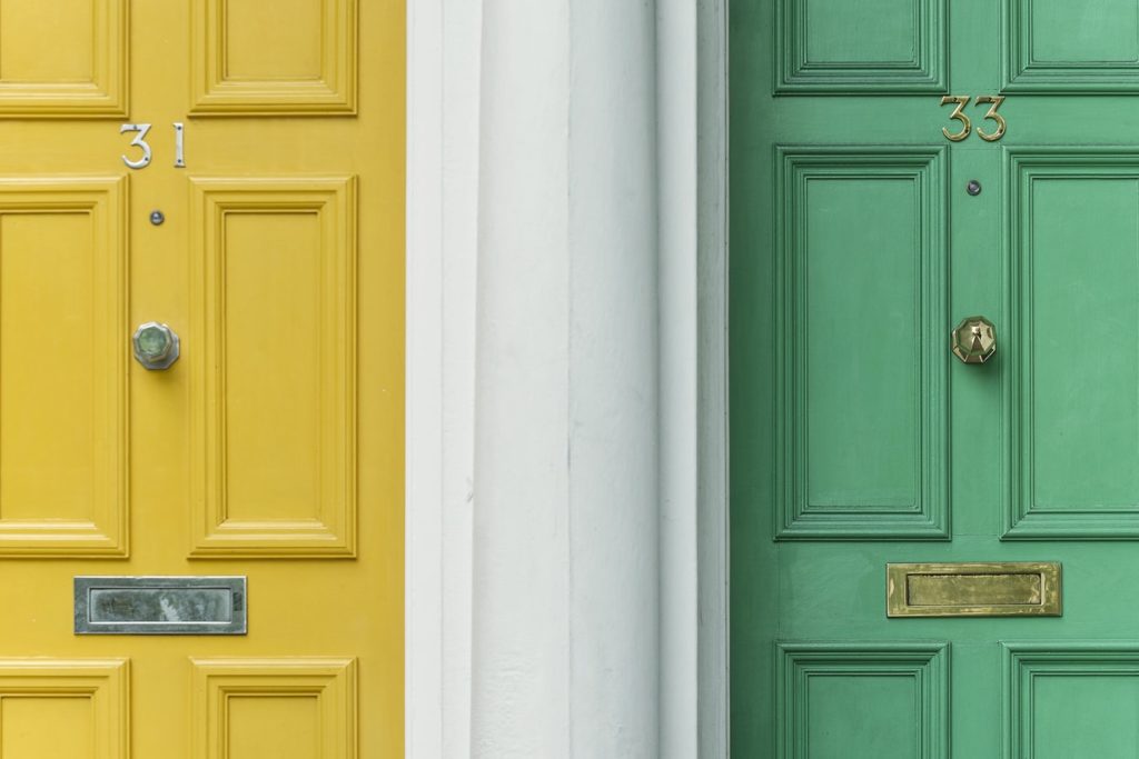
What Is The Difference Between Color Correcting And Color Grading?
It's important to understand that color grading is not quite the same thing as color correction. Color correction has more to do with making a color as accurate as possible – basically making it the same as what your eyes see in the real scene. That can be quite tricky depending on the light sources.
An example of color correction might happen if you photograph a person under a colored light. in such a case you might be forced to remove the color of the light from the person's skin. The truth is that a lot of photographs if not the majority will need some form of color correction in post-production.
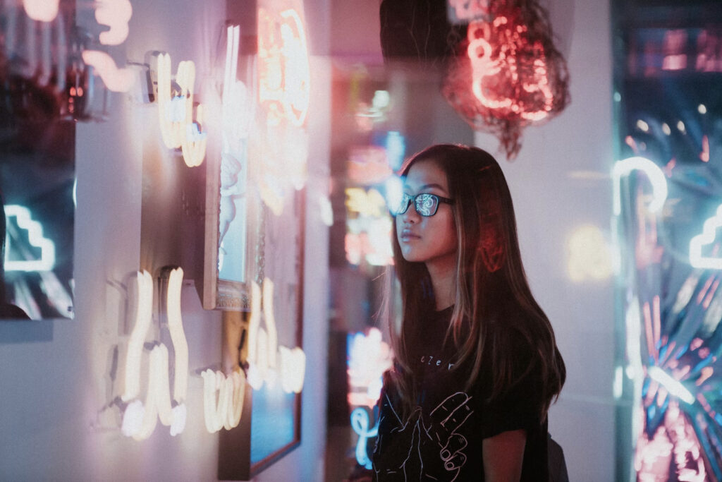
On the other hand color grading involves adding color to specific tones within an image usually in order to create the effect that the photographer is looking for. A famous example of this is the movie 300 – everyone remembers the color grading done to that film. Other things were done too but it was the color grading that did the heavy lifting for that famous effect.

How Do You Prepare An Image For Color Grading?
One of the first things you'll need to do is to remember to shoot in raw format. This will make all of your post-production work a lot easier and allow you to push the photo a lot further depending on your taste. It also makes correcting color temperature a lot easier,
That's lucky because adjusting the white balance of your photograph is usually the first thing you will want to do before color grading an image. Next up you should adjust the tint and also if it suits your taste the highlights and shadows and whites and blacks.

How To Color Grade Your Images
For this article, we're going to concentrate on how to undertake this process in Adobe Lightroom. Almost every other photography software has the same or similar functionality so it will just be a matter of finding where it is.
Luckily for us, Adobe Lightroom has a specific Color Grading panel.
Open it up!
The panel is divided into three main sections covering midtones shadows and highlights.
In one of these, you can use your mouse to drag those tones toward the color you would like to apply to the photograph.
That’s color grading!
A more advanced move is to do it to two or more tones so we move into “split toning” territory.
A good start here, if you want to experiment, is to pull the Shadows towards yellow and the highlights towards blue. this will give you an old-school film look. of course, you should keep experimenting and adjusting the mid-tones shadows and highlights to match your own photographic vision.
This is the crux of split toning in Lightroom (which is now basically incorporated into the Color Grading panel in Lightroom after having its own panel in past iterations of the software.
The two sliders you should be aware of are the Blending slider and the Balance slider.
You can use the blending slider to increase or reduce the transition between the tones. It's worth experimenting with on a case-by-case basis.
The balance slider can adjust the balance of the effect between Shadows and highlights. again it's very useful on a case-by-case basis.
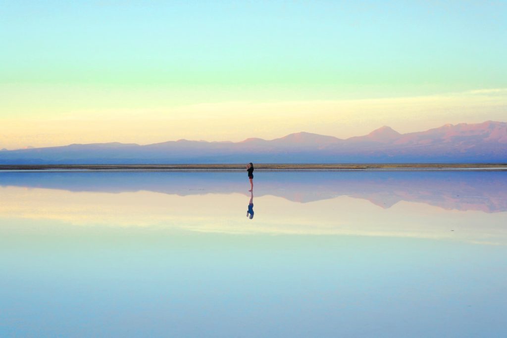
How Can Presets Help With Color Grading?
It can be useful to know that a lot of talented photographers offer Lightroom Presets, as the name suggests, offer preset color grading setups for your photograph.
We even have some pretty good ones here ourselves on our Lightroom Presets page!
You can find out how to install Presets here. Adding the effect to your photograph is as simple as opening the preset panel and choosing the one you wish to apply. Just click on it.
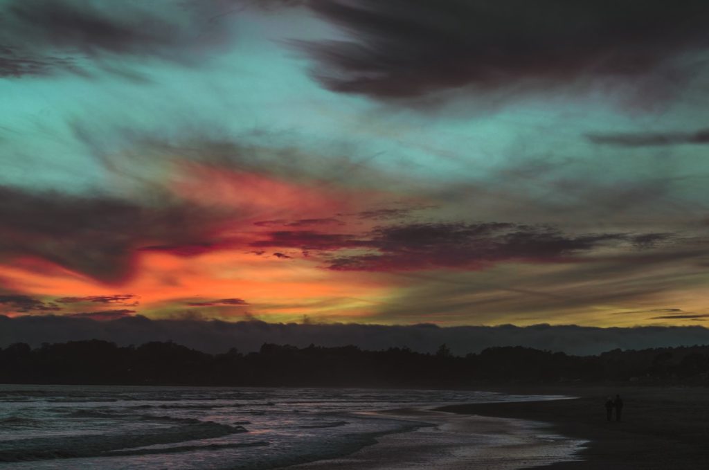
Some Extra Tips for Color Grading
Find inspiration for color grading where you can.
I mentioned the movie 300 above and it stands as a useful model for finding color-grading inspiration. As photographers, we should be looking for inspiration wherever we can find it and one of the more obvious places is in older photographs that we admire. Go back through your old collections and old books and you will find many pieces of inspiration that you can apply in your own work.
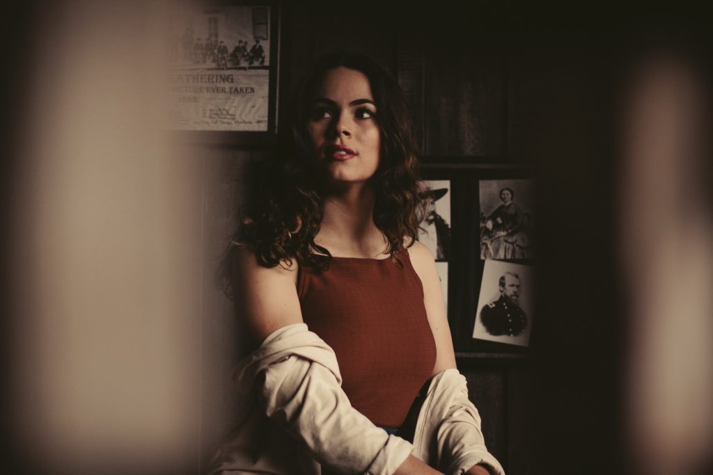
Be careful with color grading people.
Color grading people can very easily look unnatural if you overdo it. Of course, you should still attempt it and practice it but just don't go too hard before you’re experienced at applying color grading well.

Don’t Oversaturate Portraits
Feel free to experiment with saturation in portraiture, but don’t forget that your subject’s skin should look natural – you should avoid making it orange or red because it will ruin the entire portrait. You should be mindful of how you set the RGB channel.
Try the tone curve panel.
If after applying color grading or split turning you are still struggling to find the effect that you are looking for there is a strong possibility that you will need to visit the tone curves. while it's beyond the scope of this article to cover tone Curves fully a good starting point is to create an s shape of that tone curve and go from there. you paragraph
Get to grips with color theory.
As you dive deeper and deeper into photography you will find yourself coming back to color Theory more and more. the sooner you understand the basics of color Theory the sooner you will be able to apply useful and artistic vision to your images. while it's outside the full scope of this article you can read more about color theory here.


As an addendum, there is a really cool and useful video that we found on color grading. if you have a bit of time this as well worth a watch.
If you want to learn more about color grading, check out the links below!



1 Comment
I like that you mentioned avoiding making your pictures look too red and be careful how much you saturate your photos. My boss just told me yesterday that I will be in charge of creating photos of models wearing our new clothing line. I’ll have to keep researching editing tips so I can get the job done.