So far, you’ve probably noticed that color has a major impact in a picture. If you use the wrong color combination, the picture simply won’t work.
You’ve probably done some reading on combining colors, in the sense of neighboring colors versus complementary colors, using no more than three main colors, two that work best and so forth. This is where we help you out with an understanding of color tones and how to use them.
Basically, that's all great, it's a major step into improving your photography game. But there is much more about color than that, and the more you know, the better your pictures will be.
This article will focus on the major and minor tone scales. Major and minor are usually associated with the major and minor chords in music, and to be honest they are quite similar. That is, if you are able to connect color to sound and vice versa.
The way major and minor key tones are used can be observed in classical art. Ranging from monochrome to full color, there are so many pieces that utilize these scales, in fact, they can be implemented in every picture.
To explain major and minor tones better, take a look at this scale:

This concept works with luminance levels for any color as well. Not only just monochrome. Don’t mistake luminance for saturation however – this only applies for the luminance. Although it is used in conjunction with saturation, but that is part of the complementary/contrasting colors.
Want to try applying these rules to better black and white photography too? Well, have a look over at this truly amazing guide by Kent DuFault on how to create Black & White images that simply jump out and look stunning!
Major Tones (High Contrast)
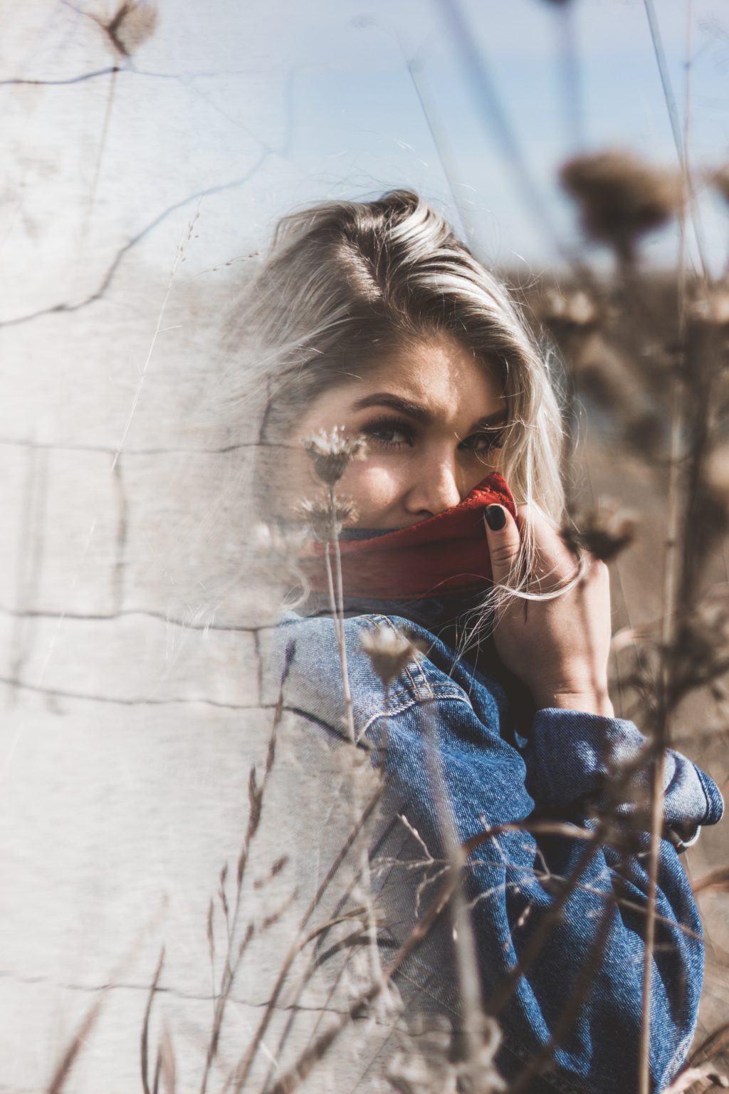
Major tones, or basically the high contrast tone combinations are often used in portraiture in order to separate the subject from the background. Since the eye automatically focuses on the brightest part of the image, the brightest part is the portrait itself.
In other words, the model has the two brighter tones created by the key and fill light, while the background has the darker tone, created by the background light.
Most of the time, high contrast combinations are used to achieve a cleaner look. Basically, it is a minimalistic approach to everything, cleaner background, cleaner foreground, thus the attention goes straight to the subject.
Of course, colors are still in the complementary or contrasting set up, the intensity is in the major scale, which makes for greater contrast.

Bear in mind that this doesn’t mean cranking up the contrast slider in Photoshop/Lightroom. The contrast is portrayed in the luminescence of the elements in the picture. The way they are lit, positioned and the material.
Landscapes can utilize the major tones as well, though it is a bit trickier to pull it out due to the fact that the light isn’t really under your control.
Minor Tones (Low Contrast)
Having small differences between the main tones often can produce a generally dull image, but if you are careful enough you can use those small differences to create shots full with mystery.
High key and low key photography are usually shot in this set up since most of the tones are quite close to each other. Even though they look as high contrast, have a look at the histogram and you’ll see that most of the data is focused towards the highlights or shadows.

If you look at the renaissance period, you’ll notice that many of the artists painted in minor tones and there isn’t much contrast, but the tones are carefully picked and placed so the image is still striking.
Using minor tones is trickier than using major ones, due to the fact that you can get away with small mistakes in the higher contrast, but with the lower contrast ratios the tones can easily get too close to one another and seem as one.
Summary
Whether you are going to use major or minor tones is entirely up to you. If you are clever enough you can combine both of them. However, when you choose whether a certain shot will be in major or minor tones, make sure that you plan it properly and execute it to the best of your abilities.
Remember, making the most out of the colors and tones is quite important.
Want to try applying these rules to better black and white photography too? Well, have a look over at this truly amazing guide by Kent DuFault on how to create Black & White images that simply jump out and look stunning!
Further Resources
- How to Use High Key, Low Key and Moderate Adjustments for Creative Photographs by Sheen Watkins
- How to Create Duotones and Split Tones in Lightroom by Jason Row
- How To Use Color Contrast To Make An Image More Interesting by Dzvonko Petrovski