Composing with color is something that many photographers have been abandoning, and is one of the most interesting ways to create a compelling photograph.
I must admit that it is still hard for me to create good color photographs, and not because I don't like color, but because it's hard for me.
Every time I take a photograph, I use a beautiful color film simulation my camera has built-in, but very few remain as color photographs in the final stages of my workflow.
Composing with color in mind on the streets is pretty hard because you have very short control of the elements that will fill your frame, but when working under controlled situations, color composition is magnificent.

The whole purpose of composing with color in the top of your mind is simple, good color choices make pleasant, vibrant and striking photographs. The contrast that colors have with each other, or the balance you can achieve my mixing a strong prime color with a neutral background is something of taste, and there are no secret recipes for that.
There is a whole psychology associated with color, and if you have studied something that is related to advertising or graphic design you'll know these facts better than me. Beyond the dense theory linked to color, we'll tell you a couple of things so you can start composing better photographs just by contrasting colors today.
The Color Wheel
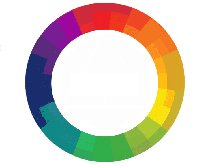
Our eyes (and brains) are designed to perceive three primary colors, and every other color we can see is just a unique mixture of those three colors. Said that, we can talk about the color wheel.

The Color wheel begins with the three primary colors arranged together in a simple triangular position. The three primary colors are red, yellow, and blue and are known to be pure colors since they can't be created by mixing other colors.

Secondary colors are straightforward 50/50 combinations of any of the two primary colors. Example: Blue + Yellow = Green.

Tertiary colors are a little bit more complex to predict, and are basically 25/75 or 75/25 combinations of one primary color and a secondary color.
Creating Contrast By Using Complementary Colors

Complementary colors are those sitting on opposite sides of the color wheel or spectrum, and simply by combining two opposing colors, you can achieve some pretty hardcore contrast, or mild as well, depending on the use of primary, secondary or tertiary colors.
Creating Balance by Using Adjacent Colors
Not everything in photography has to be about high contrast, in a lot of situations you'll want to achieve some mellow and muted looks instead of highly dramatic frames.
Colors sitting next to each other in the wheel are known to be Adjacent or Analogous colors, and they are often found in nature, therefore landscape photographers should really be thinking about this because they will benefit by using them correctly.
Learning to understand how color impacts photographs is not something easy to embed in our minds, but is worth learning indeed.
All this has to do with some pretty advanced composition thinking that will not only help you with color, but also withblack and white photography.
Knowing how to order colors will help you make better photographs guaranteed in terms of aesthetics and message transmission as well.


