I know I’m not the only photographer who has been confronted by the following dilemma: should this shot be color or black and white? Some people may not appreciate the gravity of such a predicament, probably because they work exclusively with one or the other. Film photographers have a particular grasp of this due to the immutable characteristics of the medium. But digital photography has afforded us the luxury of being noncommittal — the raw file you transfer from your camera to your computer can become anything you want it to be. Should the image be black and white or should it be color? You can decide later and change your mind as many times as you want. Of course you will need to come to a final decision, so how do you decide the ultimate fate of a photo?
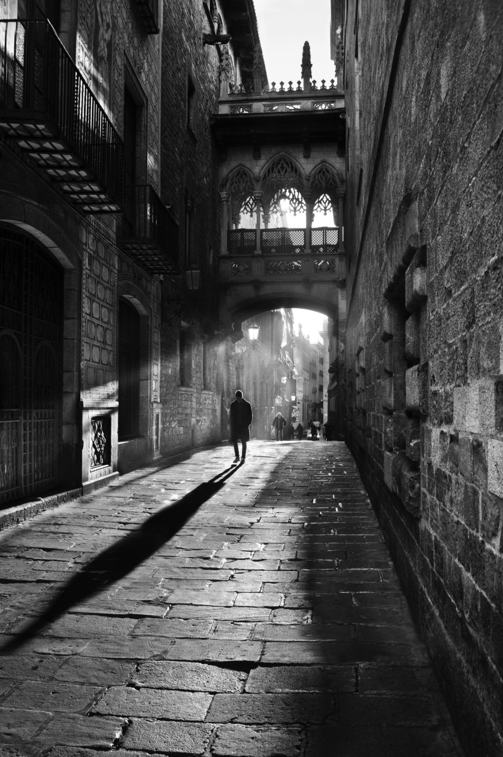
Now, these ideas will get you started, but if you want to really dig down into the details of the black and white photography process, then you will want to check out Kent DuFault's guide to the topic.
Sure, you could try both a color version and a black and white version and go with whichever happens to have the most aesthetic appeal. This may work sometimes, but it’s an unrefined tactic. Making the color vs. black and white decision requires a bit of forethought and an awareness that each benefits from a specific mindset.
The Color Photography Process
In color photography you should use colors in such a way that they have a meaningful impact on the subject or to create a strong composition. If it sounds easier said than done, the following three suggestions for when to work in color may prove helpful.
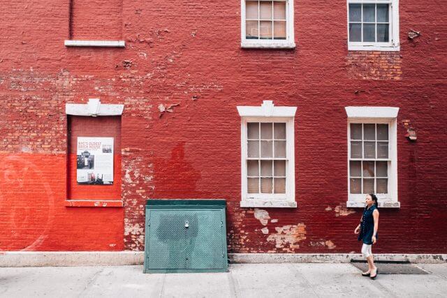
- When color is a vital aspect of a subject’s character. Recall some of the best travel photos you’ve seen of places like Cuba or China. Those photos are so often presented in color because the locations almost demand it, providing endless opportunities to play with color relationships and use color itself as a compositional tool. Furthermore, any time you want to call attention to distinct hues (red and green, for instance), color is the way to go, as contrasting colors can sometimes take on barely distinguishable tones when converted to black and white.
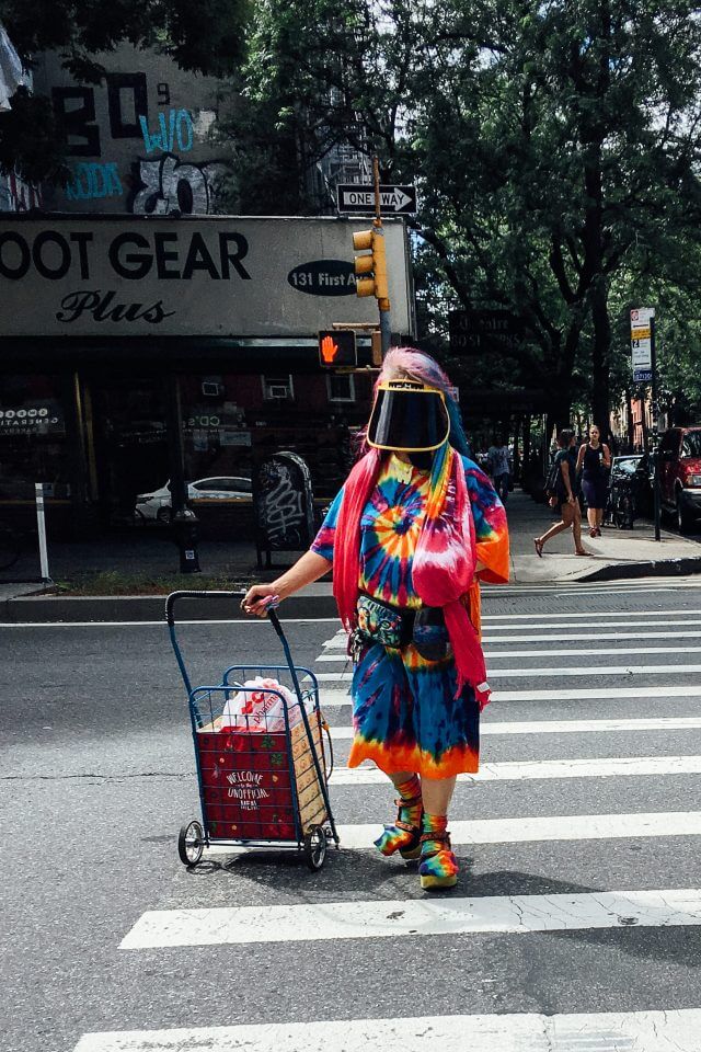
- When the light is perfect. This could just as easily apply to creating black and white images, but “perfect” would be defined differently. In color photography, perfect light often refers to the soft, warm glow of golden hour; or perhaps near dusk when the remaining blue ambient light intermingles beautifully with the artificial light of light bulbs, store signs and street lamps. Partly cloudy skies can also have a softening effect on the light.

- When you want to evoke ideas or emotions. Thoughtfully composed words can make people swoon; a disturbing image can compel people to action; a gentle melody can give people a sense of peace. Colors can do all this and more, as they have a profound impact on human psychology. Using color photography you can provide the viewer with important visual cues that will help them interpret a photo within a given emotional context. Different colors can be used to evoke various emotions and ideas. Red: passionate, important, aggressive. Green: natural, prosperous, stable. Blue: trustworthy, serene, inviting. Also be aware the vibrancy also factors into determining how a specific color is interpreted.
The Black And White Photography Process
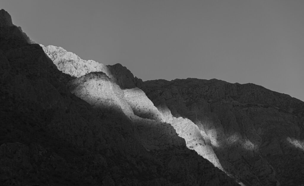
A key element of successful black and white photography is to learn to see in black and white, to know before you press the shutter button that a shot is going to work once it has been converted to a monochrome state. Rather than colors, you want to pay close attention to tonal contrasts, textures and shapes. Below are three occasions when you would choose to work in black and white.
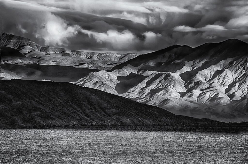
- When the texture, light or shape of a subject is more compelling than its color. Color isn’t everything in photography; in fact, there are times when color can detract from the visual impact of a subject. Working in black and white can enhance textures and strengthen geometrical compositions.

- When you want to create a timeless visual aesthetic. The various color schemes associated with a given film type or post-processing trend only serve to betray the ideas of a specific time. Black and white photography, however, maintains a classic look that isn’t beholden to the constraints of time and fashion.
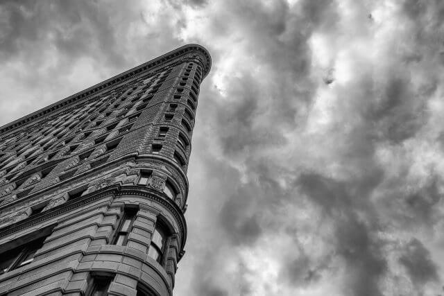
- When you want to eliminate distractions. Working in black and white gives the viewer a chance to really focus on aspects of a photo that might be overlooked in a color image. We’re accustomed to seeing the real world in color, so when we see the world represented in a black and white photo it forces us to look a bit longer and allows us to appreciate details that we would otherwise miss. Black and white photos are sometimes a way of detaching subject matter from our accepted reality.

Final Thoughts On Color Versus Black And White Photography
There is no wrong choice here, but it may be helpful to think of black and white photography and color photography as distinct aesthetic mediums, where one emphasizes elements like shape and texture, the other emphasizes hue and vibrancy. In practice there’s much more than the few thoughts presented here that goes into determining when to work in color versus black and white; it’s a decision making process that you will refine over time. Even if you choose to work exclusively in one “medium” you will find you still need to know what to look for to maximize the visual impact of your work. Hopefully this information provides you with a basic but encouraging pathway toward success.
And as mentioned above, to take a deep dive into black and white photography, take a look at Kent DuFault's guide on the topic.



6 Comments
Sodium vapour lighting seems to create a compelling reason for switching to B&W !!!
Ha! I couldn’t agree more.
Thank you, Jason! This helps! Most of what I see that I want to shoot, I “see” in B/W…but this helps define my choices.
Glad you found it useful. I’m often tempted to work exclusively in b/w, but then I come across something that I think just HAS to be in color, so that’s what I do. No pressure. : )
This is an interesting topic to me. I’m currently carrying around two cameras. One loaded with Tri-X, the other with Ektar. So, I’ve been trying to do this mental calculus on the fly. It’s starting to come down to question: “What caught my attention here?” LIke you said, if color played a big role in that, color it is. If it’s more about form and lines and stuff, I’ll fire off a B&W frame.
Side Note: This is my first B&W roll since 2006 — We’ll see what happens!
Thanks Jason!