Possibly the most well known and most talked about photographic composition guideline is the ‘Rule of Thirds.’ However it doesn’t stop with photography. You will find the Rule of Thirds applied everywhere; architecture, graphic design, web design, film, Angry Birds and more.
If you haven’t heard of it, there may be something wrong with you. Never fear though, this article will bring you up to speed. But don’t get me wrong, this article isn’t aimed at the less informed. It’s written for you, yes you… the one that knows all about the Rule of Thirds.
Majority of cameras sold today even come with a display setting to ‘overlay’ the thirds when you’re composing your shot. Handy if you suffer some kind of visually mathematical fraction impairment type thing; and often confuse your thirds with fifths and fifty-eighths. Granted it does help you line up your horizon, if you’re into that sort of thing.
Before we start, let’s get one thing straight (ideally the photo too). It might be called the ‘Rule of Thirds’ but the name need not be taken too laterally. It’s a guideline; you don’t have to use it. If you do use it, even badly, you will see an improvement in your photography. That’s my professional opinion, as is the following:
What is it?
Now, hopefully I haven’t insulted your intelligence too much. What is it? Let’s talk definitions. Urban Dictionary defines ‘The Rule of Thirds’ as: “When organising an event on Facebook you can use the rule of thirds to estimate how many people who have said they will or may attend will actually attend. You can assume that approximately two thirds of those who have said they will attend will turn up, and one third of those who have clicked maybe will turn up.” Wait, what? That’s not quite what I was after. Good rule nonetheless. Perhaps I’ll try a diagram.

Phenomenal isn’t it? Calm yourselves and mentally prepare for another…. I’ve added some dots

Breathtaking right? The elegant vertical lines, the striking horizontal ones and the enchanting blobs where they meet… you might even say this is where the romance happens (you might be pretty odd for saying so). For politically correct reasons, lets just call them “really important places for your focal point” or ‘RIPFYFP’ for short.
To sum it up, you should be placing your horizon (or dominant horizontal line) on the upper or lower third; and your focal point on the left or right third. This counts for portraits too.
For maximum effect have your focal point roughly where the lines intersect. This basically helps to draw the viewer deeper into the frame. As with all composition techniques it’s all about creating a third dimension.
Don’t get too carried away with exact placement, you can skew the portions closer or further so long as its not bang on centre as I do in much of my landscape photography composition. (Yes we really do spell ‘centre’ like that in Australia)
Further Explained
Now I might have been joking when I mentioned Angry Birds at the beginning of this article but lo and behold ‘The Thirds’
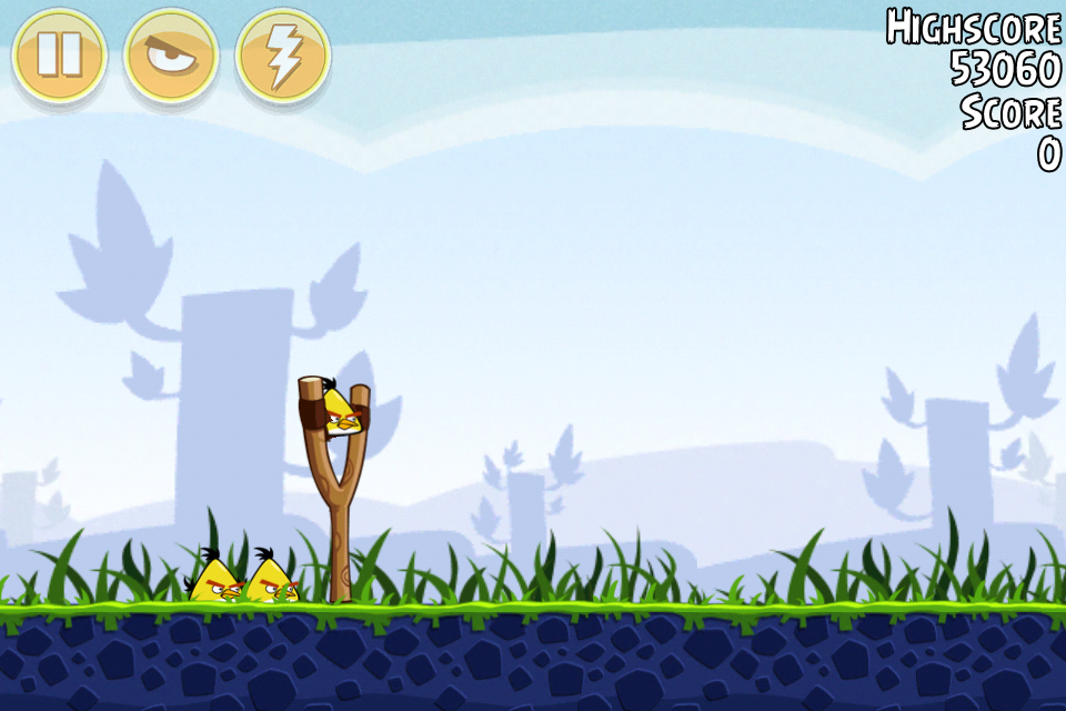
Can you imagine a world where Angry Birds didn’t obey the Rule of Thirds? I couldn’t either so I included a picture.
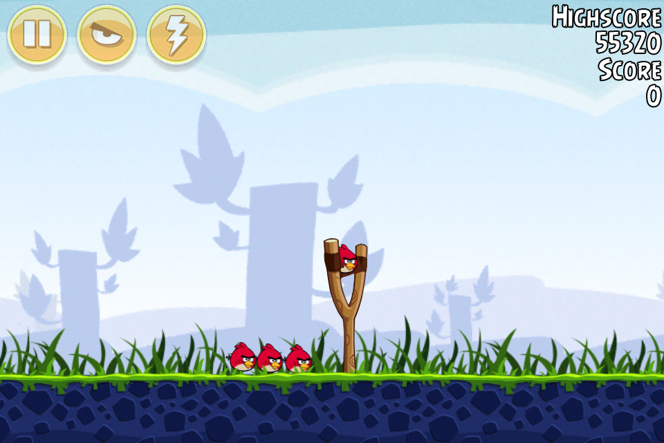
Disturbing right……? That high score is terrible.
Okay so you are probably a little sick of seeing screenshots of Angry Birds but they’re quite possibly the text book example of ‘The Thirds'. So last one I promise.
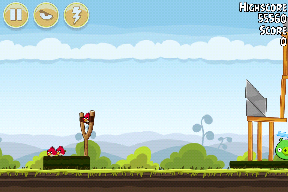
If you didn’t notice anything fundamentally wrong with the last picture you may need glasses. It looks stupid right? It defies common sense even. They’re facing the wrong way!
If you CAN REMEMBER this next time you take a candid portrait shot you’ll be 1000 times better off. Make sure your subject is looking in the right correct direction. They should be looking in the direction you want your viewer to look, not straight off the frame. This is important!
Designers and advertisers use this technique religiously. Take a look at this magazine advertisement for my photography courses.
Conflicting Focal Points & Thirds
It is possible have something such as conflicting thirds. A prime example would be two people in the same shot, one on the left of the frame and one on the right. If this is unavoidable try to have them interacting with one another. Pointing at each other or laughing together etc.
In other words here and here:

Now if your subjects or focal points are in the below positions, try to make sure one is more dominant than the other. This will generally happen naturally as subjects on the upper third are further away thus appearing smaller but nonetheless keep it in mind.

Breaking It
Now, hopefully you’re up to speed with The Rule of Thirds. As they say in The Matrix “What you must learn is that these rules are no different than the rules of a computer system. Some of them can be bent. Others can be broken.”
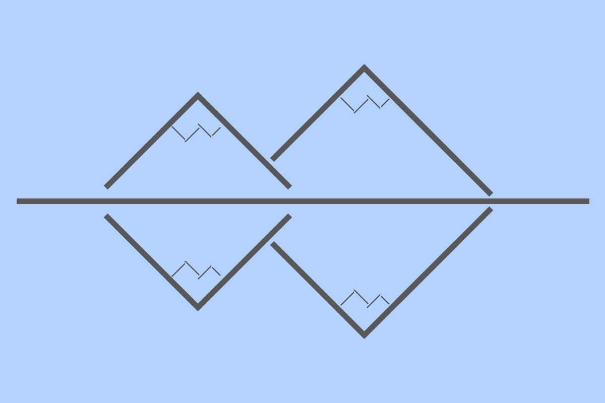
This rule can absolutely be broken; in fact there are times when it should be broken. Symmetry is the ideal example. Symmetry works well as composition by itself and can be accentuated by putting everything smack bang in the middle.
Before I go, I’d like to leave you with a recent shot of mine. Don't forget to follow me on Facebook



6 Comments
Great Article, angry birds reference was strait to the point and very ease to understand. Didn’t quite understand the last diagram…
Thanks
Hi SxperiaS,
Thanks for dropping by. The one with the triangles? Thats my bad illustration of mountains and their reflection in a lake.
The ideal time to break the rule of thirds.
Regards,
Destin
Hello Destin,
I see it now, thank you for you reply. Glad to see that i used this method before in photographing my hometown (Porto).
Hope to see more useful articles from you, love landscape photos.
PS: Great photos
Best Regards
Good article on thirds, but title and intro is misleading. It spends 90% on explaining ROT and next to nothing on examples of breaking it.
A followup with examples of photographs that work better because it broke the rules would be great.
I wonder how a big modal/lightbox ad affects your rule of thirds… (couldn’t use the page until I scrolled up)
Evil UI techniques should not be used!
As Mike indicated, more information as to how and when to bend / break the ROT would be helpful.
As for the last diagram, even though it seems to break the ROT, with the horizon line “dead center(re)” if you look closely at your (mountains) you will notice that the smaller one to the left is pretty darned close to 2/3rds the size of the larger one. Also, the base slope of each mountain lies on the left and right (approxomately) vertical third.
Breaking the ROT is harder than one would imagine I guess. 🙂