We all love the movies. It's not only the feel of sitting in a cinema watching on a big screen, it’s the skill of the director and cinematographers to draw you into the film. They make you part of it. One of the biggest elements in creating this feel is what film-makers call grading. This is the postproduction technique of tweaking exposure and color to give the scene a mood. Today we are going to look at how to recreate that cinematic look for your own images.
Picking the Right Shot and Mood
Choosing the right shot and mood combination is vital. There is no point in taking a bright colorful landscape and turning into a blue moody scene. You also need to look at composition and the technique used in the shot. There is no one way to define a cinematic look but shallow depth of field is one often used element, as it lowers contrast and muted colors. Motion pictures, shot on film seem to have a wider tonal range compared to digital shots, so look for an image with a flatter contrast and decent tones.
Creating the Look
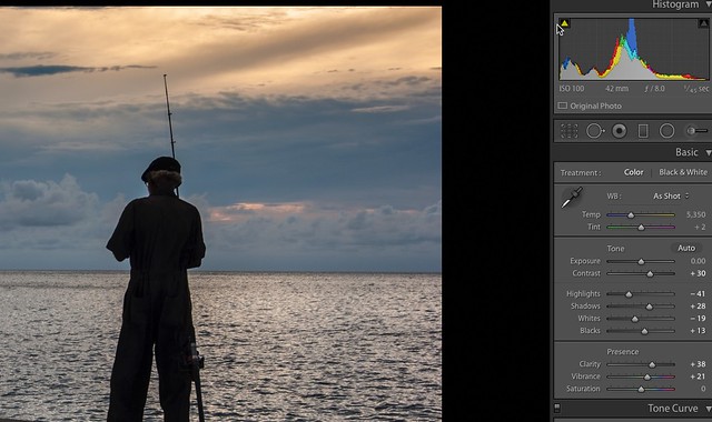
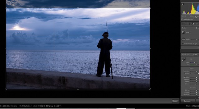
Our image of choice is of a Cuban man fishing on the Malecon in Havana. It is already low contrast and fairly neutral in color but I want to try and give it a bluish, impending storm feel. The image has a nice tonal range and the clouds in the background will serve us well in achieve the look we desire. We will use Lightroom CC for this tutorial, but the principles work in both LR5 and Photoshop.
The first thing we will work on is a cinematic technique called crushing the blacks. This effectively gives us a good black shadow area. In the Develop module we are going to slide the Blacks slider to the left until the histogram starts to clip slightly.
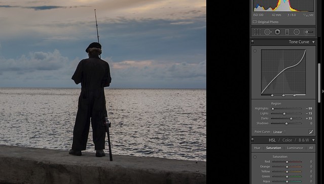
Next we are going to flatten the contrast a little using the Tone Curve tool. As we have already manipulated the Blacks we will work at the highlights end of the curve, dragging the upper right end of the curve slowly down. The effect of this is to add some definition to the highlights area in the sky and give us a slightly lower contrast in the overall image. We also bring the Darks up a little. This does not affect the shadows or blacks but raises increases the lightness of the tonal range that is just to the left of the mid tones again this helps to flatten the contrast a little.
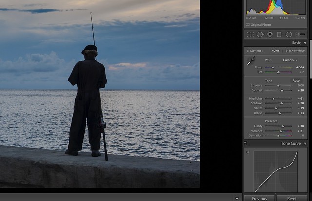
Now to get that initial blue look, we will reduce the Color Temperature. The aim is not to go too far, the default is around 5400k, which still has hints of warmth in it. We will slide the White Balance down to around 4600k. Our image now has a cool but not overly blue feel to it.
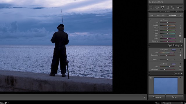
The next stage is to enhance the blueness using Split Toning. This tool is found lower down the Develop Module tools. Slide the highlights saturation to about 50% then move the Hue slider to a blue tone. Once you have found the right blue, back off the Saturation slider until you get a natural looking feel.
Repeat the toning using the Shadows sliders, you can aim for a similar blue or a slightly different blue for the shadow areas, but try to keep in natural looking.
To get the sky looking stormy, we now go to the HSL section and select the Luminance tab. Slide the Blue slider to the left and you will see that the blueness of the sky will become darker and stormier looking.
The last stage of exposure manipulation is to use tweak the image using the Contrast slider in the Basic section. In this case I have very slightly added some contrast to enhance the mood.
The Final Tweaks
If you want a true cinematic looking image, then you will need to crop it to a 16:9 format. In Lightroom this is pretty easy. Select the Crop tool and then change the aspect ratio to 16:9. The crop grid will now appear on the image. Crop to the desired look.
The last, optional extra is to add a slight vignette using the Post-Crop Vignette tool. You can also if desired add a little Grain to the image using the Grain slider under the Effects section.
As we mentioned at the top, getting the Cinematic look is not about doing one single thing. You need to pick a suitable image, and the right mood. In postproduction the aims are to lower contrast and maintain a good tonal range. Isolate a specific color feel to the image and use the split tone tool to enhance that color in both the shadows and highlights.
Done well, a cinematic feel can convey a great sense of emotion to a photograph.






1 Comment
Cool effect, but the final photo doesn’t look right. The guy looks taller and thinner than the photo above it. Maybe it’s just me, but it looks weird.