If you observe photos or have been a photographer for some time, you would have noticed how colours affect the mood. Warmer colours lend a cheerful mood whereas dull and cooler colours lend a bleak or melancholic mood. We photographers shoot mostly in colour these days and we have been able to observe the relationship between colour and mood since the 1970s when images were shot in colour film.
However, because colour is now so ubiquitous in photography, how many of us ever step back and consider how it affects the mood or emotion of a shot? If you think about it a little, you will realise just how much colour affects the way an image looks.
Colour in photography often mirrors the way we perceive colour in other aspects of our lives. Blue tones suggest coldness and isolation, red can be speed or danger. So let's delve a little deeper into how colour affects mood in photography and a little on how you can control that colour.
The Emotion Of A Colour
Let’s kick off with looking a little at the more common colours and the emotions they evoke in us. Colours can be collected into two broad camps:
- Cool colours
- Warm colours
We will look first at the cool colours.
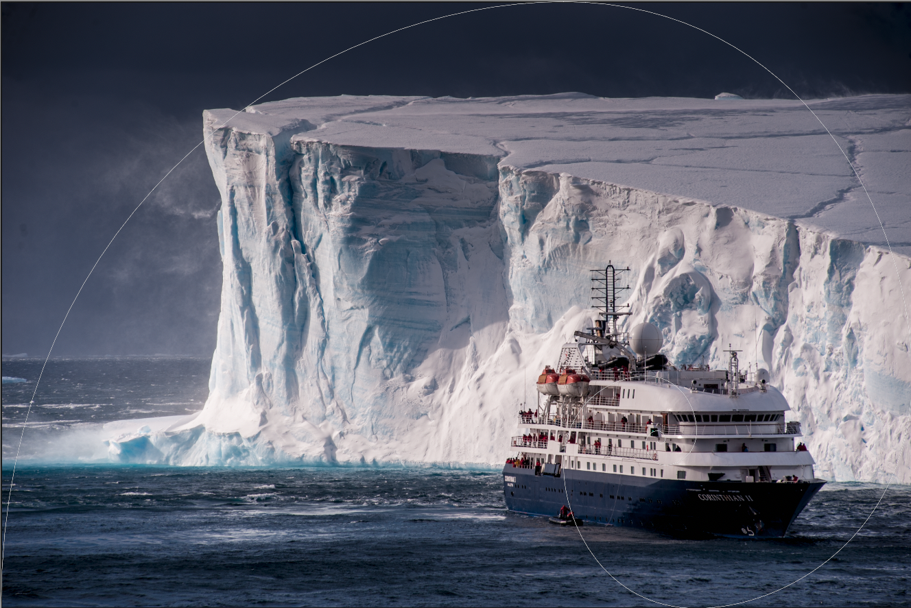
- Blue: The blue tones can convey a feeling of cold, isolation perhaps even fear. It’s why when you watch horror movies the colour grading is very often a cold, almost steel blue tone. However, blues can also give us a feeling of calmness, and serenity. Different shades of blue can give different feelings, with the darker tones edging more towards foreboding and drama. Images with a mix of blue tones can be very powerful.
- Green: Green is regarded as a cool colour but it does not have the negative connotations of the blue tones. This is because green is the most abundant colour that we see in nature. It represents renewal and life and has a soothing and optimistic feel.
- Purple: Purple or violet is very rare as a natural colour. Indeed the only places you will see it is in the colour of certain flowers and in the sky during twilight – if the conditions are right. It has a very similar feel to the more positive emotions of blue, that of calmness and tranquillity. In the man-made world, it can also suggest wealth and riches.


As you can see the emotions of the cool colours range from fright and loneliness through to tranquillity and optimism. Let’s take a look at how the warmer colours affect us.
- Red: One of the most powerful colours, red suggests passion, anger, sexuality and speed. It’s the reason when we think of a Ferrari, we think of a red Ferrari. In nature, red is found in the beauty of a sunset, in certain types of geology and in flowers. It is a colour that works well when creating compositions based around colour contrast, particularly when used with another primary colour.
- Yellow: Yellow is bright, optimistic and energetic. Its warmth is less aggressive than reds and it can convey a sense of excitement. In nature, yellow is nearly as common as greens and blues.
- Orange: Orange is the colour of adventure, creativity and confidence. Like the other warm colours, it is a common occurrence in nature, from fruits and flowers to sandstone and autumn leaves. It is a colour that works well in combination with the other warm colours more than with cool colours.


With some of the most important colours identified, how do we go about composing and shooting with them?
Composing Colour In Camera.
Let’s kick off with the most obvious aspect, white balance or colour temperature. By shooting RAW we can control that white balance in post-production. However, it’s important that we understand how we want the final image to look when we are taking it.
For example trying to get a cold, tranquil look from a field of bright orange flowers, is going to make the image look wrong, not moody.
If however, we take a misty mountain landscape at twilight, we can enhance the natural blues of the light by opting for a colder white balance.
Similarly, if we wanted to enhance that field of orange flowers, we could shoot it at sunset on a warm sunny day and enhance the warmth using the white balance.

The time of day and colour of the ambient light is an important factor in creating mood. If you are looking for a cold, blue mysterious type of image, then a deep overcast day is best suited. Thick cloud cover gives the natural light a very blue feel.
Conversely to get the warmer tones we can shoot early or late on a bright sunny day, during the fabled golden hour.
Creating Colour Moods In Post Production
As we mentioned, by shooting RAW, we can have a great amount of control over the mood of our colour in post. As well as sliding the white balance between warms and cools, we can change the tint of the white balance between greens and magentas.
Another way to create great colour mood is to use split toning. This allows you to change the tones within colours from warm to cool or vice versa. You can also create different hues of the same tone.
You can use selective saturation to boost the colour of your subject matter by masking it. Alternatively you can slightly desaturate the background to make your subject punch out.
Contrasting Moods With Colour.
One of the most powerful ways we can use colour in photos is to create conflicting emotions. This is where we use two different colours with opposite emotions in a single shot.
An example of this might be a person sitting in the window of a warm cosy cafe looking out of the window to a dark rainy street.
In such a shot, the warm, orange, yellow light would be seen in the skin of our subject and reflected in the window. It gives us a feeling of wanting to be there. Outside the blue light of a rainy day gives us a sense of isolation and depression, adding the feeling of wanting to be inside the cafe.
There are many shots where we can convey this emotional contrast, look out for scenes where your subject is predominantly one colour and your background an entirely different one.

Colour is an often underestimated part of our composition. Shooting predominantly in colour we often take it for granted and ignore the power it has to convey emotion. Next time you are out shooting, look out for ways to create emotion using colour. Look at the light, look for distinct colours and think of a way to combine them into one emotive photograph.
Further Reading:
- This is the Story of the Long Path to Colour in Photographs
- Enhance Your Images By Composing With Color
- How To Use Colors In Your Portraits
- Why The Color RED Made Me a Better Photographer
- This Is How To Decide If A Photo Should Be Color Or Black And White
Further Learning About Colour Affecting Mood In Photography:
Using colour effectively in photography is part of the wonderful world of composition. And honestly, composition is one of the greatest challenges for any photographer. If you’d like to get better at photography composition and learn concepts that go beyond the basics, you should take a look at Kent DuFault’s guide to advanced composition.
In Kent Dufault's Advanced Composition, you'll discover advanced composition concepts such as:
- Compression
- Colour Placement
- Contrast Overlap
- Rhythm
- Colour Wash
- Texture
- Stacking


1 Comment
“Purple” which I call violet is the most prevalent color in nature. It is the color of shadow. It is the color of “white” out of direct sunlight. It is the color of light from the open (non sun) sky. Violet is the glue that holds a landscape together. It is present in EVERY value from lightest to darkest. Only the proportion changes. Actually, every color moves thru its entire value range with every color in the spectrum in an unending eternal dance. If you paint daily in natural light for ten years or so you might discover this for yourself. If you can’t see the violet (and the pink for that matter) you don’t see color. Good luck.