Colour in our images can be a tricky thing to get spot on. We can try to give ourselves a head-start when shooting by picking an appropriate white balance or shooting in RAW. Sometimes. however, no matter what we do, we get an unwanted cast in an element of the picture. There are various ways to try and eliminate a specific cast but perhaps the most powerful is to use curves.
Why Use A Curve?
A lot of photographers use curves in their images to correct exposure and contrast. Adjusting the curve allows us to increase or decrease the brightness of the image across the entire tonal range of that image. It allows us to adjust both overall exposure and increase or decrease contrast.
However whilst many work with curves using the RGB channel, fewer realise how much control we have over colour by using the separate red, green and blue channel curves.
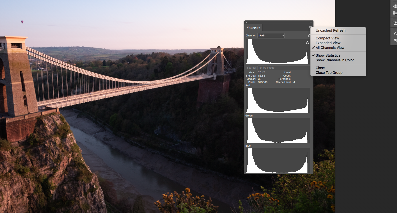
To demonstrate this we are going to work on this image of the Clifton Suspension Bridge
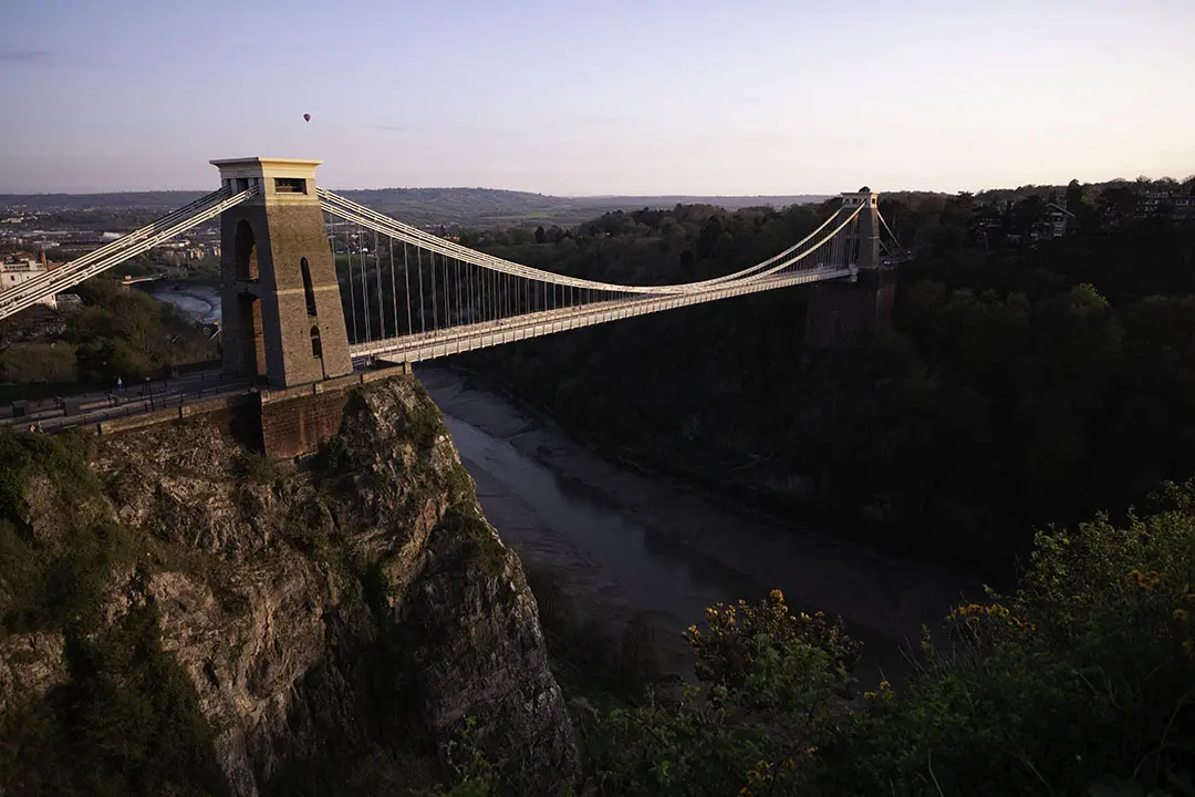
As we can see it was taken in the golden hour, but the brickwork of the bridge and the rocks on the cliff below look more red than the golden hour would suggest. The redness also extends into the highlight areas as well.
We are going to take this image and try to give it a more natural golden hour look.
Preparing The Workspace
As we don’t always see colour well in images, especially when working on the same image for a while, it's best we use some visual aids when correcting. The best option for this is to use the Histogram.
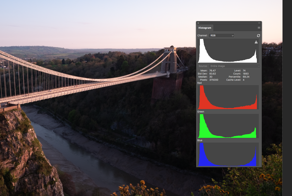
If it is not already open, click the top menu, Windows – Histogram. As we want to see what is going on in the colour channels as well as the combined RGB, click the icon top right and select All Channels View and Channels in Color.
From the histogram, we can see that our image has extra red in the darker mid-tones as well as a peak in the tonal range around the sky.
Adjusting The Curves
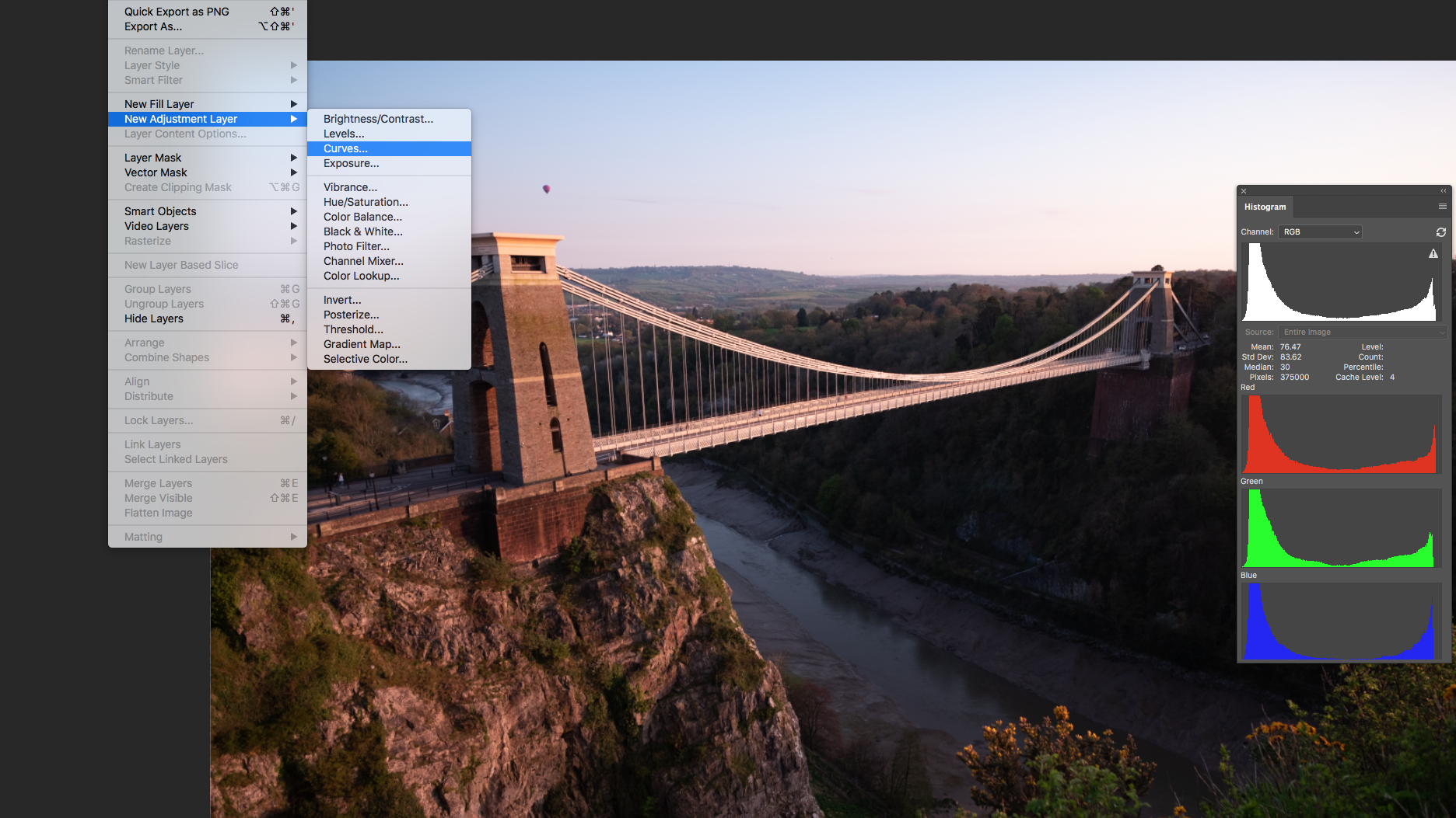
We will correct our colour cast using an adjustment layer. From the menu select Layer – New Adjustment Layer – Curves. Give the layer a suitable name.
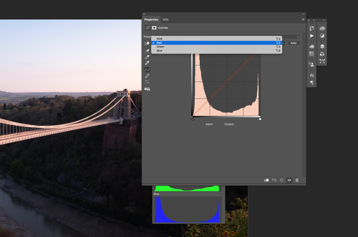
From the curves window that opened select the red layer from the drop-down box. Now for a neat little trick. We know that the red caste is predominant in the brickwork and the rocks.
To the left of the Curves window are a number of tools. The topmost one is a hand with arrows. Select this then move the eyedropper to a point where the caste is obvious. Then click and the eyedropper will become a hand with arrows. Dragging up will increase the red in that tonal region whilst dragging down will decrease it.
We drag down a little and can clearly see a reduction in the red cast and a shallow curve on the red histogram.
We repeat the effect in the brightest parts of the sky except as the original edit has dragged down the red in the sky, we are going to drag up very slightly to return some redness to it.
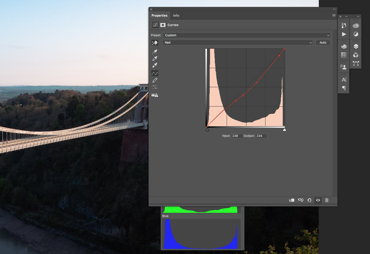
The image now looks fairly neutral but that’s not the effect we are looking for. We want the image to have a golden hour feel to it.
To do this we are going to add some yellow using the blue curve. Selecting the tower on the bridge again, we drag down to reduce yellow in that tonal range. The effect is to add warmth across the mid-tones of the image. It has also added a little too much warmth to the blue parts of the sky. To counter that we are going to click and drag up in the bluest part of the sky, giving us a more natural blue.
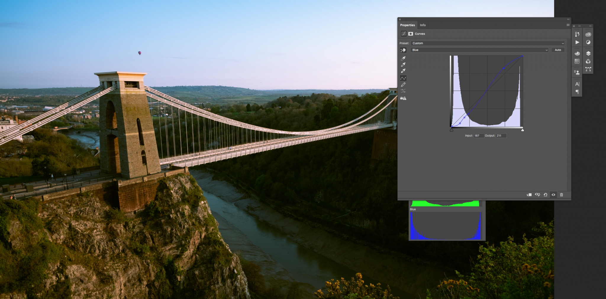
The image is looking much more like a golden hour shot now, however, overall there seems to be a slight green caste across all tonal ranges.
To counter this we select the green curve channel and drag the middle of the curve down slightly to reduce the green. The end result is a much more natural looking golden hour image.
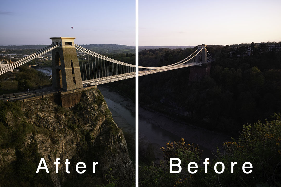
Using curves to correct colour is one of the most powerful options we have. It allows us to isolate colour in very specific tones or tonal ranges and micro-adjust them to our needs.
You need to be aware that every adjustment you make will make a small change elsewhere in the image but if you work carefully with the colour curves you can counter those changes and create very natural looking final images in a relatively easy way.
Now, this is just one part of a solid understanding of proper post-production. If you really want to get down to business and solidify your understanding of the craft of post-production, then dive deeper with this guide.

