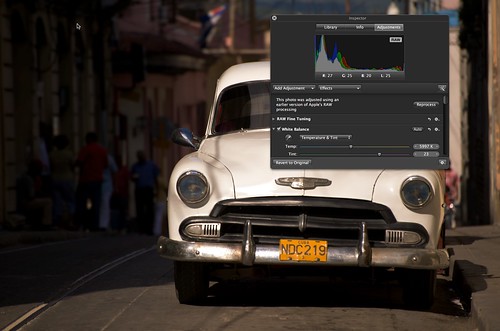
Many of us will go about our photography without ever looking at those magical graphs called histograms, yet by doing so, we are severely restricting our ability to get the perfect exposure. Histograms are perhaps the most powerful, and often overlooked, tool in the photographer’s skill-set. By understanding what they are telling us and reacting to that information, we can dramatically increase the quality of our exposures.
Where Do You Find a Histogram?
The two most common places photographers will come across histograms are in your camera settings and in your photo editing software. Both work in similar ways and are basically a representation of how the light is distributed through your image through the use of a graph. This means it can not only tell you how close you are to a correct exposure but also whether that exposure has high or low contrast and whether you have lost details in the shadows or highlights. On your camera you will usually find the histogram information in the display section of the menu. Most cameras, when reviewing an image, allow you to cycle through several screens of information. These will include, just the image, image plus exposure details, clipping, in other words where the image is overexposed and histogram. Some camera’s will also allow you to show the histogram in terms or red, green and blue as well as luminance.
Reading a Histogram
So lets assume we have just taken our image, now we will cycle through the display modes to see the histogram. For the moment we will look at just the luminance histogram. What we see is a typical graph, with the light represented similar to the cross sections of a mountain ranges you may have drawn in high school geography. The lefthand side of the graph represents black and the righthand side represents light. Everything in between are the shades of grey. The easiest way to think of the graph is as a bucket of light. The aim is to get all of our light to fit within the confines of the bucket, i.e. the left and right sides of the graph.
Using Histograms to Assess Exposure
If we have light spilling out of the left side, we have underexposed our image. We, therefore, need to do one of three things, open the aperture more, use a lower shutter speed or as a last resort, increase our ISO. Conversely, if we have light spilling over the right side, we are overexposing, potentially blowing the highlights out. This can be seen if we switch the image display mode to clipping, the black flashing over the extreme light areas of the image are the areas that are blown. This means for the most part they are unrecoverable in post production. In this case we do the opposite to underexposure, that is, use a smaller aperture, faster or faster shutter speed.
Our aim in getting the correct exposure is to try and get all of our light to sit within the confines of the graph. Depending on the scene, this is not always going to be possible. For example, if you have a scene with a lot of very dark shadows and very light, bright overcast sky, you may find that the light runs out both sides of our bucket. In this case, you should generally work towards keeping the light inside the right side of our bucket, preserving the highlights.

Bunched to left, the image is underexposed
Contrast and ‘Mountains' in Histograms
You will find some shots will have a very tall, very steep mountain somewhere in the center of the graph. This is a typical high contrast scene, perhaps as in the example, a dark dog on snow. If you come across this type of scenario, try to keep the light to the right side of the graph. There is an article to explain the benefits of this.
In-Camera Histograms: A Raw Deal
For those of us that shoot RAW, there is one caveat to using the histogram on your camera and that is, it only represents a graph of the jpg version of the image. In reality the way to re-imagine this is that, when shooting RAW, you have a slightly bigger bucket than is represented on screen, in other words a wider dynamic range. If you are using histograms in your post production software, the graph will represent the full dynamic range of the RAW image.
RGB Histograms
So lastly, lets look at why you might use an RGB histogram. As many of us have found out, digital cameras do not always expose different colors well. For example reds can easily be blown out with incorrect exposure and when taking an image that is predominately one color, our camera’s meter can be easily fooled. By using the RGB histogram, we can make sure we are not drastically over or under exposing on one color and then make corrections for it, making sure we are not over saturating our shot.
As you can see, histograms are immensely powerful info-graphics. They provide us with an in-depth, visual representation of the quality of our exposure, and by understanding this information, we can get the perfect exposure every time.


1 Comment
Cool