Creating black and white landscapes is a powerful way to capture stunning tones with a traditional subject. However, if black and white is a bit too boring for you, you can easily take it to the next level and turn your image into a two-tone landscape that adds interest and drama to your photograph. Best of all, you can do this entirely in Photoshop RAW which will give you the most editing versatility without damaging your photograph.
1. Convert to Black and White
Throughout the editing process, keep in mind that the base of a two-tone image is one that has a full range of shadows and highlights – the entire spectrum. If your image is low in contrast or rather flat, we’ll need to adjust this in order to have a truly successful two-tone landscape.
Once your image is open in RAW, do any kind of editing you would normally do (exposure correction, etc.). However, watch your histogram to see if you’ve got points in both ends of the spectrum – shadows and highlights. If not, adjust as necessary using the tools available.
For example, if you don’t have enough highlights, increase the Exposure and Brightness. Not enough shadows? Pump up your Blacks. Also play with the contrast a bit to take out any cloudiness to your tones and make your image stand out.
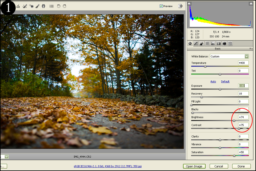
For my image here, it has a pretty wide tonal range to begin with (which is why I chose it) so not many adjustments are needed. I started to blow some highlights so I didn’t adjust my exposure, but I did increase my Brightness to 74 so that my middle tones were lightened a bit (Figure 1). I also bumped my contrast up to 75 to make the image more crisp.
Note: Click on all images to view at full resolution.
Now we’re ready to convert to black and white. Click on your HSL tab (Figure 2) and tick the Convert to Grayscale tab. If you want to make things quick, you can leave your settings alone as you’ve already established a pretty wide tonal range in the last step. However, if you want to tweak your image (like me), play with the sliders below to see how your image turns out.
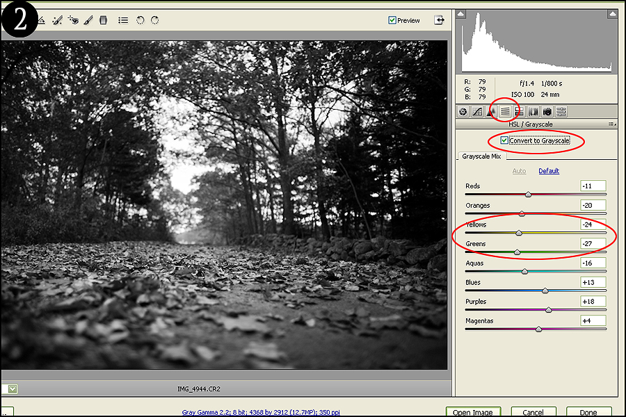
What these sliders do is add black or white to the colors that were present in your original (color) image. So for my example image, there were a lot of yellows and oranges. If I adjust those color sliders, I will be darkening or brightening the tones of just those colors.
RAW will automatically set these sliders to what they think is optimal. I decided to darken my yellows and brightened my greens to add some more tonal range to my tree lines as they were blending a bit. Take your time and adjust these sliders as you like, but keep an eye out for unnatural-looking tones.
2. Add Your Tones
Now that we have a solid base (a strong b/w image), we can add our two-tone coloring. Select the Split Toning menu (Figure 3) and increase the saturation of the highlights to about 50 to start. Your image will look horrible, but don’t worry – we’re just beginning. Adjust your Hue slider to what color you want your highlights to be (the bright parts of your image). In my photo, I’d like the highlights to be a yellow/sepia.
Next, let’s move onto the Shadows. Do the same thing you did here for your Highlights by increasing your Saturation to 50 to start, and select a color (preferably one opposite of your highlight color). I decided to go with purple.
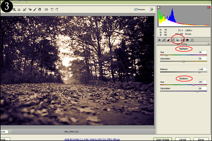
So what we’re basically doing here in changing the color of our dark tones (shadows) to purple, and our bright tones (highlights) to sepia. Increase the saturation to both the highlights and shadows to 100 and you can see what I mean. Now you know why it’s so important to have good contrast in your image and a lot of tonal variation – so that you have different tones of your selected colors going throughout your image.
Finally, we have the Balance slider. This basically lets you decide how much weight you want each color to have (the sepia highlights vs. the purple shadows). Since I have more shadows in my image than highlights, I want my sepia to have a bit more dominance over my image – so I increased it to 68.
As a final touch, I decided to also increase the saturation of my shadows to 80 because I wanted the purple to stand out a bit more. It's best to set your saturation to 50 and adjust it as the last step.
Here's the finished product:
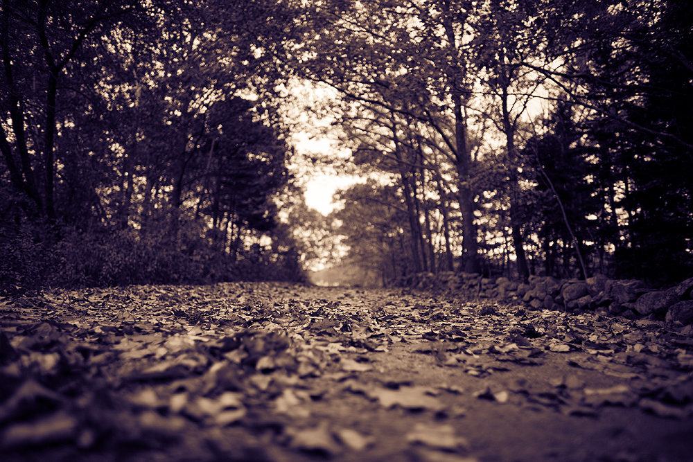
The best part about RAW editing is that none of it is permanent: you can easily switch back to your original and/or adjust your changes as necessary at any time. Although Photoshop files work in the same manner if you have a good workflow (working on layers so that you always have an original to revert back to), doing all of your editing in RAW first is just smart since you have so much more image data to work with. This will lessen any unwanted editing damage.
Read more great articles by Christopher O’Donnell at his blog or follow him on Facebook. You can also enter his print giveaway contest by signing up for his newsletter.



6 Comments
Another way to do this that works well is to use Lightroom’s “Split toning” feature. Basically, make the image BW/grayscale, and then set the highlight tone and the shadows tone. Thanks for this.
Great tips…and I agree, you have to shoot in RAW.
I used to do this by converting to grayscale and then to duotone in Photoshop. But this involves destructive editing and also means if you want a b&W AND a duotone version of the same photo you have to have two psd files.
I recently became aware of the split toning option in RAW, but my preferred method now is the gradient map function in photoshop which can be applied as an adjustment layer and allows for more control more intuitively than the other methods.
I do this quit often, because it is so cool.
Here is one of my wife.
https://www.flickr.com/photos/ken-b-images/4715755497/
nicely done
It can work well with industrial shots as well as softer subjects … Bibble with toning