Colourful photography brightens our collections, social media and websites. Our use of colour influences emotional responses to our images. Colour creates compositional wow!
In photography, playing with colour is more than part of our workflow. It's our statement, our stamp, our view.
Our use of colours evolves with seasons, our moods, our subjects. How we apply colour ranges from realistic to creative and anywhere in between. You're the artist, you're in control of applying colour in your composition.
Colourful Photography: How Much is Too Much, Too Little?
Shooting Techniques: Finding Your Moment
Finding our colourful moments isn't accidental. As photographers, our eyes are always on the hunt. We are either intentionally searching or we're subconsciously keeping our eyes open for opportunities.
Example of an intentional search: It's tulip season. Time to explore botanical gardens exploding with shades of pinks, reds, yellows and purples. For a brief moment, our photography life reminds us what it was like to be on an Easter egg hunt. We're in search of the perfect pairs, tulips with personality, collections and individual flowers. Our memory cards are loaded with tulips galore. A happy day!

Example of an accidental discovery: One could say that every image is intentional since I always have a camera (and tripod) with me. However, there are those moments when you're on errands, a country rode, a city street and then “bam!” You see it. That shock of colour or colours. That haunting imagery. You just have to have it! You stop, you snap and move on.
In the accidental discovery, we may have a lot of photos to work on, or it may be just a few. In either case, it's not about quantity but the quality of our artistry and satisfaction with our work.
Colourful Photography: From Capture to Final Image
When I initially started with photography, the majority of my work was processed to reflect what I saw in the field. Over time, how I saw moments and processed images evolved. They were no longer two separate events but very connected.
When processing images, I start with the intent of bringing the image to what I saw and felt in the field. But in all honesty, I don't always stop there.
Why? Colour ignites an image.
It tells the story. How you apply colour is personal. Vibrant, desaturated, soft, hard and anywhere in between. We have a pallets of colours within our images to modify. There's a pallet of colours to play with or add in post processing.
In the field, consider the following colour characteristics with post processing considerations at the time of image capture.
Colour and our Story:
The following elements of colourful photography set the stage for our image:
- Mood – Dark and creepy, vibrant and happy, soft and dreamy. How we use colour invokes mood. You can literally take one image and process it multiple ways and it won't event look like the same image. Colour paints the message.
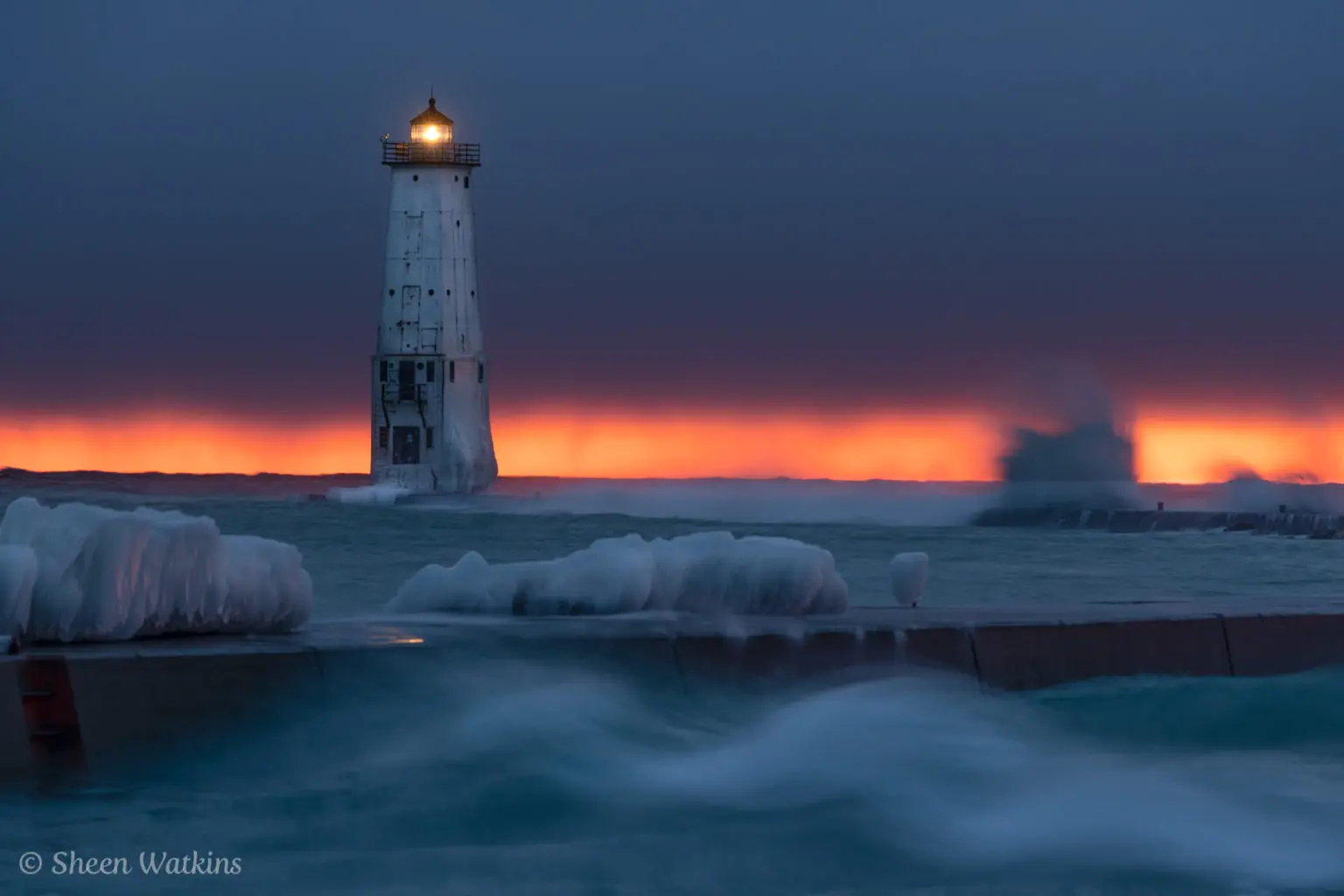
- Warm and cool – Winter images, summer images. Taken in realistic context and they should emote a sense of the season. In either case, balance strengthens our composition. Stroke an overly cool image with a touch of warmth. Conversely, a warm image image with a hint of cool guides the eyes.

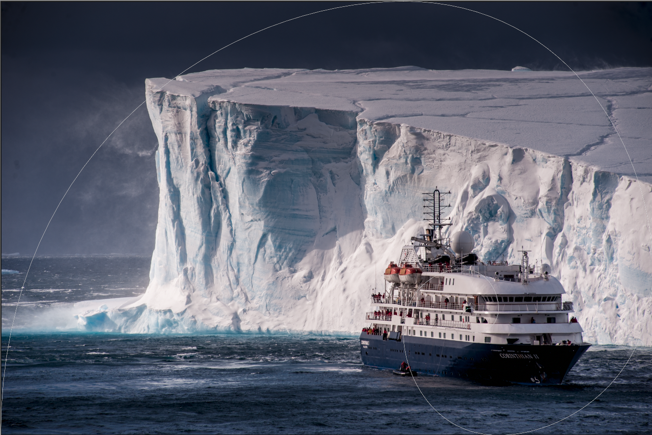
- Complementary colours – Bring harmony and simplicity through scenes filled with one hue or colours that run next to each other on the colour wheel. Blue and purple, yellow and orange.
- Contrasting colours – Opposites attract in life and on the colour wheel.

- Isolated colour – A simple smash or pop of colour draws the eye directly to your subject.
- Eruption of colour – Bold colour is your friend and enemy. Colour for the sake of adding punch looks over-saturated. Bold, saturated colours that frame your subject or tells the story engages the viewer.
- Desaturation of colour – Not all images need a heavy hand in colour. Strong textures and lines may be emphasized with a less is more approach in the use of colour.
- Story or story book – When working in the moment, there's also many creative tools that work alone or as a plug in to Lightroom, Photoshop and others. Topaz Studio 2 pulls your images into a huge array of themes that you further customize into a realistic or fantasy moment.

Too much or too little?
Find five photographers and ask them, “How much colour is too much or too little?” More than likely you'll get five different views. How we manage and process colour is as individual as our shooting techniques.
Today, I consider post processing when in the field. The phrase of “get it right in camera” still applies. We don't want an ugly branch or other distraction that's hard to get rid of in post processing.
There's also the “this is what I'll do in post processing” element too. From cropping (leave room on the edges for your mat when framing!) to the use of colour, our knowledge of what we want in the end elevates artistry. Colour on!