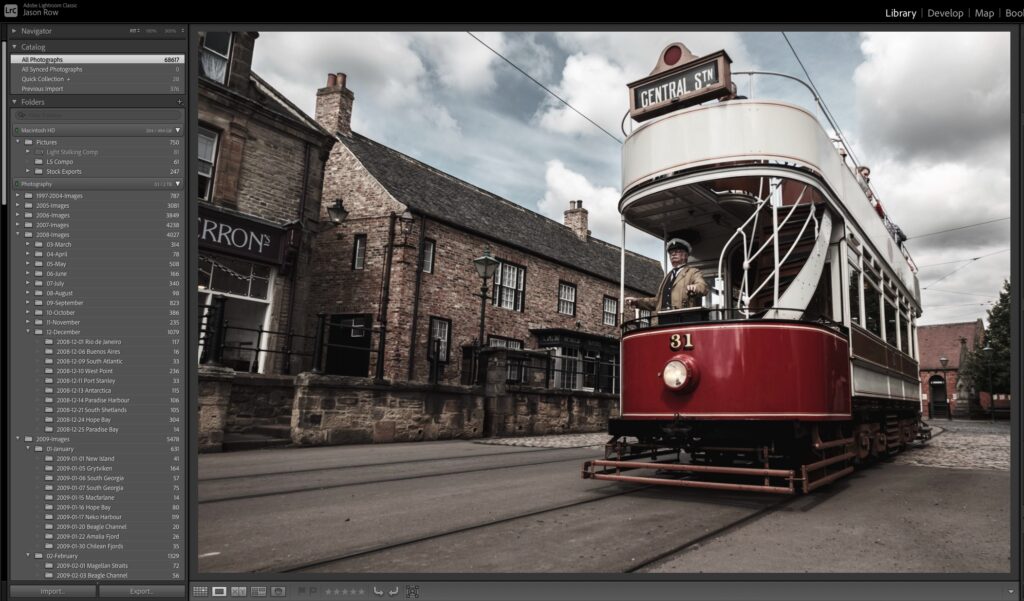
Saturation in images can be a very tricky thing to get right. If you shoot raw, then your image files will not have any extra Saturation added to them. If you shoot jpeg, then depending on your settings your image could be under saturated or unnaturally over saturated.
In order to get the very best control over Saturation you are best advised to shoot RAW. But how do saturate those raw files without going over top? How do you avoid garish images that sting the viewer’s eyeballs? Today we are going to look at three separate saturation tools in Lightroom and how to use them effectively.
The Lightroom Saturation Slider
Let’s start with the obvious tool, Saturation. As a newcomer, this might be your first choice when editing. Sliding it to the right will increase the intensity of all the colours in your image, regardless of how saturated they are to begin with. Sliding to the left will gradually desaturate them all the way down to monochrome.
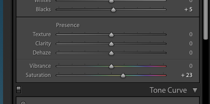
For minor, small increases in overall Saturation this tool is fine. It is, however, a little like bringing a gun to a knife fight.
The problem is that digital sensors do not record colours equally. Most cameras will tend to make reds more saturated than greens and blues. By increasing overall Saturation you can easily blow out the red Saturation in your shots. Here is an example of overblown reds
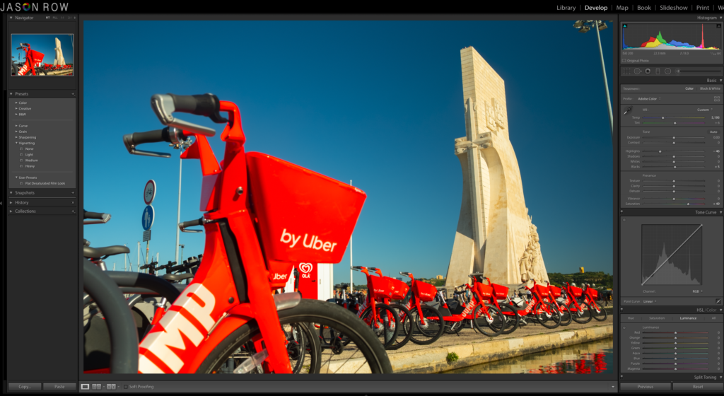
So are there any alternatives to the Saturation slider that will give us finer control over the colour of our images? Fortunately there are. One a simple slider, the Vibrance control, the other a whole series of sliders and tabs, the HSL or Hue Saturation Luminance tool. Let’s look at Vibrance first.
The Lightroom Vibrance Slider
The real power of the Vibrance slider in Lightroom, is that it knows how much Saturation each of your colours already has.
Let’s assume you have an image has a particularly saturated colour such as a deep red flower yet other parts are somewhat muted. By sliding Vibrance to the right, you can raise the Saturation of those muted colours without affecting the red Saturation.
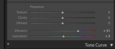
The Vibrance slider is a particular useful tool for portrait and landscape photographers. In portrait images, it tends to have less effect on skin tones allowing the photographer to increase the overall colour saturation without affecting the subject’s face.
In landscape photography the tool is very useful for punching out a blue sky or for increasing the saturation of foliage without giving an unnatural look to the shot.
In this shot below you can see how a small increase in Vibrance has added some punch to the blue sky.
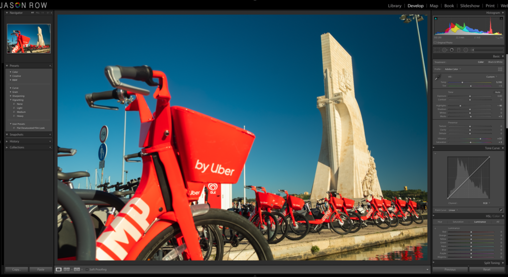
However, like the Saturation tool, Vibrance is somewhat of a one trick pony. It might affect saturated colours less than muted ones, but the editor still does not have full control over the individual colours. For that we need are more advanced tool, the HSL tool.
Hue Saturation Luminance in Lightroom
Lightroom's HSL tool is so powerful it gets an entire tab in the Develop Module to itself.
It allows us to control the hue, saturation and luminance in 8 separate colour channels. Those channels are Red, Orange, Yellow, Green, Aqua, Blue, Purple and Magenta.
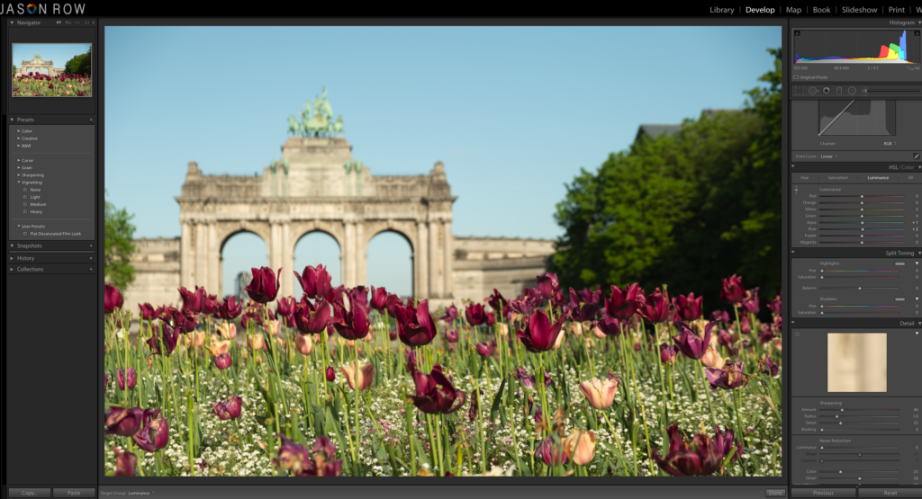
The power of this tool lies in the fact that you can control saturation in any one of those colour channels or combinations of channels to affect very specific colours. Lets look at what HSL does.
- H – Hue. This affects the colour tone of a specific colour. For example if you slide the blue slider to the left, any blue in the image will gradually become more greenish. Slide it to the right and the blues will become more magenta.
- S – Saturation. This simply increase the colour intensity of the selected channel or channels. Sliding to the right increases that channel's saturation.
- L – Luminance. This affects the exposure density of each colour. Sliding to the right will make the colour lighter without reducing saturation. Sliding to the left will make the colour darker without increasing saturation.
Using HSL in Lightroom
As you might gather the HSL tool is very powerful and gives you much more control over the saturation of colour in your images. Not only can you increase or decrease the saturation, but you can change the tone of a colour to increase or reduce its impact on the shot. You can also reduce the appearance of saturation by decreasing the exposure of a colour.
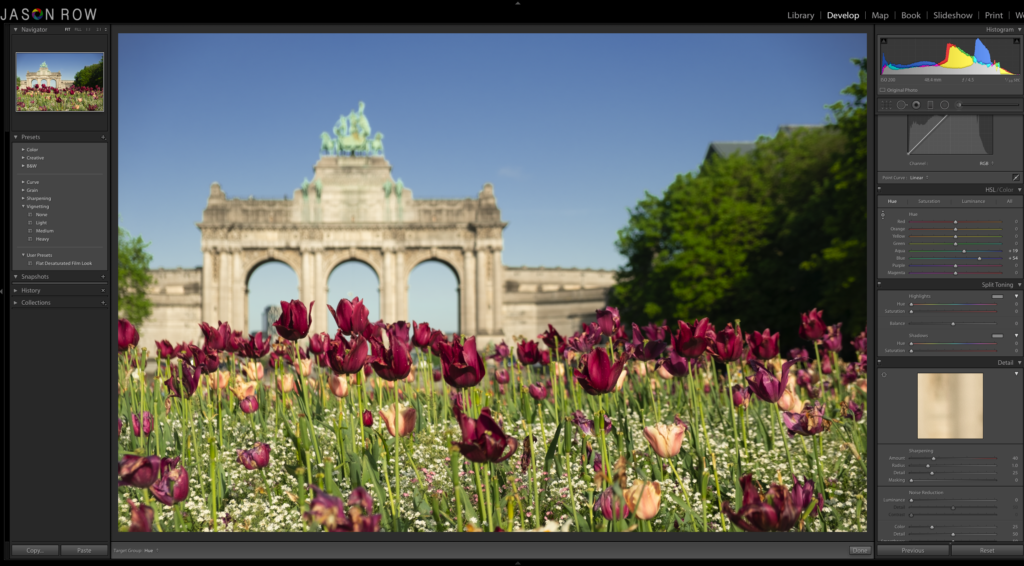
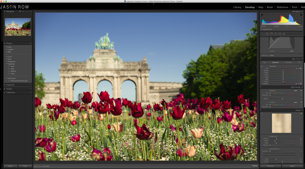
To do any of this, you need to select either the H, S or L tab then slide the individual colour channel to suit. However, there is an extremely useful and fairly hidden tool that makes HSL so powerful.
To the top left to the sliders, is a small circle icon. Clicking on this will allow you to select a specific colour on your image and to drag up or down. Dragging your cursor up, will push the relevant sliders to the right, dragging down pushes them to the left. The key here though is that when you select the colour on the image, Lightroom will determine which combination of channels make up that colour and all relevant sliders will move.
For example if you are adjusting a red flower, you might find that the orange channel also moves but not as much as the red. It is an extremely powerful control and can drastically change the way an image looks.
How Much Saturation Is Too Much?
Of course the answer to this can only be subjective. There are however some pointers to help you.
The main one is the histogram. If you have your histogram set to RGB mode, you can see if any of the channels is clipping to the left or right of the graph. You can then back off the H, S or L to bring that colour back within tolerances.
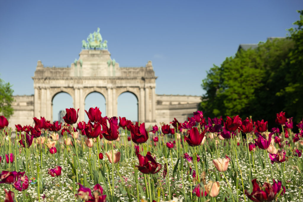
Another way is to simply look at the picture. Take a break from editing, come back a little while later and look carefully at the image. If the colours seem too unnatural or garish then you have probably gone over the top with your saturation.
Saturation is a hard thing to get right. Using the Saturation slider is like using a sledgehammer to crack a walnut. The Vibrance slider gives us more control especially over the more muted colours.
For the finest control over how colours look in an image the HSL tools are unmatched. Practice with them, in particular with the colour picker took and you will soon find yourself able to make very subtle yet important changes to the way your image looks.


