The Instagram Faded Effect has been around for quite a while and there are many users looking for presets or filters in apps to apply the faded effect as it kind of gives a classic film photography feel to images.
There are apps like VSCO and the likes that have filters that can be applied, but, did you know that this faded effect can be created in under a minute if you have a post-processing software like Lightroom?
And no, you do not need to invest extra money into purchasing any filters!
Here Are The Steps Involved On How To Get The Instagram Faded Effect In Lightroom:
Note: These tips are aimed at users who like this look and are looking to achieve the faded effect and not as a “must use” effect to get better or classy images. But, I personally think, as an artist, there is no harm in trying and discovering new styles and tones!
First Step: Basic Adjustments
Once you have imported the image/s into Lightroom, make the basic adjustments as you would normally do to any image. In the image below, I have slightly increased the contrast and clarity, lowered the highlights and blacks a bit. This differs for each image and is completely dependent on what you wish to create.
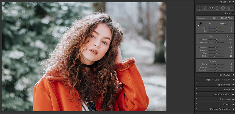
Image by Jonas-Svidras
Second Step: Creating The Faded Effect
Moving on to the fun and exciting bit – Scroll down to where you see the tone curve. Click on the bottom right box straight at the end of where it says “Point Curve.” Now, this is where you create the faded effect.
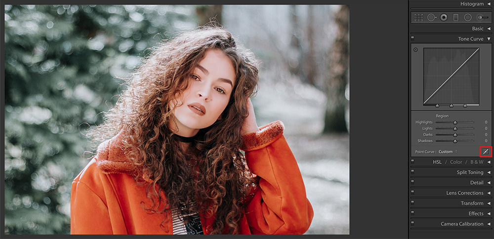
This is how it looks. You can see the difference between the 2 curves.
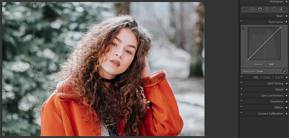
Create a control or anchor point, at about 25 / 25%. This is a point that is 25% into the x-axis and y-axis of the curve. See image below for reference.

Now click on the bottom left control point that is at (0,0) and drag this to about (0,15), but it all depends on what appeals to you. You can go all the way to (0,25) but overdoing it can make the image look very awkward and unreal, but it also depends on the image itself – one setting does not work for all.
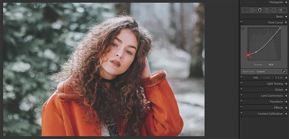
At this point, you’ll see that the tone curve is slightly curved downwards and the created fade effect may look a bit too much. In order to have control over the fade only in the shadows region, you can create a control point right at about (50,50) – that is the midpoint of the curve.
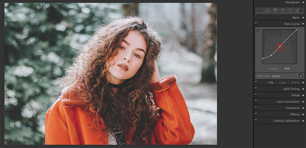
Note: What happens when you make adjustments to the tone curve in the shadow area is, it makes the dark blacks slightly grey colour causing the faded effect.
Third Step (Optional): Split Toning
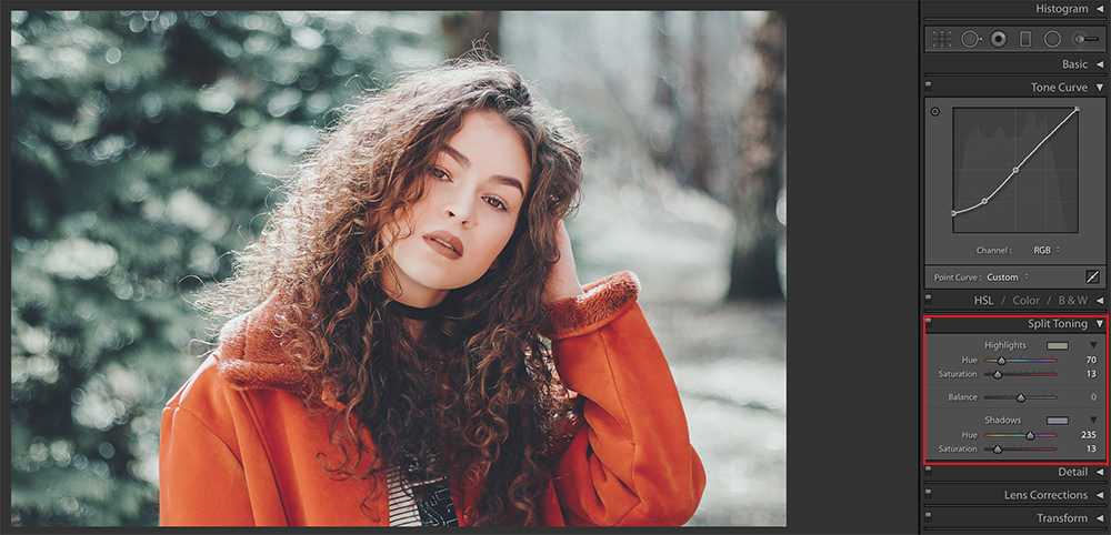
Now, if you want to play around with your image, even more, this adds different tones to the shadows and highlights area, then you will need to make use of the split toning panel. Again, do not overdo this as it may make the image look ugly and unreal.
Tip: Just to make things easier for you if you are new to using “Split Toning” panel – keep the “Saturation” value to something between 10 and 15 and drag the “Hue” for the “Highlights” to change tones int he highlights area and “Hue” for the “Shadows” to change tones for the shadows area.
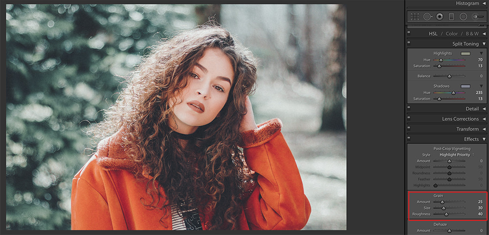
Optional: If you want to add a slight amount of grain to the image, you can do so in the “Effects” panel. What you want to do with your image depends entirely on what appeals to you and what you are looking to achieve with that image.
Fourth Step: Final Tweaks
Once you have completed all of the steps above if you feel that your image looks dull and lacks contrast or vibrance or anything else, feel free to make some final tweaks before you export the image. That’s about it. Wasn’t it very simple?
Here is the final image after all the effects have been applied. You can also check the “Before and After” effect just below it!
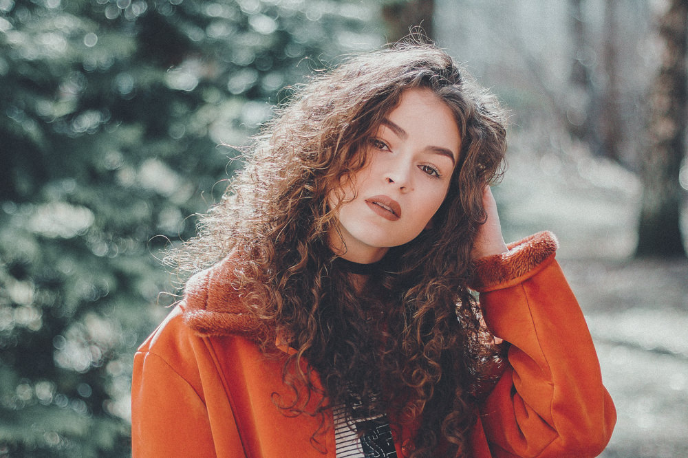
Image by Jonas-Svidras

Note: The tone curve is a very powerful tool and there is so much you can achieve by tweaking it. If there is a look that you have created and you would like to save it for future use, just go ahead and save it as a new preset.
Here are some “Before and After” sample images to give you an idea of how applying this effect to different images looks. Each image has different split tone settings.

Image by Nastya_Gepp

Image by Ultra_Nancy

Image by 12019

Image by Valiunic

Image by Nastya_Gepp

Image by Atlantios
How did you like this effect? Would this be something that you will be trying? If this is an effect that you have created before, feel free to share any tips that you may have in the comments section below.
If you wish to improve your photos instantly, check out “The Ultimate Guide to Fundamental Editing” where you can learn the fundamental editing steps from a pro, that will help you change your photography forever.
Further Resources:
- Bite Size Tips: Fundamental Lightroom Editing Skills
- Bite Size Tips: How to Build Your Own Workflow for Post Production
- 5 Little Known Lightroom Tools That Will Make Your Photos Better
- 4 Important Post Processing Steps That Are Often Overlooked
- Common Lightroom Classic Stumpers
- Some Lesser Known But Very Helpful Lightroom Tips Lightroomround for quite a while and there are many users looking for presets or filters in apps to apply the faded effect as it kind of gives a classic film photography feel to images.
- Bite Size Tips: Fundamental Lightroom Editing Skills
- Bite Size Tips: How to Build Your Own Workflow for Post Production
- 5 Little Known Lightroom Tools That Will Make Your Photos Better
- 4 Important Post Processing Steps That Are Often Overlooked
- Common Lightroom Classic Stumpers
- Some Lesser Known But Very Helpful Lightroom Tips
There are apps like VSCO and the likes that have filters that can be applied, but, did you know that this faded effect can be created in under a minute if you have a post-processing software like Lightroom?
And no, you do not need to invest extra money into purchasing any filters!
Here Are The Steps Involved On How To Get The Instagram Faded Effect In Lightroom:
Note: These tips are aimed at users who like this look and are looking to achieve the faded effect and not as a “must use” effect to get better or classy images. But, I personally think, as an artist, there is no harm in trying and discovering new styles and tones!
First Step: Basic Adjustments
Once you have imported the image/s into Lightroom, make the basic adjustments as you would normally do to any image. In the image below, I have slightly increased the contrast and clarity, lowered the highlights and blacks a bit. This differs for each image and is completely dependent on what you wish to create.

Image by Jonas-Svidras
Second Step: Creating The Faded Effect
Moving on to the fun and exciting bit – Scroll down to where you see the tone curve. Click on the bottom right box straight at the end of where it says “Point Curve.” Now, this is where you create the faded effect.

This is how it looks. You can see the difference between the 2 curves.

Create a control or anchor point, at about 25 / 25%. This is a point that is 25% into the x-axis and y-axis of the curve. See image below for reference.

Now click on the bottom left control point that is at (0,0) and drag this to about (0,15), but it all depends on what appeals to you. You can go all the way to (0,25) but overdoing it can make the image look very awkward and unreal, but it also depends on the image itself – one setting does not work for all.

At this point, you’ll see that the tone curve is slightly curved downwards and the created fade effect may look a bit too much. In order to have control over the fade only in the shadows region, you can create a control point right at about (50,50) – that is the midpoint of the curve.

Note: What happens when you make adjustments to the tone curve in the shadow area is, it makes the dark blacks slightly grey colour causing the faded effect.
Third Step (Optional): Split Toning
Now, if you want to play around with your image, even more, this adds different tones to the shadows and highlights area, then you will need to make use of the split toning panel. Again, do not overdo this as it may make the image look ugly and unreal.
Tip: Just to make things easier for you if you are new to using “Split Toning” panel – keep the “Saturation” value to something between 10 and 15 and drag the “Hue” for the “Highlights” to change tones int he highlights area and “Hue” for the “Shadows” to change tones for the shadows area.

Optional: If you want to add a slight amount of grain to the image, you can do so in the “Effects” panel. What you want to do with your image depends entirely on what appeals to you and what you are looking to achieve with that image.

Fourth Step: Final Tweaks
Once you have completed all of the steps above if you feel that your image looks dull and lacks contrast or vibrance or anything else, feel free to make some final tweaks before you export the image. That’s about it. Wasn’t it very simple?
Here is the final image after all the effects have been applied. You can also check the “Before and After” effect just below it!

Image by Jonas-Svidras

Note: The tone curve is a very powerful tool and there is so much you can achieve by tweaking it. If there is a look that you have created and you would like to save it for future use, just go ahead and save it as a new preset.
Here are some “Before and After” sample images to give you an idea of how applying this effect to different images looks. Each image has different split tone settings.

Image by Nastya_Gepp

Image by Ultra_Nancy

Image by 12019

Image by Valiunic

Image by Nastya_Gepp

Image by Atlantios
How did you like this effect? Would this be something that you will be trying? If this is an effect that you have created before, feel free to share any tips that you may have in the comments section below.
If you wish to improve your photos instantly, check out “The Ultimate Guide to Fundamental Editing” where you can learn the fundamental editing steps from a pro, that will help you change your photography forever.
Further Resources:



1 Comment
While I found your article interesting I had a hard time seeing any difference on the before and after images. I’m viewing it a high quality monitor.