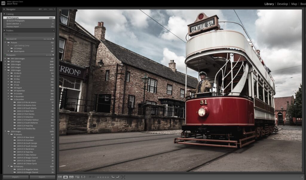
Many of you may be familiar with the term “sledgehammer to crack a walnut”. It means to use a tool that is way too powerful for what you are trying to achieve. That got me thinking about some of the tools we have in Adobe’s Lightroom.
Whilst all of them have a place and usefulness, some of them are too over-powered to give us subtle effects. They either way over process the image beyond what we want, or they require such a deft touch on the mouse that they are impossible to use for all but the most dextrous.
Today we are going to look at some tools that are not sledgehammers, some of Lightroom’s most subtle tools.
White Balance Colour Picker
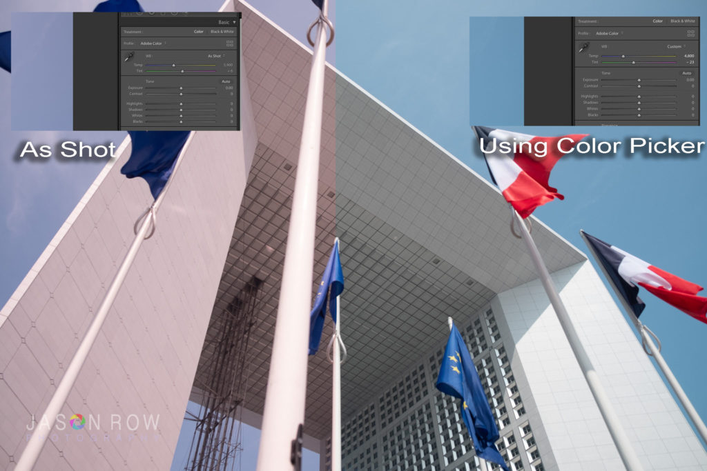
We kick off at the top of the Develop Module with the white balance tools. Sometimes it can be quite difficult to find neutral when using the white balance sliders.
Try this, adjust a shot for colour temperature for a couple of minutes until you think it’s perfect. Then step away from your computer for 15 minutes. What do you see when you return? In most cases it’s that the white balance is not as perfect as you initially thought.
When adjusting white balance it’s very easy for our mind to get fooled into thinking we have nailed it.
Fortunately there is a small tool in the White Balance panel that helps us get much more closer to neutral. It’s the small colour picker to the top left of the sliders. Click on it and then move it to a neutral part of your image. This can be white or any shade of grey.
When you click on that colour the tool white automatically adjusts the image to a more neutral white balance. This allows you to fine tune the balance more easily.
The Texture Slider
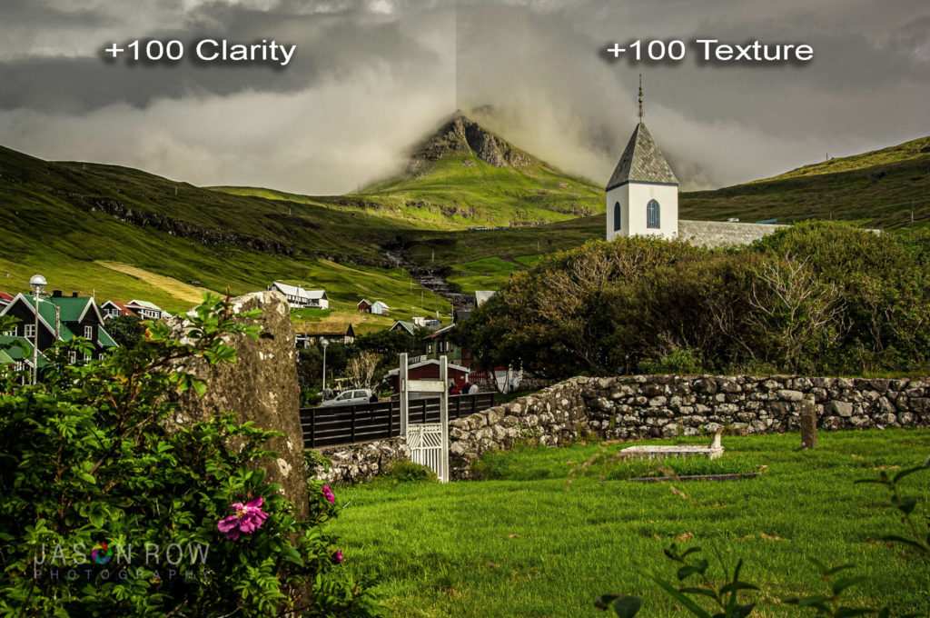
A few years ago Adobe introduced the clarity slider to Lightroom. It was, and still is a great tool but one that can be easily overdone. The tool increases contrast in the mid-tone regions which in turn leads to a better perceived sharpness and texture.
However its very easy to make an image look like an over sharpened HDR using the clarity. Push it too far and the whole image just looks unnaturally sharp.
Adobe realised that this tool was a bit of a sledgehammer and a couple of years ago added the texture tool. Texture works on the same principle but with a much more subtle effect. Its particularly good at adding better tonal contrast to areas of fine detail such as hair.
Clarity can often cause the fine details to merge with each other and look as if they have been smoothed out. Texture works much better in these micro contrast regions and gives a much more subtle look.
Vibrance Slider
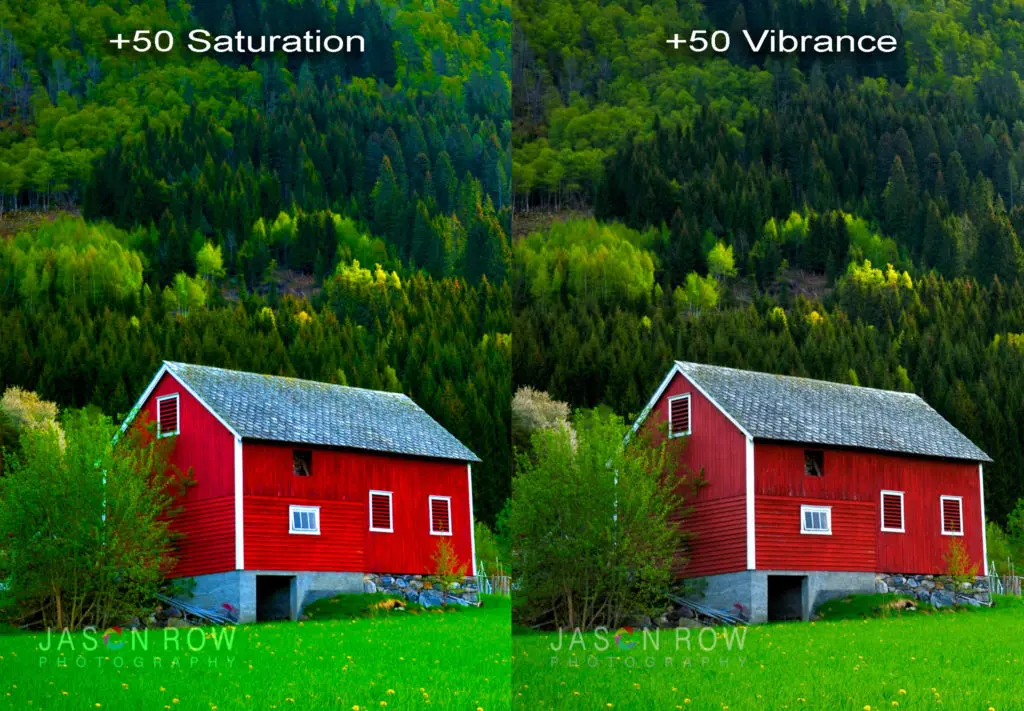
Saturation and Vibrance are to color what Clarity and Texture are to detail. The saturation slider can very much be a sledgehammer. This is because it affects all colour levels equally. The Vibrance slider however is much more subtle. It adds saturation but only to colors that are already relatively muted.
Let’s say, for example you had a photo of a red barn against a green hillside. Adding saturation would make both the unsaturated green and the saturated reds more saturated. As red can be easily over saturated, this is not ideal.
If you do the same using the Vibrance slider, we will find that the green will becomes a much richer but the red barn will not change in saturation. The Vibrance tool is great for bringing muted colours up to similar levels as more saturated ones. This in turn can make the whole image look brighter and more colorful without being over saturated.
The HSL Picker
The HSL or Hue/Saturation/Luminance panel is one of the most powerful tools in Lightroom’s Develop Module. As the name suggests it can allow you to adjust the hue, saturation or luminance of eight specific colour tones. This is great is you have a dull green grass as sliding the green saturation to the right will punch it out nicely.
The problem is however, most areas that we want to improve in our shots are not a single, well-defined colour but a delicate mixture of several. Finding the right combination of colour slider to adjust this can be very difficult.
Fortunately, like with the White Balance tool HSL has a picker tool. It can be quite difficult to spot, not resembling the picker tool in white balance. Instead it’s represented by a small circular icon just below the word hue at the top of the panel.
To use it, you first select either the Hue, Saturation or Luminance tab. Then click on the tool icon and move it to the colour that you wish to work on.
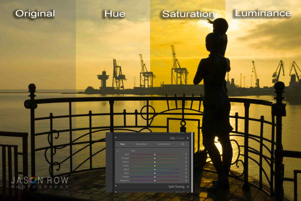
For example lets slightly change the hue of a sunset. We select the Hue tab in the HSL panel. Click on the HSL picker tool and position it over the colour we wish to change.
Now we click and slide the mouse up and down. We will see that our orange sunset sky is made up of Reds, Oranges and Yellows. Sliding up will increase the yellow in the sky whilst sliding the mouse down will add more red. With Saturation, sliding up increases and sliding down decreases. For luminance, up is brighter, down is darker. Its a very power tool that allows you to subtly change the color within your image.
The Guided Upright
Perspective control in post production can be a tricky thing to manage. We can use the vertical tool. However if one vertical is different to the another, it will look lopsided. We will also stretch the image ratio making our buildings look slightly off. The manual perspective controls tools are indeed somewhat of a sledgehammer.
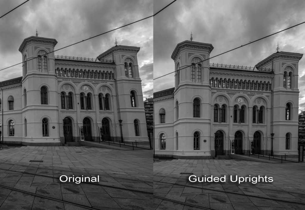
There is however, a relatively new tool for correcting perspective. It’s called Guided Uprights. It’s a hands on tool that allows you to define two verticals and will then correct the perspective automatically.
To use it, you click on the two crossed lines icon on the upper left of the transform panel. You then move the curser to the first vertical. You will see a loupe appear allowing you to finely place the curser. Then click and drag up or down that vertical and you will see a lined guide lock in place.
You then repeat the exercise for the opposite panel. When you release the mouse button, Lightroom will correct the perspective taking care to keep the image ratio the same and then automatically crop the image to size. It works very will on light to moderate converging parallels and is much more subtle than the manual correction tools.
Lightroom is full of amazing tools. Some of them are very powerful, but too powerful for subtle effects. The tools we have listed above are alternative, more subtle tools to more commonly used ones. They give finer control over your image in a number of key areas. If you have a favourite, subtle tool in Lightroom, let us know in the comments below.


